

Core: critical for gameplay
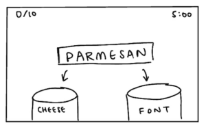
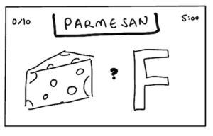
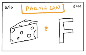
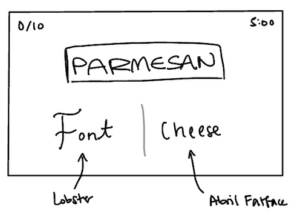
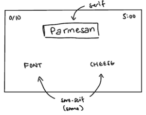
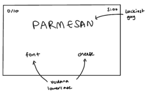
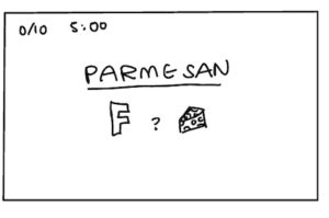
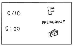
- Type of cheese
- Type of font
- Ability to assign one to each category
- Score
- Timer
Supportive: hints / instructions
- “I’d give you a second guess, but there are no second guesses. It’s a cheese.”
- “Nope, it’s a font!”
- Header: Cheese or font?
- Header: Enter C or F
Extraneous: things to remove
- Grid displaying past answers
- Automatic next question
- Large text box (you only need to enter ‘C’ or ‘F’)
- ‘PREV’ & ‘NEXT’ buttons
SKETCHES
Core elements:
Size:
Color:
Type:
Proximity:
Chosen game: 2048
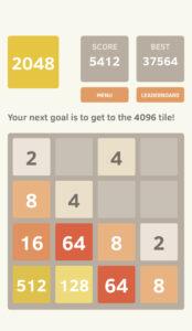
I think 2048 is a very beautifully designed game because it uses grid alignment very well and follows Gestalt principles to the T as well. It really only has the core elements of the game displayed, and uses color to effectively help the eye differentiate between number tiles that are the same and that are different. The fact that the number board takes up such a huge space on the screen immediately tells the player that this is what they are meant to be doing, and the fact the “menu” and “leaderboard” button text is so small immediately makes these two actions secondary to the act of playing the game. Overall, the simple design is (in my opinion) both pleasing and calming and very in line with the fact that the aesthetic of this game is submission/abnegation.
