

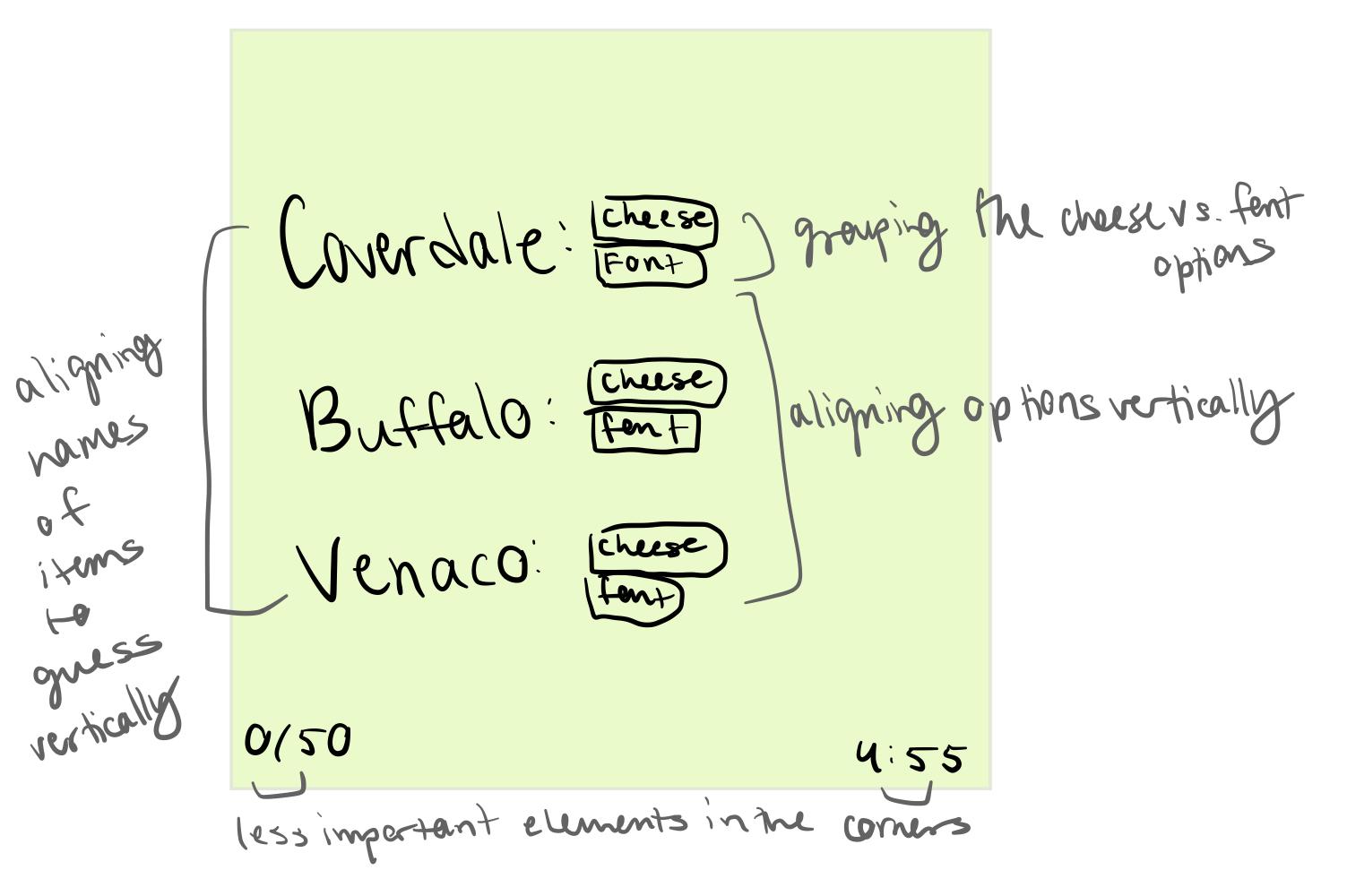
Elements of Cheese or Font
Core (parts needed for gameplay)
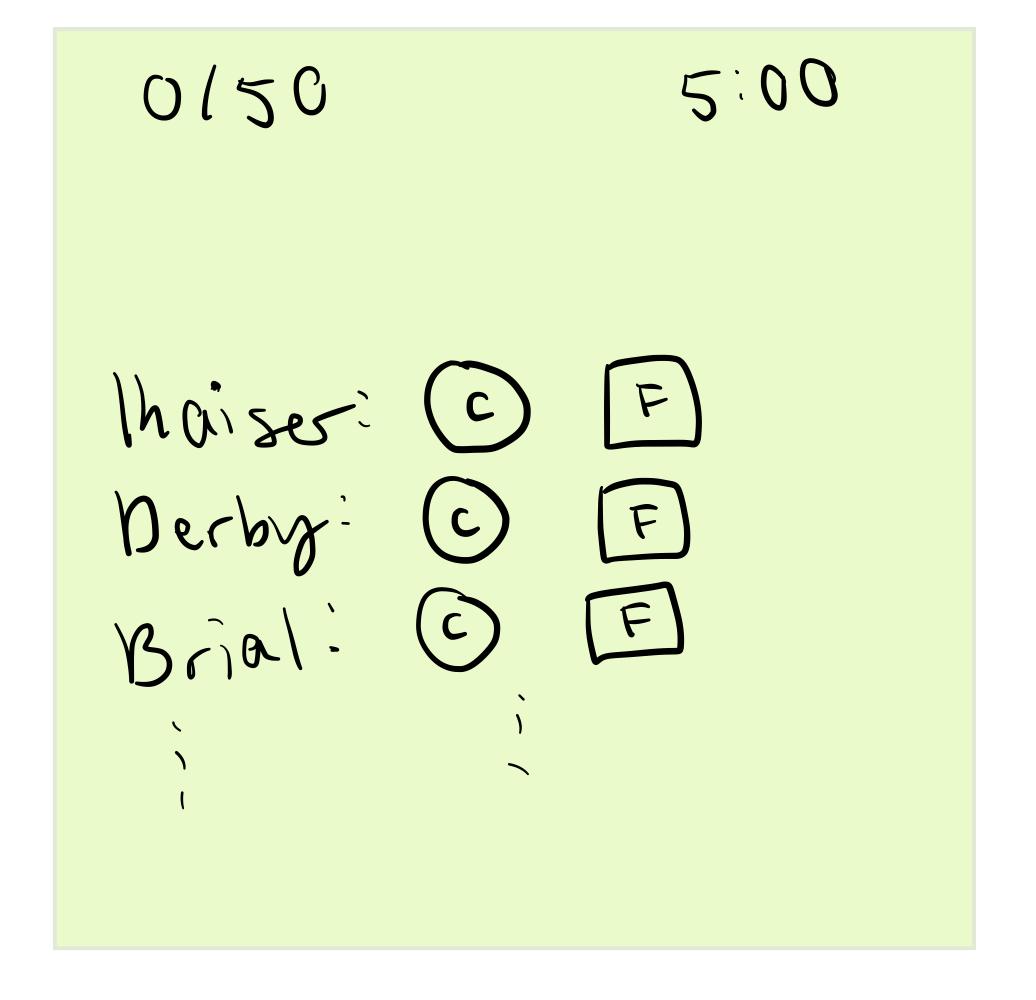
- Player vs. game – a player is needed to fill out the quiz.
- Timer visual indicator
- Current score visual indicator
- Clear rows/columns indicating which item is being labeled as cheese or font
- Ability to choose Cheese or Font
Supportive (hints and instructions)
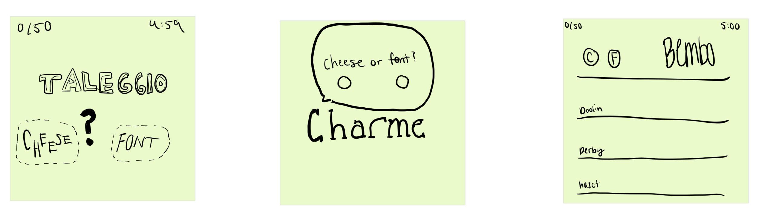
- The procedures/rules written as title/subtitle at the top of the game: “Cheese or font? Can you name the cheeses and fonts?”
- The additional instructions that appear when you hover over the “Classic”, “Forced Order”, and “Wrong Answer” icons
- The column headers of “Cheese or font?” and “Enter C or F”
Extraneous (things you can remove)
- The name of the creator (“By chair”)
- Total number of plays
- Rating out of 5
- More info popup
- Rate Quiz button
- Quiz playlist, scoreboard, comments
- Color
6 Layout Ideas
Sketching out the core elements
Sketch with HUGE element
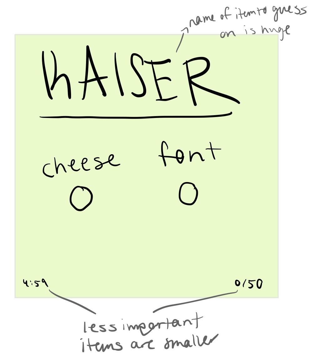
One-color sketch
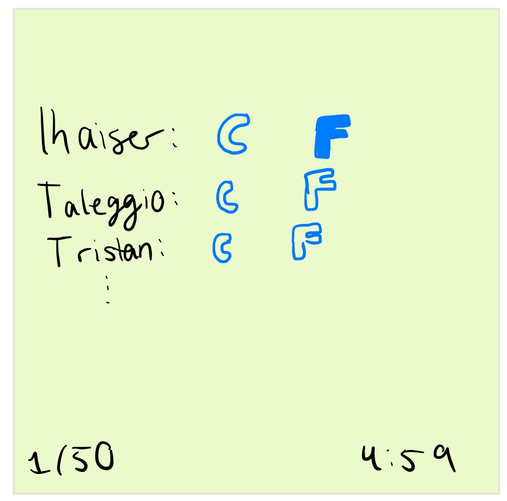
Using Type in 3 different ways
*note for the third sketch: the idea here is that once a player choose C or F, then the next item will move to the top of the screen and appear in the larger font; incoming items are intentionally smaller because they’re not the current one to answer
Proximity
A Beautiful Game: Doodle Jump
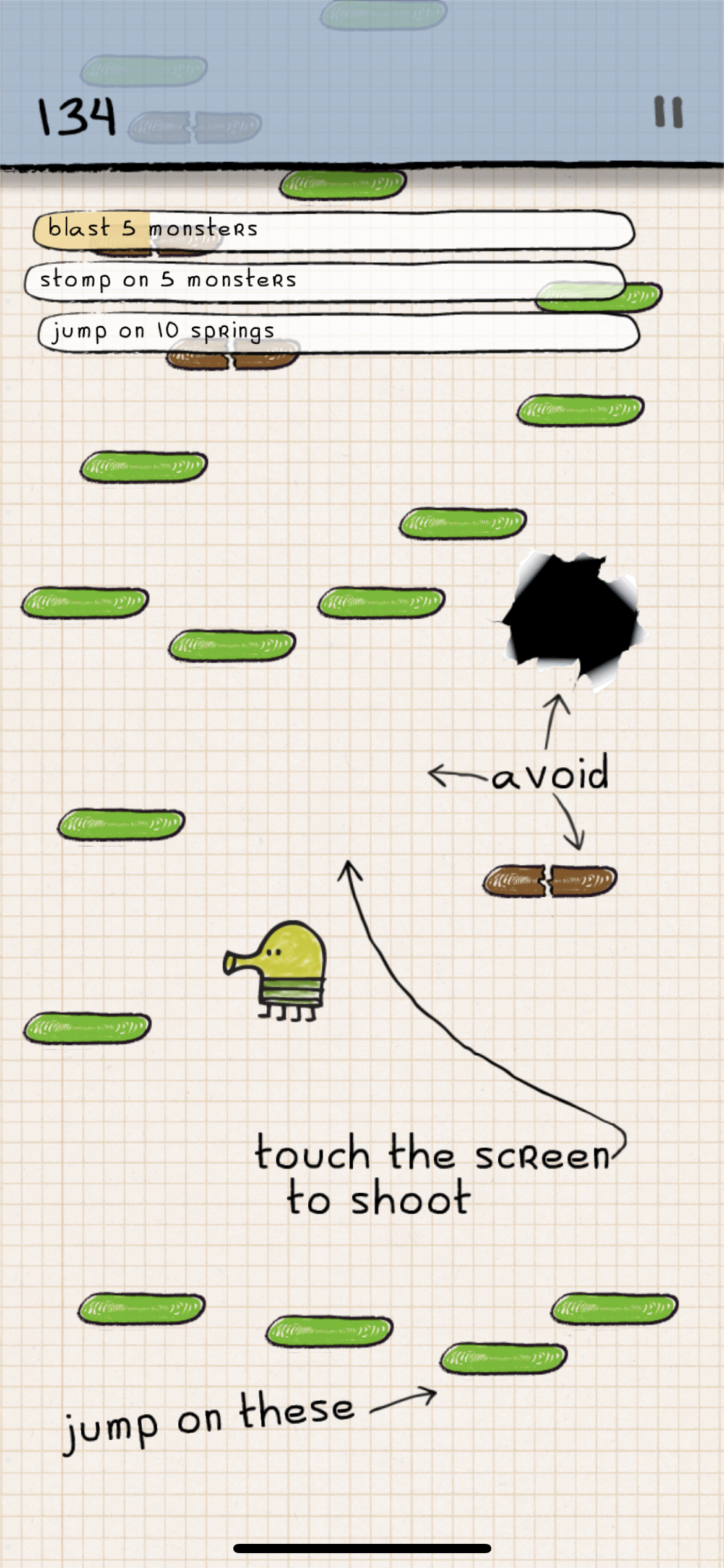
I find Doodle Jump very aesthetically pleasing. It uses color quite well, using sharp shades of green and brown to contrast from the neutral background to indicate to the player that those platforms can be interacted with. They follow good typography practice by using the same art style in both text and non-text items: everything has that elementary doodling, hand-drawn look to it. They also follow good alignment and proximity principles: less important elements like the player’s score and the pause button are placed on the top corners of the screen. The objectives that the player should accomplish are grouped together at the top of the screen. Everything else is the actual game. Size is used intentionally: the less important elements like objectives, score, and pause are noticeably smaller than the rest of the game, which helps keep my attention on the most important part of the game: keeping Doodle alive and jumping. The placement of everything seems very intentional because they do not want to block a player’s vision as the jump from platform to platform and progress.
