Cheese or Font: Visual Design
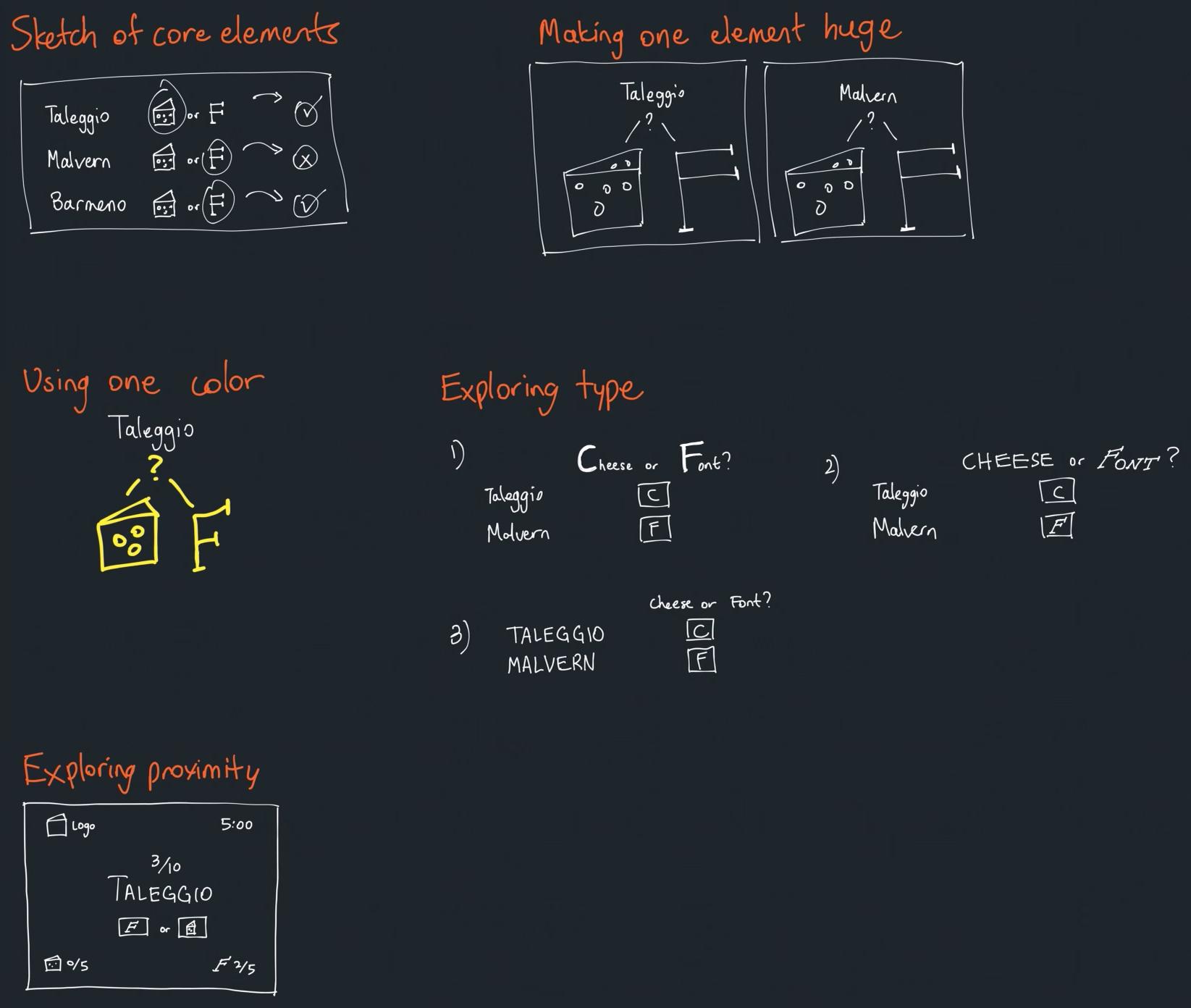
Cheese or Font is a simple and humorous game testing your abilities to guess whether a word is a cheese or font. Some of the core elements of its design are:
- Core: A list of cheese and fonts
- Core: A way to input whether you think something is a cheese or a font
- Core: A way to tell player whether they were correct or not
- Supporting: Descriptive text saying “Cheese or font?”
- Supporting: Descriptive text saying “Enter C or F”
- Extraneous: A points system
- Extraneous: Timer
- Extraneous: Table with coloring (orange and yellow)
Exploring some of the design elements:

Visual Design of Slither.io
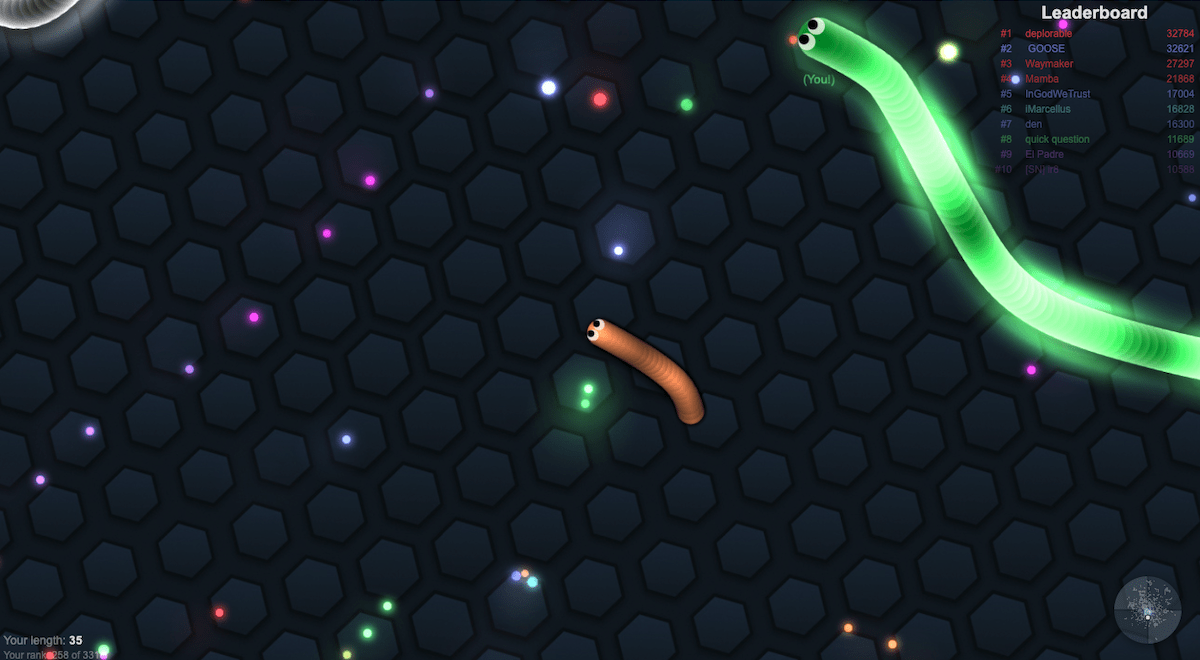
Slither.io is a game that that great visual design. It has beautiful and serene graphics, as shown below.

Some of its core visual elements are:
- Centered player. The player’s snake is always at the center of the screen, while the map moves, giving a feel that you see a constant distance around you, and giving the player a rooted sense of position.
- Vibrant colors. Snake food is multicolored, created a beautiful starry backdrop. Other snakes are multicolored as well. When snakes use the boost, they glow, created a beautiful light effect. The dark background creates aesthetically pleasing contrast with the vibrant colors.
- Use of size to convey success. Size directly conveys a player’s progress in the game (bigger snakes have accomplished more). They player starts out as a tiny snake and eventually grows to a big one, leading to a sense of accomplishment that is very intuitive.
- Simple, discreet text. The score and leaderboard are in small unassuming text in the corners. The font is simple. They don’t draw attention to themselves, letting the player focus on the gameplay.


