Elements of Cheese or Font
- Core elements:
- Prompt (i.e. “Tahoma”)
- Input (“Enter C or F”)
- Interactive answer (after a couple of seconds, the system lets you know if you are correct or not)
- Timer
- Supportive elements:
- Play quiz button
- Previous and next buttons
- Your results (score and percentage)
- Pause
- Extraneous elements:
- Average score
- Average friend score
- Fun responses to incorrect inputs (i.e. “Snark snark snark. It’s a font.”)
- Next quiz and random quiz buttons
Thumbnail Drawings
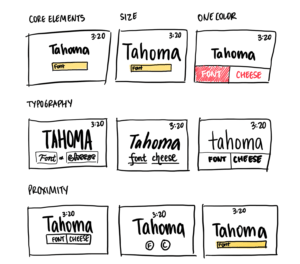
Exploring Proximity
Per the Gestalt principles, we assume things are part of a group when they are close to each other and different when they are separated by space. I explored different ways of grouping together the core elements. In the first, I grouped everything together, keeping the space between each of the three core elements very small; this perhaps is not the best or most logical design. In the second, I grouped the timer and prompt together and inserted a bit of distance between this group and the input buttons; this puts emphasis on the user input, highlighting the main interaction of this game: the guessing of font versus color. In the third, I grouped together the prompt and the input, which makes sense as these two elements are coupled together to be able to support a Question and Answer functionality; the timer, then, is on its own, as this is a mechanic that simply guides the gameplay.
Beautiful Game
A game I find that is simple yet beautiful is Wordle.
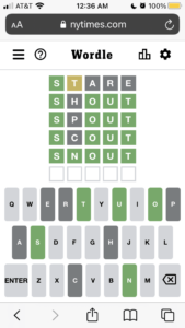
- Size: Interestingly, the size of elements are pretty evenly distributed. Both the grid and the keyboard are pretty equally sized, signifying that both displaying your guesses and making your guesses are similarly important to your gameplay. However, I will note that the size of the letters are much bigger in the grid than in the keyboard.
- Color: The color palette of the game is very clean and comfortable. There are not many colors, and all the colors that are being used make sense. Green is a correct letter, yellow is an almost-correct letter, and gray is an incorrect letter.
- Typography: Besides the title of the game, which matches NYT, all the components of the game use sans serif. This is easy to read and clean, and it is consistent throughout.
- Proximity: The two major groups on the screen are the grid and the keyboard. There is a clear visual distinction between these two elements, yet at the same time, the distance in between them is also little, which likely serves gameplay as the user needs to be able to easily reference both elements in one glance.