

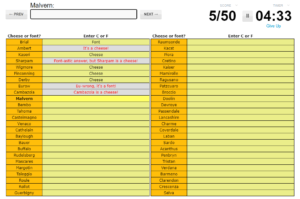
Core: Answer input, prompt, score, timer
Supportive: Question navigation buttons, table layout, ability to click on a table element, give up button
Extraneous: Yellow coloring for the table, red font for incorrect answers, funny comments for incorrect answers, average score of people who complete the quiz (not pictured)
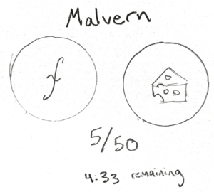
Small Sketch:
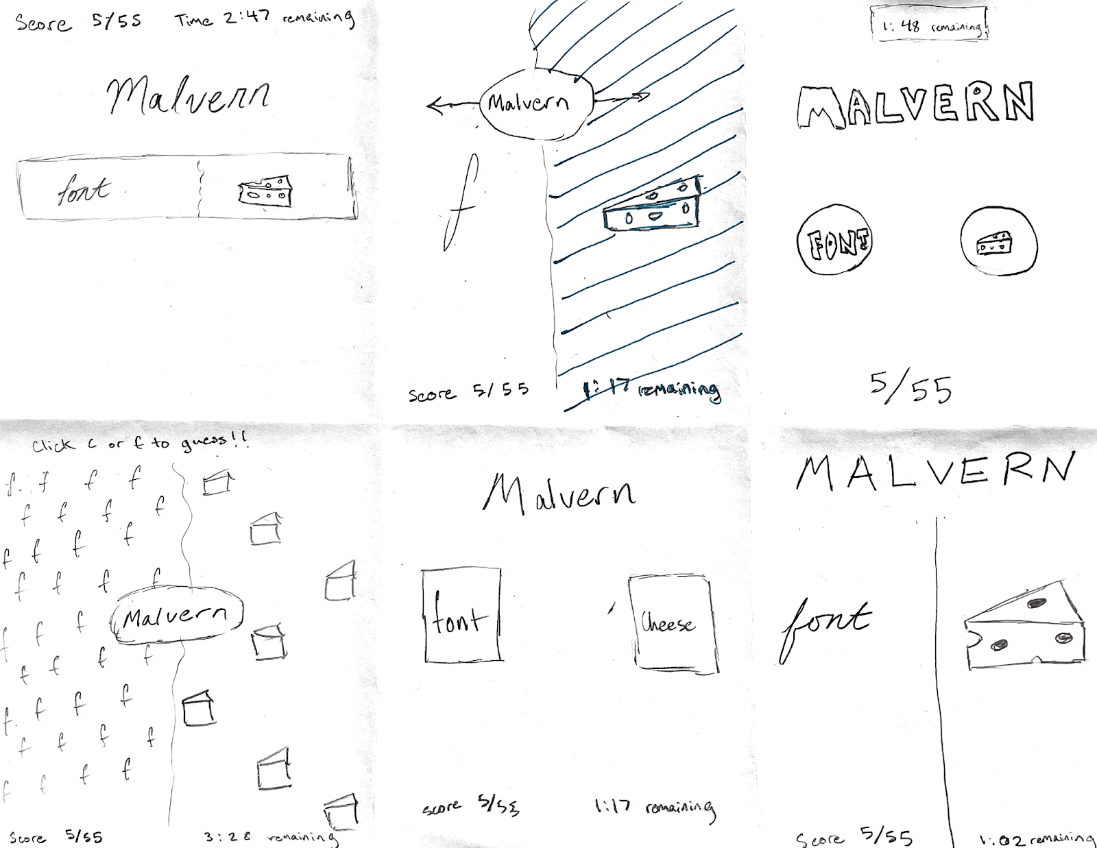
Permutations:
Visual Analysis of Hollow Knight
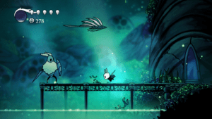
The game Hollow Knight is awesome and is widely regarded as one of the most beautiful games to exist. The aesthetics of the game are fantastic–it is sleek, stylized and minimalistic in the right places. The game uses color in a very interesting way. Most of the colors on the screen are not particularly vibrant. So when color is introduced, there is a stark contrast that can really highlight a particular element on the screen. The HUD makes good use of proximity to display important information to the user, but is set back so the user can immerse and enjoy the whole screen.
