Elements of Cheese or Font
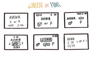
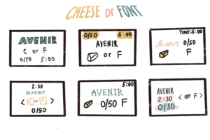
Core elements: score, timer, prompt, input
Supportive: instructions in column headers, hints provided for almost every wrong answer, boldface for current prompt, different hues of yellow for prompts and correct answers
Extraneous: how to play instructions, previous and next buttons, another input box, taunts for incorrect answers, give up, pause, resume, average score, quiz statistics
Visual Design of Sonic Hedgehog
The game I chose to explore is Sonic the Hedgehog, a Japanese video game series created and owned by Sega. This is my favorite video game that I played using Sega when I was a child. It is an endless game with absolutely amazing graphical decisions. I remember playing this game just for getting a sense of pleasure, so I’ve decided that Sonic would be a great example for this assignment.
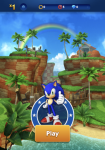
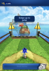
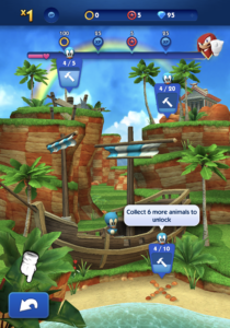
Size: The designer was able to delivering the most important information by making a good choice of sizes. For example, play button, instructional texts, scores, etc.
Color & Contrast: This game comes off as both cool and cute. The zones are enjoyable to look at with bright greens for the nature zones. It has a graffiti like image with bold line-work. The game is colorful and it is easy to distinguish all important elements, for instance, you know that monsters are usually pink, coins are yellow, etc.
Typography: The designer uses the same font family everywhere just changing the boldness and color.
Alignment & Proximity: I like how elements in the game are aligned to each other, for instance, coins are arranged in a proper sequence so it makes easy for a player to gather all of them.

