

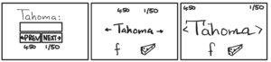
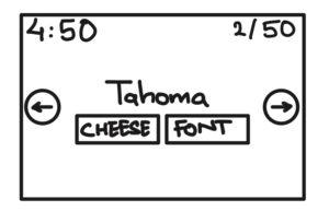
- Identify all the elements of Cheese or Font.
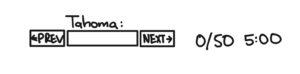
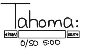
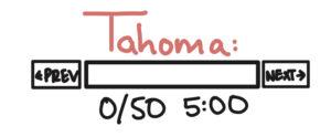
- Core:
- Answer Box
- Next/Prev Buttons to navigate
- Scoreboard + Timer
- Replay/Next Quiz buttons
- Play Quiz Button
- Current word to identify
- Supportive:
- List of all words to identify
- Quiz stats
- Extraneous:
- Descriptive Feedback of right/wrong answers
- Give up button
- Core:
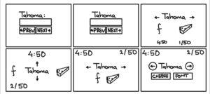
- Small quick sketch:
- At least Six ways to rearrange core elements:
-
Make one element in a NEW thumbnail sketch HUGE:
-
Try taking ONE color and using it in your thumbnail sketch along with black:
-
Make 3–4 thumbnail drawings that use type in different ways:
- Explore proximity in your design:
Game Analysis:
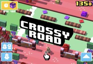
I am choosing to explore the elements of the game Crossy Roads.
The above picture is the main start screen of the game, and we will start by analyzing its elements:
Alignment: We can see that all the Supportive elements of the game such as total coins, settings, and other buttons are placed in all the corners forming a grid like pattern. This choice for element alignment allows users to focus on the main game play resulting in better retention and makes the game logic easy to understand.
Typography: Fonts being used in the game are “blocky” indicative of the fonts used by popular games in 90’s and helps sets the aesthetics for the game.
Contrast: We can also see that the game obeys the commandments of the color theory with its complementary colors and different shades.
