

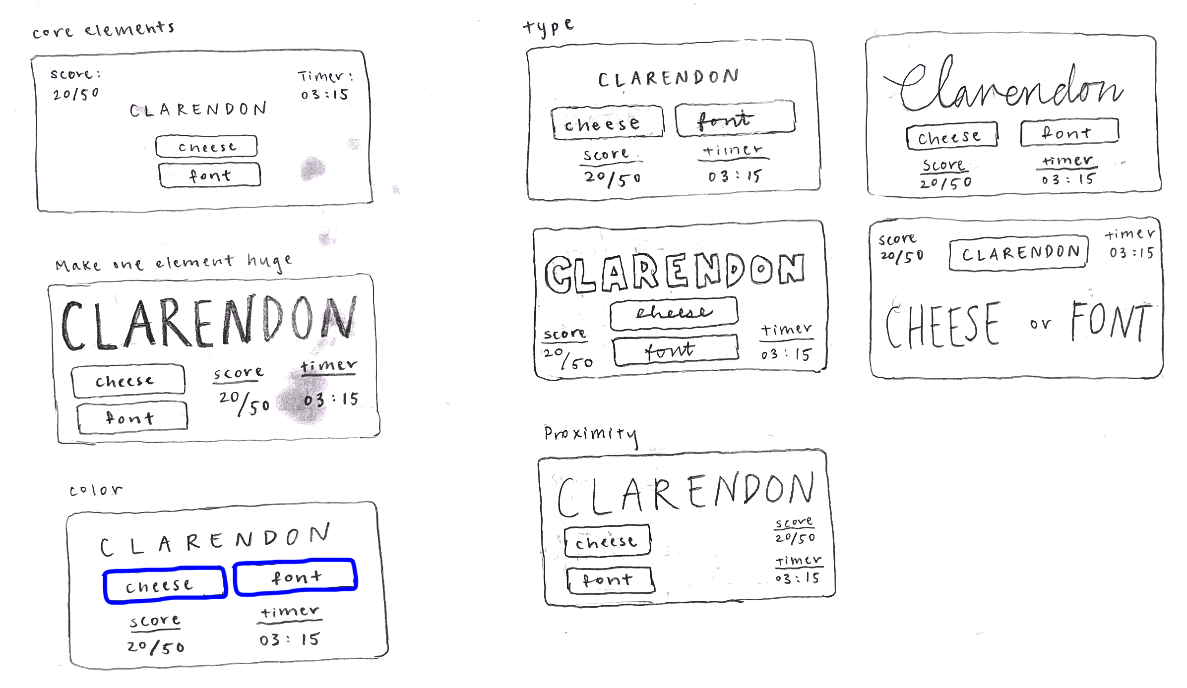
Elements of Cheese or Font
Core:
List of cheeses/fonts and place to indicate your guess
Score or indication of whether the guess was correct
Timer
Supportive:
“Enter c or f” label
Prev/next buttons
Option to pause and resume
Hints
Extraneous
Commentary on wrong answers
Historical average score of all players
Ability to see quiz stats, challenge friends, or randomly shuffle to a different quiz
Option to give up
Cheese or Font Design Exercises
A Beautiful Game: Wordle
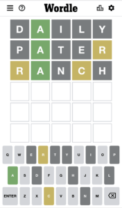
I think Wordle is a beautiful game. Wordle is a word guessing game that prompts the user to guess the day’s 5-letter word in 6 guesses or fewer, providing feedback about whether the letter is in the word (and in the correct place) or not.
First, the use of color — light grey, dark grey, green, and yellow — help emphasize the key element of the game: guessing letters correctly. This visual communication is a clear and intuitive way for the user to understand how correct their guess is. On the board, if a letter is dark grey, the letter is not used in the word. If a letter is yellow, the letter is in the word but in an incorrect spot. If a letter is green, the letter is in the word and in the correct spot. On the keyboard, light grey letters indicate the letter has not been guessed yet. This gives the user intuitive visual feedback.
Second, Wordle uses visual hierarchy to emphasize the board of guesses, rather than the user’s keyboard. This is because the board takes up 70% of the user’s phone screen, which allows them to focus on the grid and letter guesses. Wordle also uses gestalt principles using proximity to indicate separation between the grid and the keyboard.
Finally, while Wordle uses the same font (a sans-serif) throughout the game, it uses size to make visual distinctions between the board letters and the keyboard letters.
