Exercises for Cheese or Font?
Core Elements:
- Text of Cheese/Font Name(s)
- Way to indicate answer, Cheese or Font
- Timer and Pause button
- Score
- Previous/Next buttons
- Give Up button
Supportive Elements:
- Instructions for answer format “Enter C or F”
- Bolding the text/name one is currently on
- Showing answer if correct
- Sometimes hints if answer is incorrect
Extraneous Elements:
- Random bold lines sectioning off rows
- Double columns, multiple same labels
- Random snarky comments shown if answer is incorrect
- Intense, similar colors
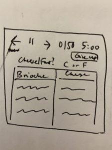
Sketched Core Elements and Regular Thumbnail Sketches:
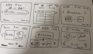
Size, Color, and Type Thumbnail Sketches:
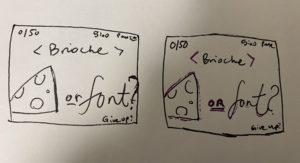
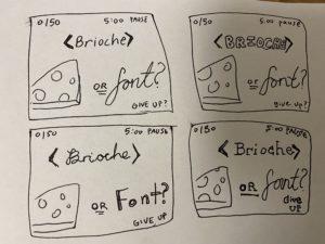
Exploring proximity in the design:
The Cheese or Font buttons should be grouped, as they are the labeling choices the player must make. The timer and pause button should be grouped together, as the pause button is used to affect the timer. The previous and next buttons and current name/text displayed should be grouped as the buttons change the displayed text in corresponding directions. Meanwhile, the Give Up button is different and should be separate, as it is an exit button used solely to quit the game. The score should also be somewhat separate as it just indicates how the player how is doing in the game and is not an interactable component directly tied to any other core element.
Example of a Visually Appealing Game: Overcooked 2
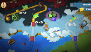
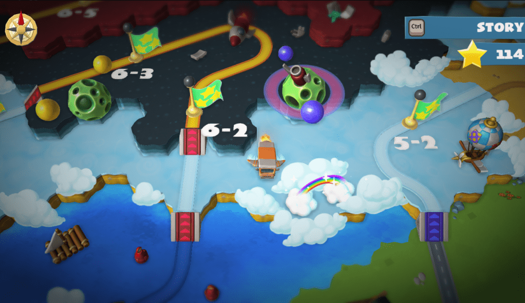
Overcooked 2 elevates its well-made but seen-before cooking mechanics with the game’s colorful and inviting visual design. The map one traverses to get to levels shows this in particular, aside from being just a great way to navigate between levels. It utilizes lots of colors to create a vibrant landscape, but also chose and used deliberately so that the map isn’t overridden or too visually noisy. In fact, Overcooked 2’s map is the opposite of confusing: contrasting colors separate different regions at different elevations, the colors becoming more dissimilar the more distance between regions. This proves to be very effective visual grouping, as well as the yellow path that stands out clearly against any region color to lead the eye towards various checkpoints. Each checkpoint is denoted by clear, bold white text of consistent typography and the same green flag. These common components, which are also consistently aligned in the same way, easily group the different levels into the same category for the player.
On the other hand, the sparkling rainbow area lacks both of this text and the green flag demarcations, so the player knows it is not the same location as the regular levels. The sparkles indicate interaction and otherwise a difference from the rest of the landscape items, however, so the player also knows it isn’t just another decorative prop. And this indeed holds true as this rainbow area ends up being a hidden or bonus level the player may attempt. Finally, throughout the map, as mentioned, there are many objects that fill in the space and give the regions some life. They provide size contrast with the rocket-bus the player uses to navigate the map, giving the player a better sense of the scale of the map. At the same time, they don’t clutter up the space as they are made much smaller in comparison to the larger objects that are close to level checkpoints. This makes sense, as the player will want to focus on these checkpoints . Hence, both ends of the object sizing play a role, with larger, more interesting landmarks drawing one’s eye to their nearby levels, and the smaller ones filling in the background without emphasizing any individual small object and taking up attention.
Overall, the careful attention to color, size, and space in Overcooked 2, particularly their navigation map, successfully keeps the liveliness that many embellishments add without losing clarity of functions.

