Identify elements of cheese or font
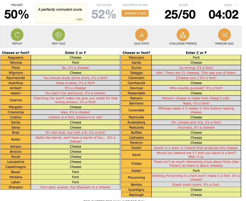
- Core Elements:
- Text prompt of a word: at this game’s core, the game is prompting you with a word to decide whether it is a cheese or font.
- Input: ‘c’ for Cheese, ‘f’ for font. The game asks you to choose between these two options and input your response.
- Timer: The time constraint on the game of 5 minutes forces you to make decisions faster as a resource that is limited in the gameplay.
- Supportive Elements:
- List of all words: As a player, it’s helpful to see what words you’ve guessed correctly and incorrectly already to help you make future judgments.
- Feedback: If you’ve guessed incorrectly, the game gives you feedback on the category of the word and feedback on how to improve through funny comments.
- Score: As you guess correctly or incorrectly, your score for all rounds of the game is updated to be out of 50.
- Replay: Helps you restart the game so that you can play again.
- Extraneous Elements:
- Average score/quiz stats: After you play, you can see how you’ve done on average from this game or your performance over time. This is extraneous as it does not add to the core gameplay, despite it being helpful for players who may want to track their progress.
- Average friend score/Challenge a friend: While this may help drive competitive spirit among friends, this feature is not needed for the core game.
- Next Quiz / Random Quiz: These features navigate you away from the current game.
Thumbnail Sketches
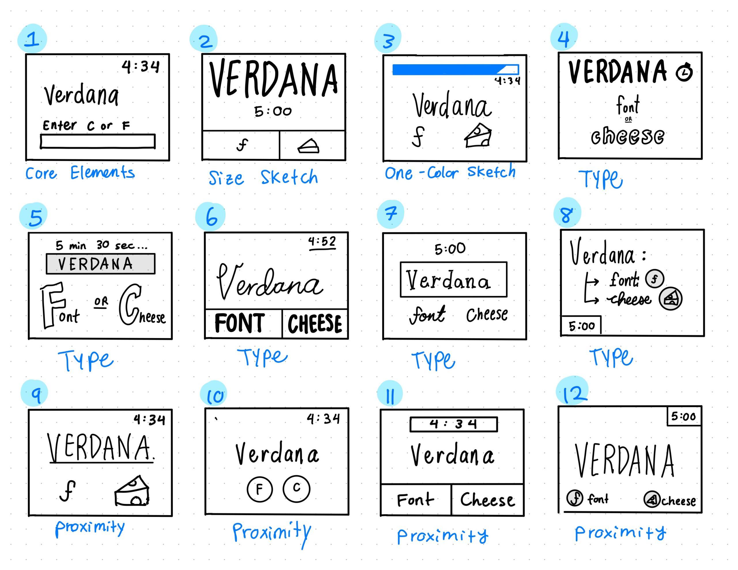
- Core elements: In sketch 1, I identify the core elements of the timer, input, and word prompt and sketch them as they appear in the current game.
- Size Sketch: In sketch 2, I use size to magnify the importance of the word prompt, which appears significantly larger than the rest of the information on screen. This is to create visual hierarchy that draws your eye to the word prompt first.
- One-Color Sketch: In Sketch 3, I use a different color to create contrast between the timer bar counting down in blue with the rest of the information on screen. The use of color here draws attention to the time counting down, creating additional pressure for the player.
- Type: In Sketches 4 – 8, I play with the combinations of different font and layout pairings. In Sketch 4, I use bubble letters and sans serif fonts with different weights. In sketch 5, I use size to emphasize the bubble letter of F and C for font and cheese. In sketch 6, I use a script font to draw attention to the text prompt and create visual distinction from the rest of the screen. Lastly, in sketches 7 and 8, I combine slab serif fonts, script fonts, and sans serif fonts in different breakdowns to pair fonts together and visually communicate different ideas.
- Proximity: In sketches 9 – 12, I use the principle of proximity to draw attention to the text prompt. I also visually separate the text prompt and timer from the input of font or cheese in all sketches to show the difference between the inputs and the rest of the information. These sketches use proximity to create distance between the timer, inputs, and text prompt.
Graphic Design Analysis: Wordle
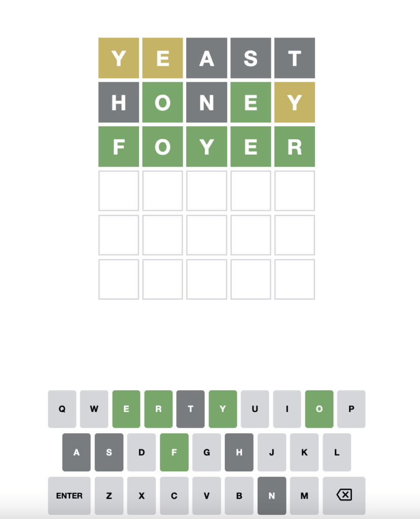
Wordle is a game that is beautifully and simply designed. Created by Josh Wardle in 2013, Wordle is a word guessing game with the core elements of a keyboard of alphabetic character inputs and a grid of up to 6 5-letter word guesses.
Wordle uses size to emphasize the grid of guesses. The guesses you type in and their size are significantly larger than the keyboard inputs at the bottom of the screen. This creates a visual hierarchy that draws your eye naturally to your guesses of the day.
Wordle is also a great example of color usage. With only 4 main colors (green, yellow, light grey, dark grey), Wordle visually communicates with the user easily. Green letters are correct and in the right place, while yellow guesses are correct but not in the right place. Light grey guesses are letters that haven’t been tried, while dark grey are incorrect letter guesses. The simple but effective color usage helps the user to understand the goal behind the game as well as provide visual feedback.
For type, Wordle uses a sans serif font throughout the game, but it uses font size to help create visual distinction.
Lastly, for the principle of proximity, Wordle clearly separates the grid of guesses from the keyboard. This distance helps players visually group the elements differently and show separations in gameplay.
All in all, these factors help make Wordle a beautiful and beloved game by all!

