

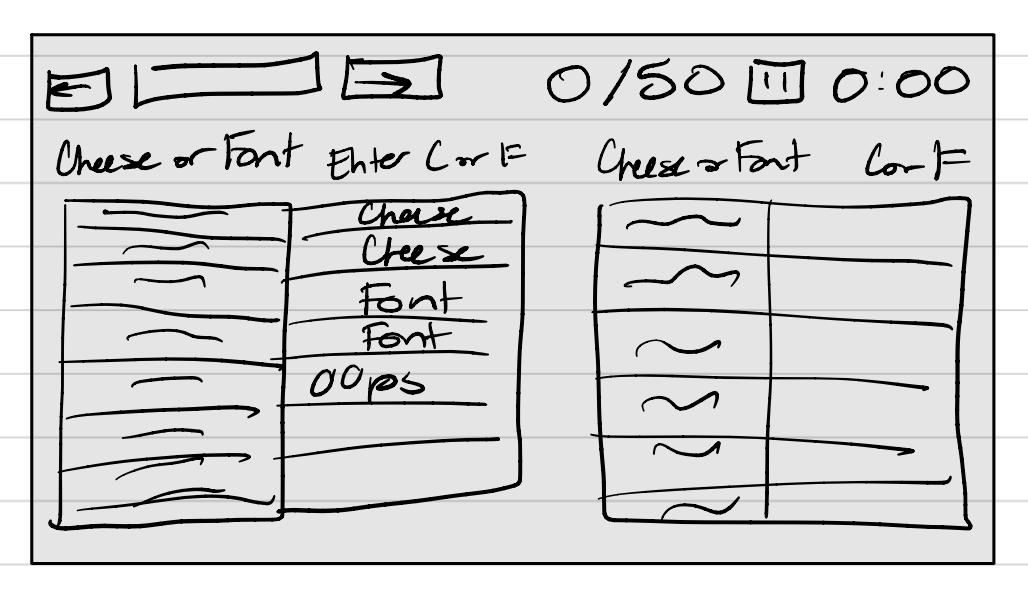
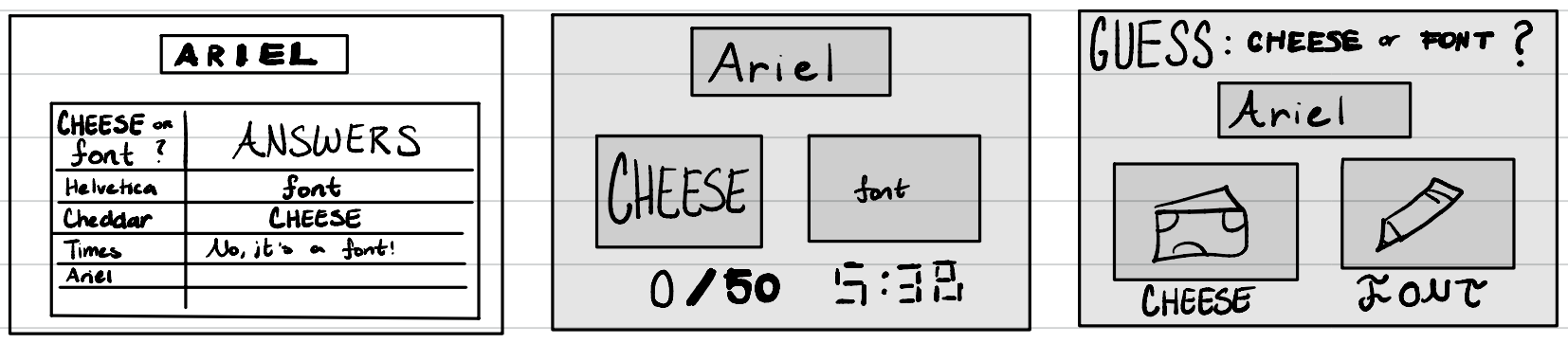
I started off today’s analysis by watching the article and looking at the game, Cheese or Font, that the handout described.
These are the specific elements I caught for each category of Cheese or Font:
- Core
- Start Person
- List of Names + Result
- Textbox to Enter Info
- Timer
- Score
- Arrows to Scroll Between Options
- Pause Button
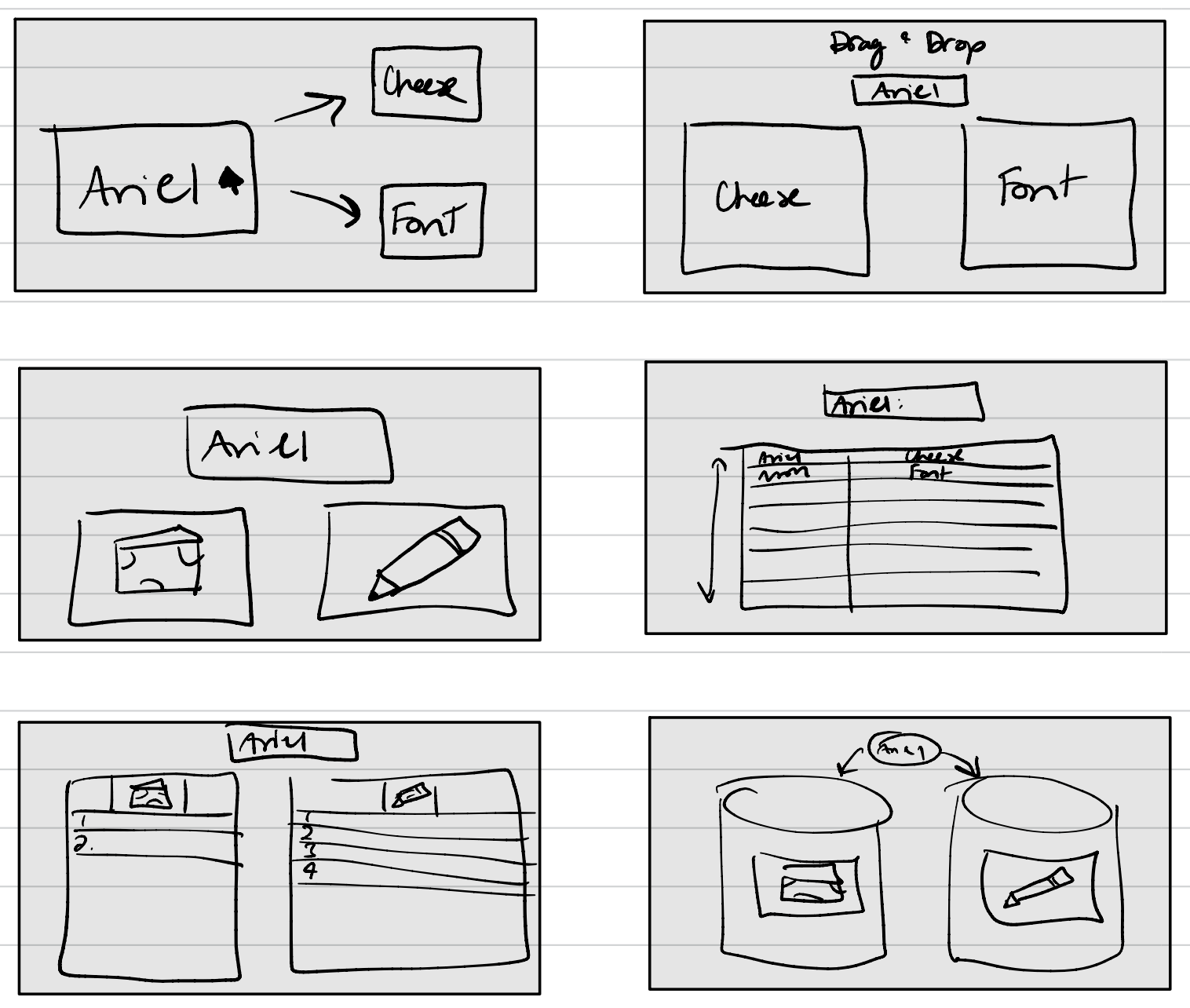
- Supportive
- Average Score + Average Friend Score
- Buttons At End-of-Game Summary
- Replay, Next Quiz, Statistics, Challenge Friends, etc.
- Prompts Above Boxes with Name and Questions
- Removable
- Long-winded Comments for Incorrect Answers
- Random Comment Box Next to Final Score
Here was my initial sketch of the core elements of the game:
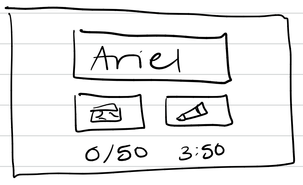
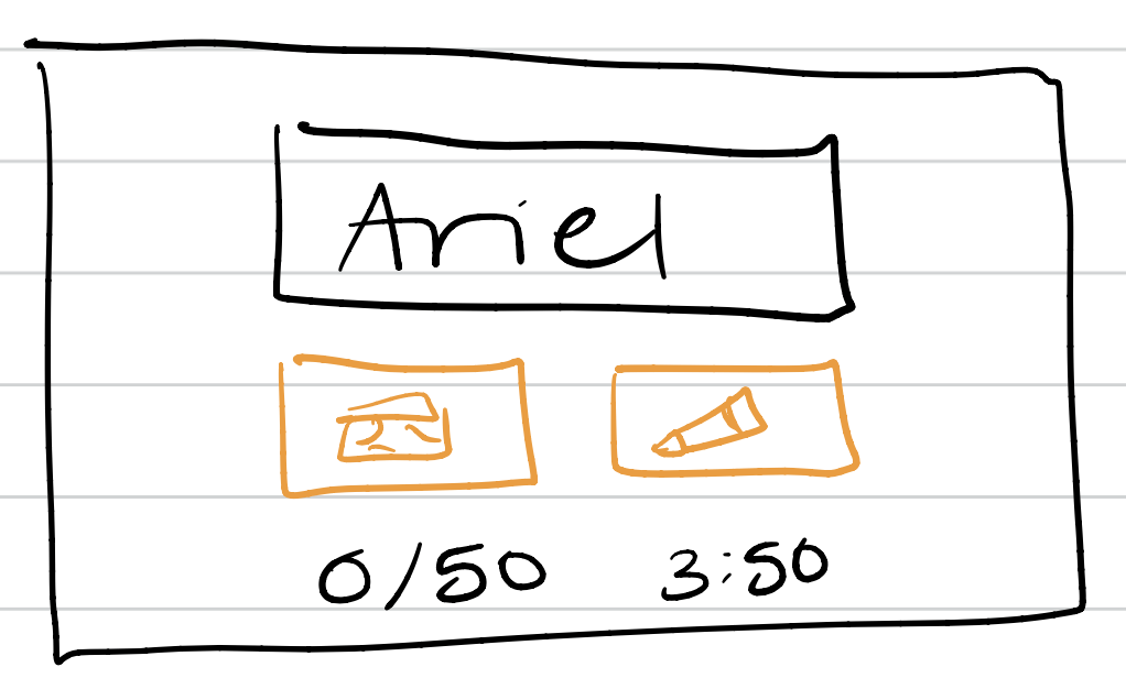
From there, I completed all of the exercises that were mentioned throughout the article:
Redesgining Cheese or Font
New Thumbnail
Color Thumbnail
Fonts/Typography
Proximity Thoughts
- Items that are related should be closer together, such as the selection method for buttons like “Cheese” and “Font”.
- Information-heavy elements that are not necessarily gamplay relevant should be placed in the same area as well.
- Fonts and colors that are near each other should be similar in style.
Now, one of my favorite games that I thought would be fun to apply design concepts to is Mario Kart. Although I have played Mario Kart on many different platforms, the one I have played most recently is Mario Kart 8 for the Nintendo Switch.
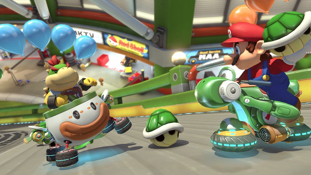

Here are how each of the design elements discussed in the article come into play:
- Size
- The size of the driver and the cart are kept small, but in the forefront and main focus of the shot, in comparison to the racetrack and surrounding features. The course seems realistic, as the game centers around the driver and their close areas but also contains important elements in the background.
- The most important contextual information is larger (e.g. position in race, racetrack shape, weapons) in comparison to other details (e.g. coins, place in race).
- The driver is always the largest element in the shot.
- The weapon that we cannot use yet is smaller than the weapon that is currently armed.
- Color and Contrast
- The background colors are vibrant and lively, to keep the scenes interesting and different. but do not distract from the game.
- The driver themselves have little decorations, like the sparks coming from the wheels, that offer contrast to the grey racetrack and catch a user’s attention.
- The less imporant text blends in with the racetrack because of the gray backgrounds, but important changes in the game are made obvious through movement or color changes.
- Details
- There are endless details in each shot, and each level, both in the foreground and background. Aspects of the environment are designed in a very specific way to catch user’s attention while not distracting from the race.
- Each character and vehicle (including customizations) have their own unique colros and features that individualize them.
- Typography
- Classic analog-like numbers are used for the less important information.
- The most important text, your spot in the race, is included in the bottom right hand corner in larger and more colorful text.
- Proximity
- Less-imporant information is kept together on the bottom left half, but all textual information together is kept in bottom corners of the screen.
- The information that is more important to the game (weapons and racetrack) is kept towards the middle and top of the screen, on their respective sides.
- The middle of the screen is always left empty so the race is clearly visible.
It’s super cool to see how these design elements come into play with the games I enjoy more!
