 Game Analysis: Forza Horizon 4
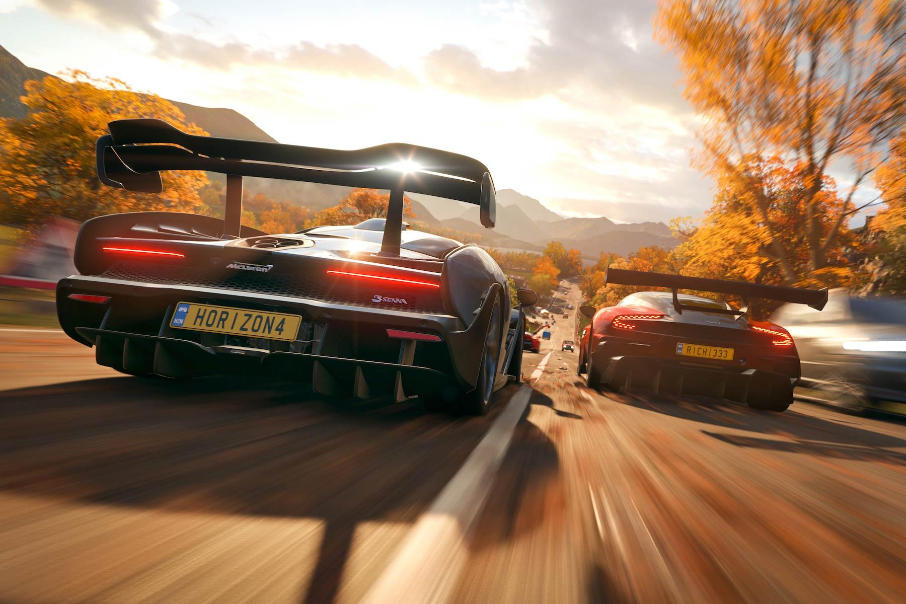
The Forza Horizon series is a racing videogames series set in photorealistic open worlds. Forza Horizon 4 is set in a fictionalized area of Great Britain. Yet, the premise remains the same as that of the previous titles: racers from all over the world come to the target location to compete in a festival called the Horizon festival, which could best be described as the Coachella of motorsports. Players can compete in everything from standard cars to supercars and perform all manner of silly stunts and competitions. While the game relies mainly on its photorealism to build its massive visual appeal, it uses bright colors and energetic fonts for its menus and HUDs to communicate the energy and mood of the festival, which is riddled with over-the-top vehicles and scenery. It thus sets a similar tone for every menu and task of the game outside of driving.
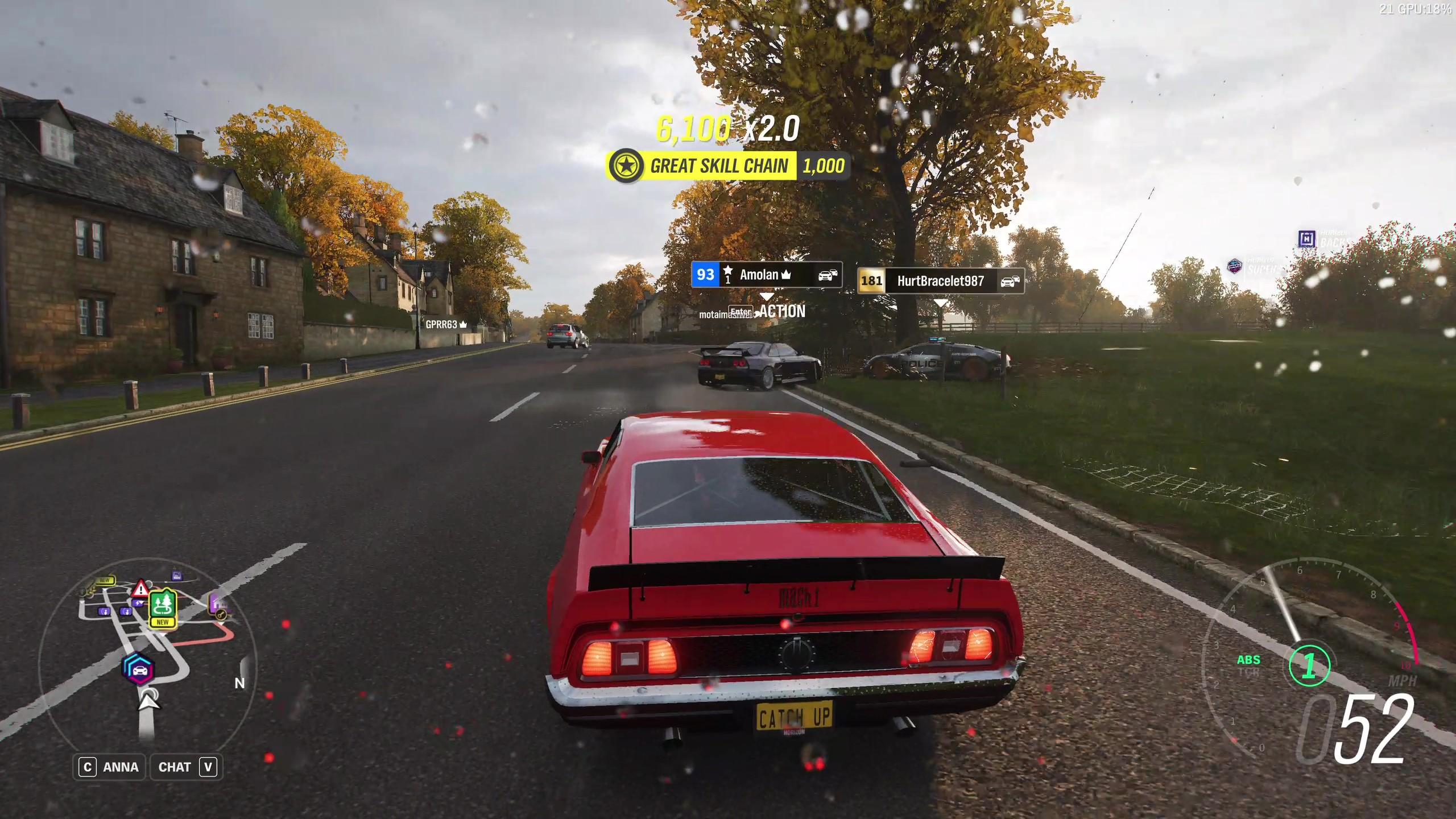
The main HUDs the player encounters are the speedometer and the map, both simplistic and potent. They are located on the lower corners of the screen; they give way to the road and the beauty of the game’s graphics by being mainly transparent and only communicating the most essential information. The speedometer emphasizes the speed with bold white numbers. The current gear, which is of little importance for most players as they are likely to use automatic shifting, uses a smaller size and bright green color that flashes red as the revs hit their upper limit, a piece of feedback important to players who enjoy manual shifting. The map communicates the importance of the events in the game world with their symbols’ relative size and contrast, using yellow outlines to call attention to events relevant to the main story and smaller characters and duller colors for side quests. In the middle of the screen, the bright yellow takes priority over the scenic backdrop as it displays the player’s skill chain, a sort of XP booster essential for “leveling up” your driver and car, which must be maintained by combining actions such as gaining speed or drifting under a time limit without crashing.
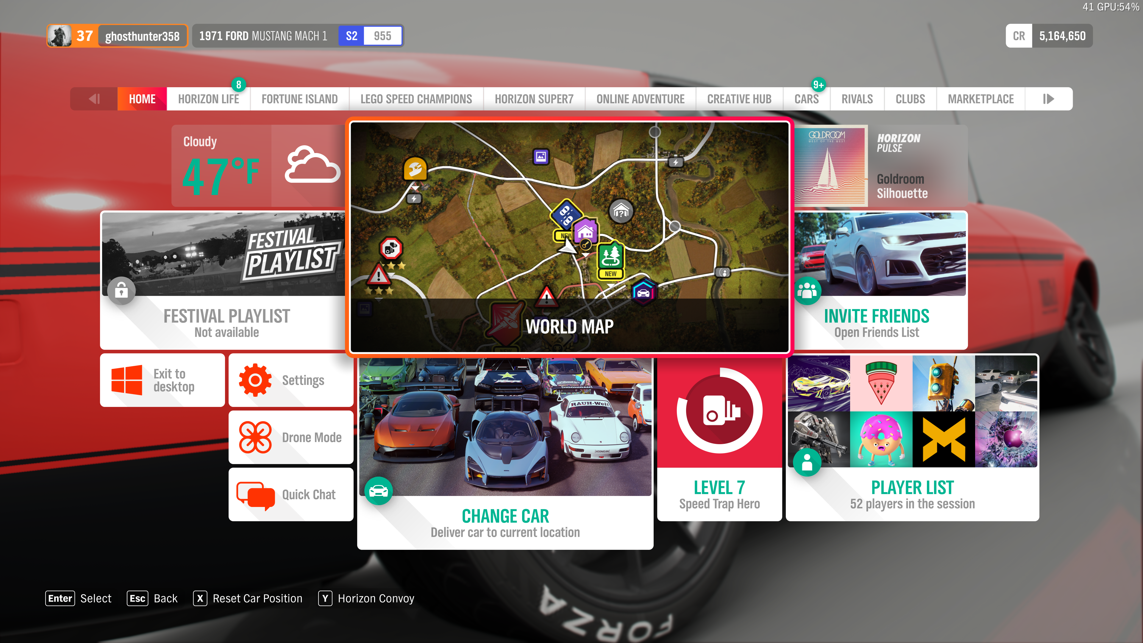
The game’s main menu is also colorful and energetic, displaying a large amount of information in an organized mess of carefully aligned boxes, using large white boxes to provide information and draw attention away from the more convoluted pictures, which also provide visual cues of the action that can be undertaken. Lastly each option is given a size and location near the center of the screen proportional to their gameplay relevance and usefulness to the player. This a fun and engaging alternative to simply having a drop-down list of options.

