

Cheese or Font Exercises:
Cheese or Font?
I really enjoyed playing Cheese or Font? this week; I’ve never played any game like it before!
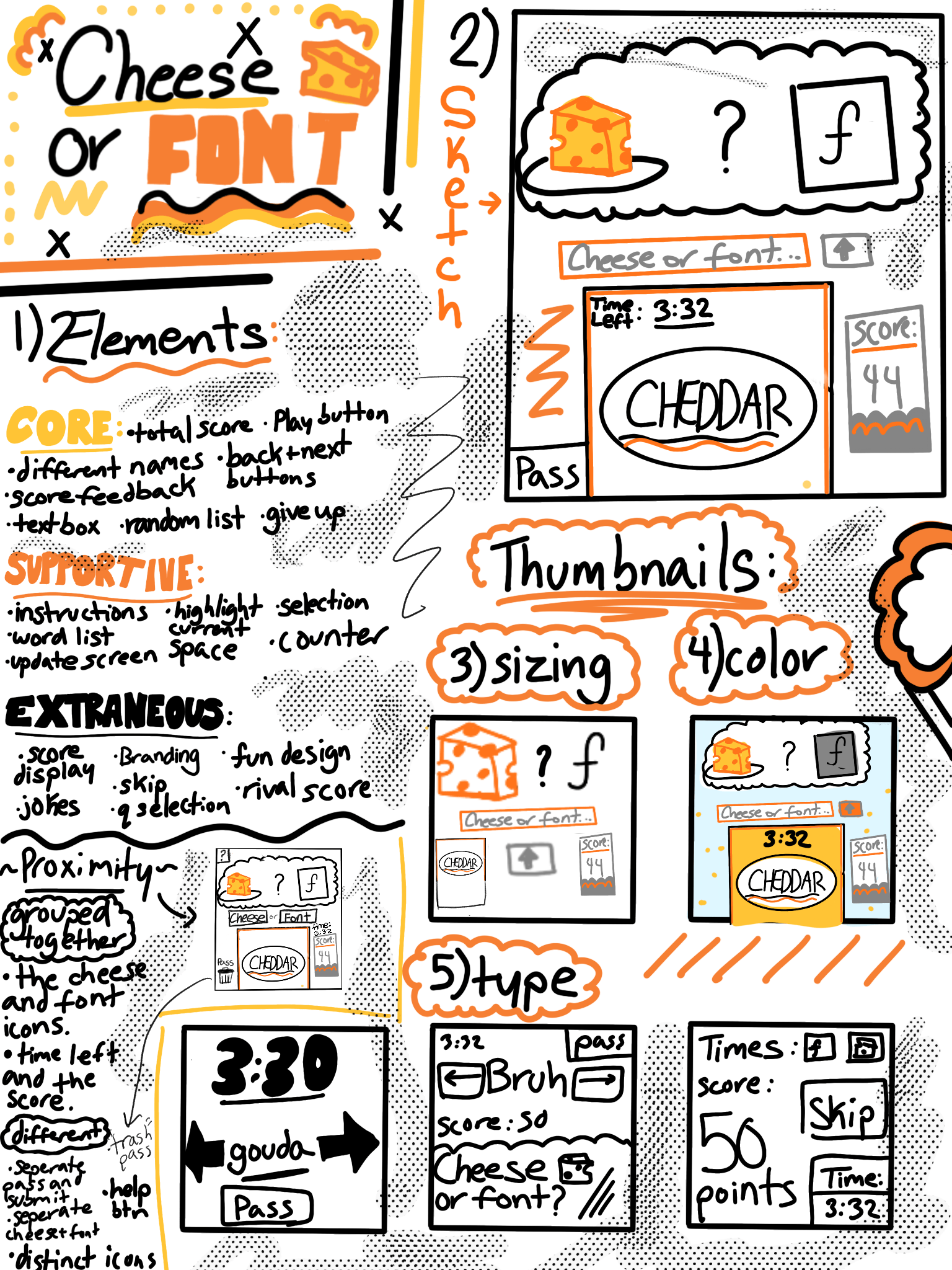
Game Design Elements of Cheese or Font (Summary + Additional):
Core:
- pressing buttons to pass, enter, skip, etc.
- time system
- entering answers in columns
- correct/incorrect functionality
- columns, “cheese”/”font” labels
Supportive:
- Instructions
- Highlight current space
- counter
- pause the game
- selection
- update/refresh screen
- additional information button
- Put the word on the card close to the pass button
Extraneous:
- Skip button
- Score Display
- Jokes
- Question selection
- rival score*
- fun design
- corrected answers
- color choice
Some more ways I could have explored proximity:
Grouped Together:
- Put the Cheese and Font icons close together
- Put timer close to the score board
- put the cheese and font BUTTONS close together
- Put the word on the card close to the pass button
Different/Distinct:
- Title/ Marketing
- Instruction Page
- Easily distinguishable iconography
Pick a Game and Explore it’s Design Principles:

I ABSOLUTELY ADORE the graphics of the OG “Plants vs. Zombies” game. It presented a game layout and strategic asset proximity that had not been used in many other games prior: having a strict divide down the screen between offensive game objects and those defensive. On the left-hand side of the screen, the user places plants with the purpose of defending the house behind them from enemy zombies attacking from the right. Through taking advantage of proximity, the game is much more intuitive and straight-forward for the user playing. They also display all of the player’s possible moves on the top of the screen which allows them to quickly deploy their plants without much hassle. “Plants vs. Zombies” also uses size to highlight the most important elements of game hierarchy. For example, most plants are made much smaller than the zombies so the user focuses on their main threats/targets in game. While, the plants who are made large are typically those whose purpose are to act as a barrier or shield. Out innate association between large things and importance is put to play in PvZ, making the game objective clearer (to focus on keeping the large enemies away). Another thing that is important to note is the game’s use of color! Honestly, I think the colorful plants and scenery is simply so fun and enjoyable to look at. As you level up in the game and unlock more settings/characters, the game scene only becomes more vibrant. Also, the colors of game objects always tend to contrast with the patchy grass background which makes it easy for the user to focus on the game. Though there is no consistent color palette in the game, the chaotic collection of color almost reflects the chaotic nature of the game itself (being very fast-paced + random).

In “Plants vs. Zombies,” the designers primarily used these elements (proximity, color, and contrast) to make the game visually appealing and easy to follow. I feel like the clashing colors is used to convey a feeling of overwhelm, pushing the user to win the game and start with a clean and simple field in the next level. In addition, it would be a disservice if I did not mention the super fun design of the characters and world itself. The cute nature of the plant and world design contrasts with that of the ugly and evil zombies (Reference screenshot above*). As the player, the design makes you want to protect this beautiful world from any harm! Whenever I play PvZ, I ALWAYS feel this intrinsic desire to win the game so that no adorable plant will die again. The design of PvZ is honestly just so fitting to the premise of the game and makes the user feel like they were truly designed for :).
