Fonts or Cheese?
First, let’s chat about the game Fonts or Cheese? I identified the following elements being core, supportive, or extraneous based on my own personal experience.
Core elements:
- the name of the font or cheese in question
- an input for the player to indicate whether the name is a font or a cheese
Supportive elements:
- text above the input indicating the cheese/font name in question
- column title above the font/cheese names indicating “Cheese or font?”
- column title above the responses indicating “Enter C or F”
Extraneous elements:
- a timer to keep the player under time-pressure (I didn’t even notice I was being timed on first play)
- the running score that tallies the number of correct answers (also something I didn’t notice)
- the next/previous buttons next to the input field
- the “give up” and pause buttons next to the timer
- text in the responses column indicating the correct answer per font/cheese prompt

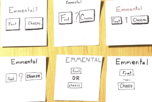
Here are my exercises from the Medium article. My ideas on proximity with respect to this game’s visual design:
To me, the obvious player inputs should be grouped together. The buttons for “font” and “cheese” should be near each other but still distinguished as distinct options via spacing or some spacer element. The name of the font/cheese in question is distinct from these input elements and should be placed further from both. Some of the extraneous elements of the game can be placed together (but distinctly apart from the previously mentioned elements) — perhaps at the top or bottom corners of the screen.
Papers, Please
Now, we’ll chat about the visual design of Papers, Please — a fantastic game by the way.
Papers, Please is another one of those games that I watched a lot of growing up but didn’t play myself. It is a simulation game where you act as the immigration official in some dystopian Soviet-esque Eastern European country called Arstotzka. You navigate the game by processing the visas, passports, and other documents of potential immigrants while remaining vigilant of forged documents and political dissidents.
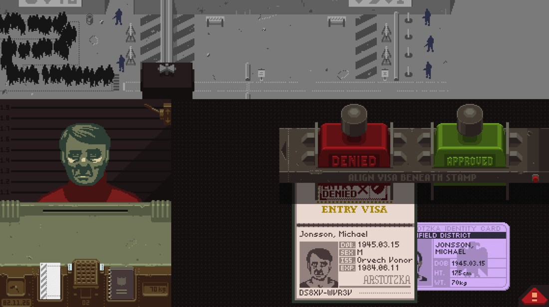
The most striking aspect of the Papers, Please gameplay is the sheer bleakness of it — a bleakness that is readily recognized in its visual design. The player is confronted with a screen composed of dull browns, greys, and greens with the occasional colorful accent of the documents they must pour over quickly and promptly return. Even the characters the player encounters reflect the joylessness of the immigration post. The migrants have facial features that are intentionally indistinct — the shadow of emaciated faces join the same low-contrast colors as features defining their hair, eyes, nose. Every form, every piece of official material, even the clocks and other digital markers in the immigration post are colored with the same dull brown as the physical counter itself.
The game designers make great use of proximity and gestalt principles to convey the manic, overwhelming experience of being an Eastern Bloc immigration official pressured to process as many migrants as possible without making any errors — lest you lose your well-wanted wages for the day or let a political terrorist enter the country and wreak havoc. As the player progresses in the game, the number of documents and rules they must be mindful of increases. Soon enough, the player’s workspace is overflowing with overlapping documents each needing to be flipped through, verified, and cross-checked for details betraying a forgery. This overstimulating scene of densely scattered documents gives the players of Papers, Please a sense of the frustratingly bureaucratic and hardly-maintained organizational busywork that maintains the peace in Arstotzka.
This game’s visual design is what makes it so great, and so powerful as an experience of empathy. The player cannot help but feel engrossed in the dark, dull, and bleak life of these migrants and the officials who process them. Papers, Please expresses what Kafka does with words using its visual construction — not to mention the storytelling and audio design that accompany it.


