

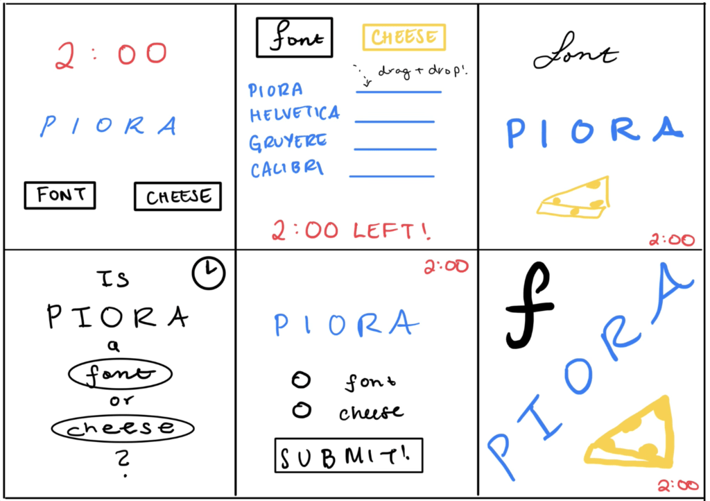
Elements of Cheese or Font
Core
- Names of cheeses and fonts to guess
- Text box to enter guess
- Timer
Supportive
- Your score
- Column labels on chart (e.g. “Cheese or font?”, “Enter C or F”)
- Quiz description (e.g. “Can you name the cheeses and fonts?”)
- Fun feedback for incorrect responses (e.g. “Rollot the barrel, we’ll have a barrel of fun… It’s a cheese!)
Extraneous
- Average score, Average friend score
- Challenge Friends
- Quiz stats
- Replay button
Redesigns of Cheese or Font
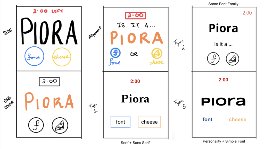
Proximity in Cheese or Font
Almost all the designs I came up with try to group the font/cheese selection (whether it’s in button form or dropdown) next to each other, so the options are clear to the user. I also try not to put the word to categorize (in this case “Piora”) too far from the font/cheese buttons because the word is closely associated with the choice; right after viewing the word, the user will view the choice.
The other core element I identified was the timer, which is separate from the other elements to some degree, whether by distance or by color. The timer is important for the user to view, but it involves a separate line of thinking from picking the right answer; they will check it less often, for one.
Some secondary elements that did not make it into my sketches were the score, quiz description, quiz stats, etc. These do not directly affect gameplay but is useful information for the player to have at some points. Therefore, they might not appear on every screen (such as the score, which only appears at the end in the original design), and can appear separately or displaced from the main elements described above.
A Beautiful Design: SushiGo
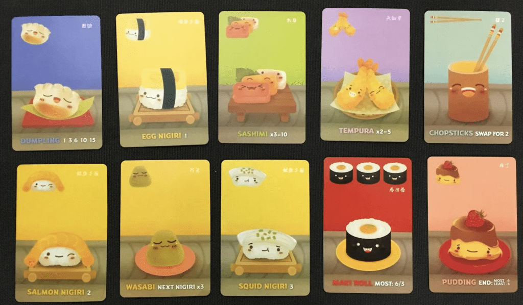
Unfortunately, I’m not super familiar with video games even though I’ve heard of some really beautiful ones, so I picked a card game I played for the first time in class: SushiGo. The first thing I noticed about this game (and something mentioned in class about it) is how well SushiGo uses colors. When cards are the same color, we know they are of the same type, so it gives us a quick visual way of identifying what cards we have in our possibly very full hand. The cards also feature (mostly) complementary colors that look aesthetically pleasing yet provide good contrast (blue/orange and purple/yellow combos are common, but the yellow background cards do less good of a job at contrasting).
In addition to colors, SushiGo does a good job at grouping with proximity and size. In the middle is the largest thing on the card, which the player’s eye is drawn to: the sushi illustration. This shows what type of sushi it is. On the top is the information we need to know for tallying scores, and on the bottom is what we need to know for grouping cards together, which conveniently makes it easy for us to look in the same place when we’re performing a certain task. As far as I can tell, all the fonts on the card are the same for all text (including numbers) which provides consistency and is pleasing to look at, but it differentiates important textual information by bolding and coloring the names of the sushi type.

It never has to be a video game and great choice!