

Core Elements of Cheese or Font
The core elements of the game include a text element containing the word that is currently being guessed, two buttons for the user to input “cheese” or “font,” and a timer. Supportive elements include the user’s score, a list of other words (both ones that have already been guessed, and ones that are yet to come), a description of the game, and a way to give the user feedback on the correctness of their response, for example through humorous responses. Extraneous elements include the average score; the average friends score; buttons to view the quiz statistics, challenge a friend, or to go to another quiz.
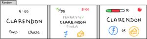
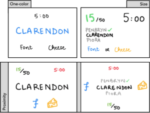
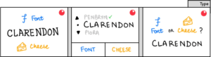
Shown above are some random thumbnail sketches for the game. To the left are some experimental sketches. The one-color sketch has a single additional color (apart from black). Since the current word seems like the most important element of the game, I thought using a different color would highlight it. Next, we have a sketch with size changes. I chose a contrasting strategy here: I chose to increase the size of the score and timer, both elements that add to the aesthetics of the game by inciting emotional responses (through an increasing score or the rush created by a decreasing timer). Next, we have sketches where I experiment with the proximity of different elements. The first proximity sketch creates three virtual regions: the top with the score and timer, the word, and the bottom with the answer choices. The second sketch has five different areas instead, placing the buttons besides the words to create a wider gap between the two possible answers. Finally, given below are sketches with types changes, where I experiment with the size, positioning, and contrast of fonts and textual elements.
Game Analysis: Superhot VR
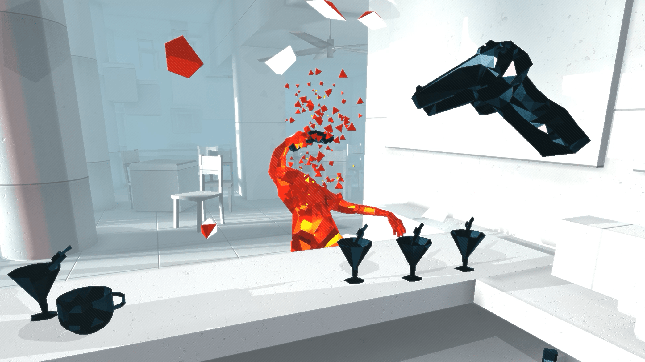
Superhot VR is a beautiful game that I’ve played on the Oculus Quest 2. The game puts you inside a virtual environment where time only moves when you do. The game has levels with red-colored glass enemies attacking the player, who can use a series of weapons, including your fists, to eliminate the enemies, who shatter on first contact with a weapon. The game employs a minimalist design with great success, using shades of white and gray for non-play elements, red for the enemies, and a black for anything the player can use to hit enemies.
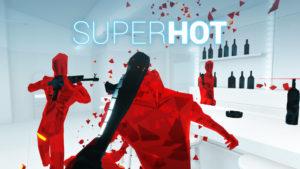
The stark contrast helps create the right effect. Players can immediately recognize weapons, and can build different strategies to beat levels. Note that enemies can carry weapons to hit the player, and players can attempt to snatch these weapons from the enemies and use them themselves. This strategy also helps clarify exactly which objects in the scene the user can interact with, which can be especially helpful for a stationary VR game. Overall, this helps ground the player in virtual reality, which can be straining on the eyes or lead to motion sickness. This image also shows good use of size and proximity to indicate which enemies are closer and need to be dealt with first.
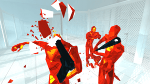
Overall, I think Superhot is one of the smoothest, most visually appealing, and most engaging virtual reality games that I have played, and its visual design plays a huge role in that.
