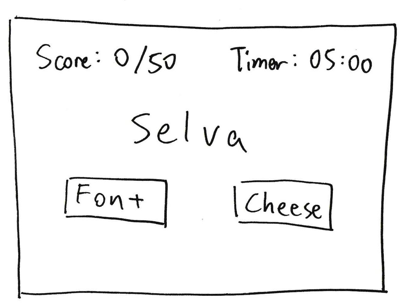
Elements of Cheese or Font:
- Core
-
- A list of 50 words to guess whether they are the names of a font or a type of cheese
- Method to choose font or cheese
- Timer
- Score
- Support
-
- Instructions (e.g. Enter C or F)
- Friendly/fun messages for wrong choices
- Extraneous
-
- Table of all the words and the player’s results
- Buttons to go next or back through the list of words still yet to be determined as a font or a type of cheese
- Give-up button
- Pause button
- Average score after game ends
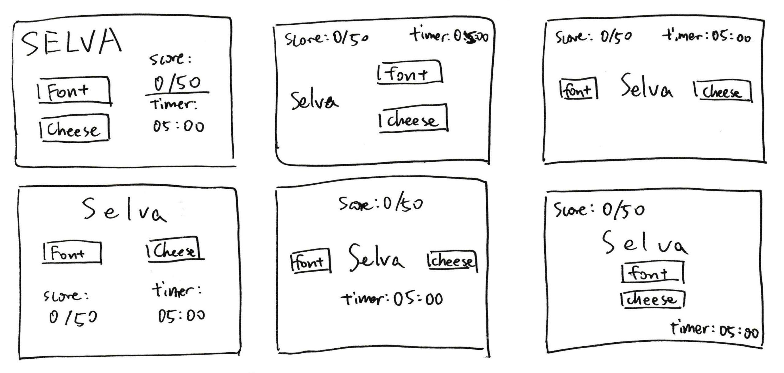
Sketch of core elements:
Exercise sketches:
Six layouts:
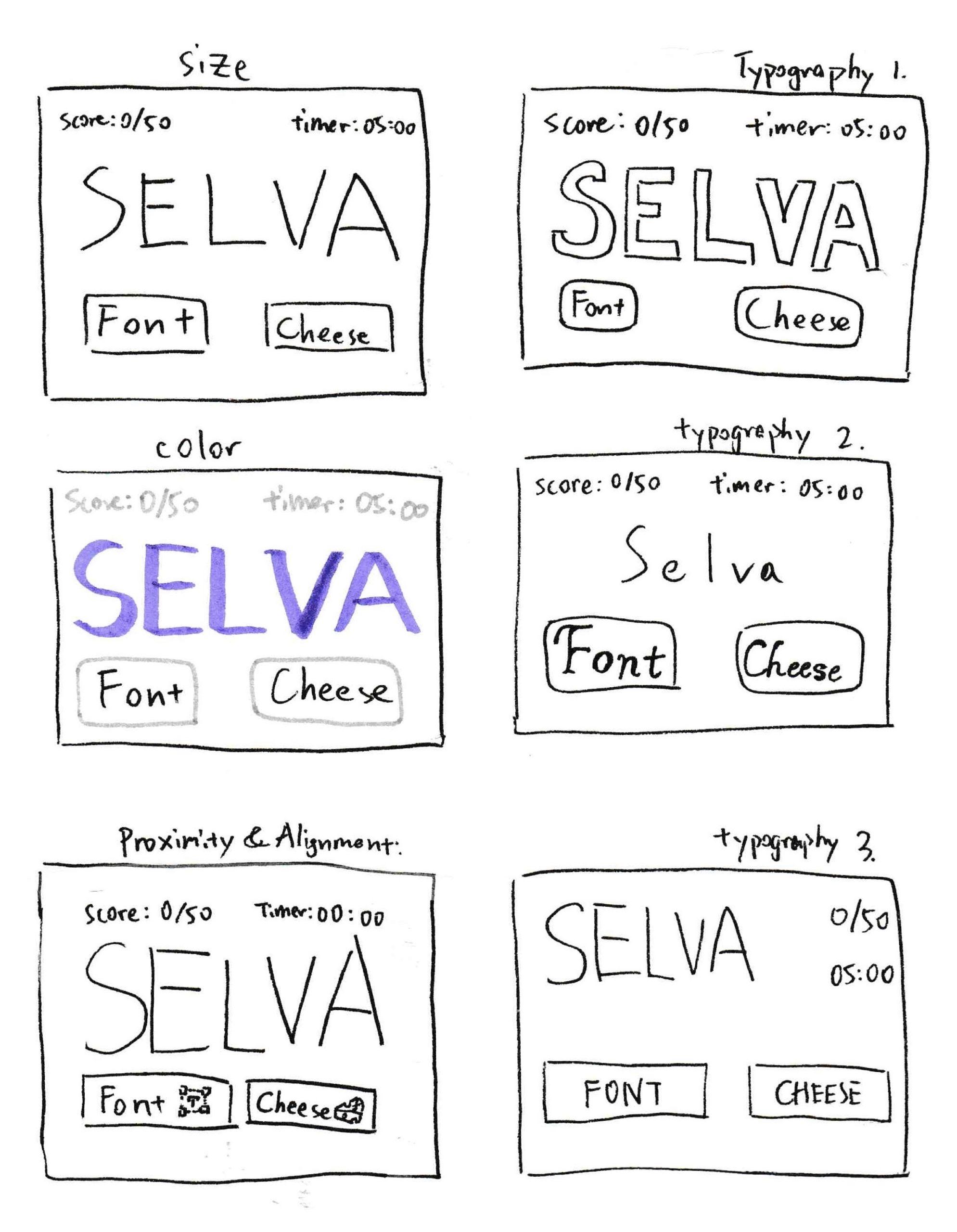
Exercises with size, color, typography, and proximity:
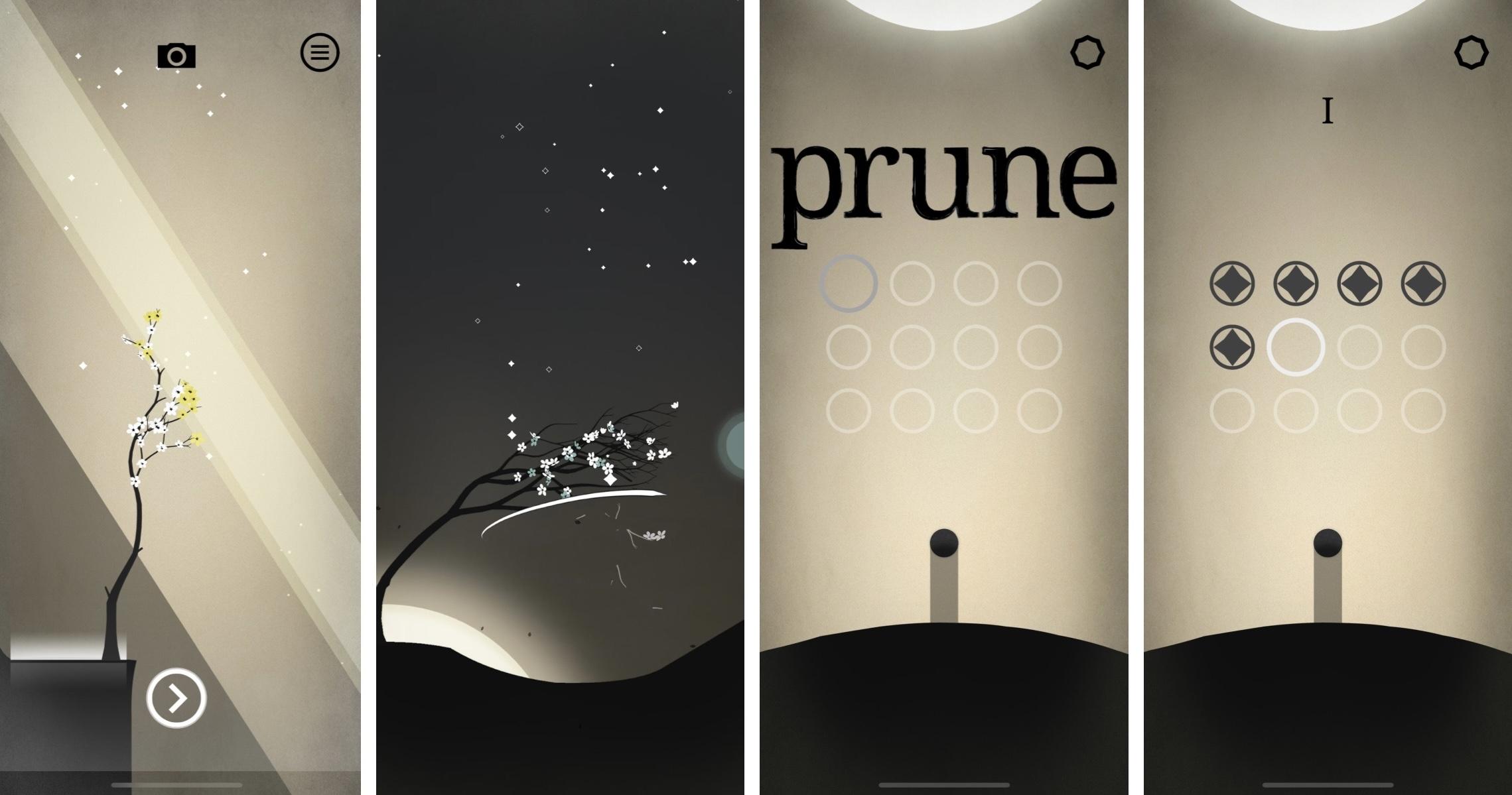
Beautiful game design analysis:
Prune is one of the most beautiful mobile games that I’ve played. Its exceptional use of color gives the game a soothing, zen-like feeling. The core color palette is black and white with different shades of dusty yellow. In the game interface, while the black growing branches blend into the setting nicely with the black ground and shadows, they stand out against the dusty yellow background. The dusty yellow background has a gradient where the lightest parts are where players should strive to guide the branches towards. The white strokes that the player’s finger create draws attention to how their actions influence the growth of the branches. Accent colors such as bright yellow, red, and blue are used sparingly in each frame (at most one accent color is present in any frame at one time) to highlight the flowers of ideal results.
The use of typography on the landing page also contributed to the beauty of the game. The title of the game “prune” uses a font that is easy to read, but at the same time has a retro flair. Once the player has started playing the game, the title of the game is shown only when the app is first opened. Then it fades and is replaced by the chapter number. The sub-levels in each chapter is represented by a grid of circles. The circles can be grouped into three different categories — cleared, the current level, and future levels. These three categories uses different graphic design principles to make even keeping track of progress a beautiful experience. Abiding to the principle of “Same things should look exactly the same, different things should look very different”, the three different types of levels have different looks. Cleared levels are dark-colored, with a pattern inside the circle, the current level changes color and is slightly larger than the other circles to draw the player’s attention, and future levels are simple semi-transparent white circles. All these circles are all aligned perfectly in a grid, nevertheless, which helps maintain a clean layout of the interface and minimizes distractions.