

Exercises
Beautiful Game
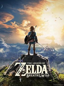
The Legend of Zelda: Breath of the Wild
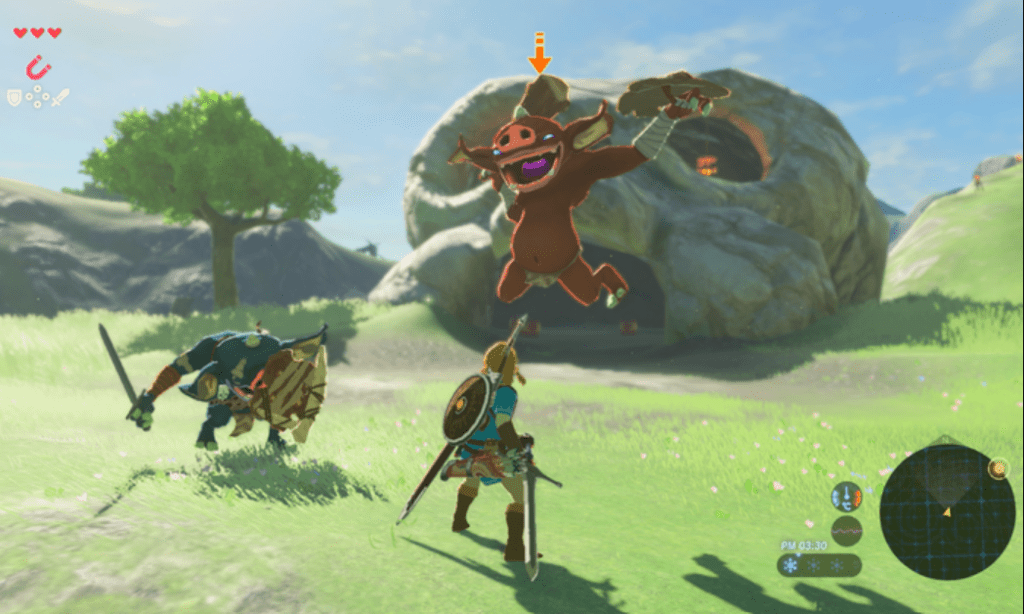
The Legend of Zelda: Breath of the Wild (BOTW) is one of the most visually appealing games I have recently played. The slightly lighter colors present throughout the entire game make it feel light and fun to explore while making it easier for pops of color (from fire, for example) to really shine (or should I say…burn). Pairing this with the dynamic movement of Link (the main playable character) and the creatures around him, BOTW feels exciting and fresh every time I start playing.
The layout of the main playing screen is simple yet effective. Small control instructions and health are in the top left while a minimap and vitals are in the bottom right. By keeping extra information to a minimum, the game designers allow us to focus solely on the gameplay and beautiful art that has been created.
Lastly, the font choices in BOTW suit the game very well. The main display font appears ancient and evokes a sense of wonder and mystery. It’s clear to read when standing alone, and the game chooses a simpler sans serif font when going through longer chunks of text. Overall, these factors come together to create a stunning visual game experience!
