

Core Elements:
- Input box
- Types of fonts/cheeses
- Scoreboard
- 5 min timer
Supportive Elements:
- Prev and Next buttons
- Visual indicators of correct and incorrect answers through words
- Quiz Stats and Challenge Friends buttons
- Reply and Next Quiz buttons
Extraneous Elements:
- All the non-related game content (ads)
- The descriptions when an answer is incorrect (way too long people would not read it)
- A visual indicator or a consistent message would work better
- The UI does not look like a game (more like a quiz or form)
- Maybe give one word at a time
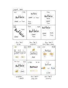
Proximity in Cheese or Font
One question I paid attention to is what should be grouped. In all of my designs, I tried to group “cheese” or “font” whether it’s in button form or as categories titles because they resemble the two choices the players have. I also kept the word close to these two choices because the choices are made based on the word.
Another thing I explored is the placement of the timer. The timer is important to signal the time left for the game. I tried putting it at the upper corners and right below the word. I think the difference in the proximity of the timer has a different effect on the gameplay. When the timer is closer to the center of the screen (near the word) it creates more pressure on the player.
However, I think the score should be separate from the other elements because it is not directly relevant to their decision on an individual cheese/font. It is still a core element because it allows the player to reflect on their performance.
A Beautiful Design Sushi Go

Sushi Go stands out to me not because of its game mechanics but because of its graphic design.
When I saw the game in class I was immediately drawn to its colorful and bubblely box design. Cards are the main component of the game and each card has a Sushi on the converter belt, its name, and its score on it. The cards are also color coordinated which helps with the gameplay because the same type of cards would have the same color. This is extremely important when we have a full hand of cards with different sushi it is really hard to keep track of every type. In addition, the game used colors that looked aesthetically pleasing together and used background colors that contracted. The use of color is so neat that the cards are vibrant but our eyes are not strained from looking at the cards.
In addition to colors, SushiGo does a good job at grouping with proximity and size. All the cards are divided into two sections: the top includes what we need to know for tallying scores and the bottom is what we need to know to group the cards. On the bottom center, there is a big picture of sushi, and below it has its name and score. The upper left corner has a smaller version of the sushi. Initially, I thought that was repetitive. However, when I started playing the game I realize its purpose was so when the hand of cards is fanned out the body of the cards is covered so the picture in the left corner helps the players identify the cards. The typography is also consistent throughout the cards adding to the aesthetic.
