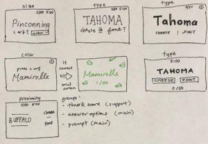
Elements of Cheese or Font:
Core:
- prompts, either cheese or font
- A separate user entry box to guess cheese or font
- A 5-minute timer
- Score
- Play button
Supportive:
- Message box saying how your score compares to others
- Average score
- Give up and replay buttons
- Compare score with friends/challenge friends
- Color of box and message changes based on correct answer
Extraneous:
- Unusual correct/incorrect messages
- Table layout
Thumbnail sketches:
A beautiful game:
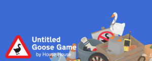
Untitled Goose Game is a charming game spreading a goose chaos agenda. Its aesthetic is simple yet charming.
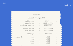
The game uses two fonts outside of gameplay: a clean sans serif with a bold and regular variation for its cover and menu, and an embellished typewriter font for its options menu. Because there is so minimal verbiage in this game, the designers made the title and other things like the “back” button in the menu large and clear.
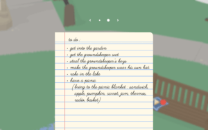
In-game, another sans serif but unusually cursive font is used to show the to-do lists or controls.
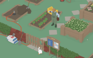
The colors used are vivid, yet flat and color-blocked, which gives a sense of a lot of space. Generally, there is a lot of whitespace and efficient element grouping to give that simple feel. The world map is also laid out with a good sense of proximity — even though there are a lot of basic shapes, diamonds mean a stone path, and different rectangles are plant beds. There is barely any text in the gameplay, as it is mostly a map to discover while watching the nonverbal reactions of the townspeople who you’re ruining the day for.