

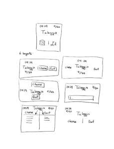
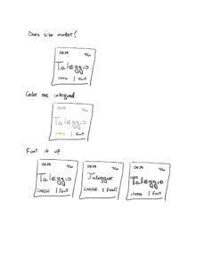
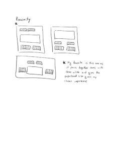
Core Elements:
- List of highly confusing words
- Response box
- Buttons C and F for cheese and font
- Timer
- Scoreboard
Supportive Elements:
- Label: “Enter C or F”
- Label: “Cheese or Font?”
- Prev and Next buttons to navigate through the list
- “Play Quiz” Button
Extraneous Elements:
- Some hints or descriptions you get with a wrong answer
- “Give up” button
- Player statistics
- Share button
- Paid features
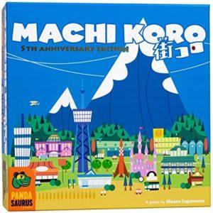
The game I chose to analyze is Machi Koro (pictured above), which is a family fun strategy and luck game where players need to collect resources to buy special development cards to win the game. I think this game is very beautiful and also extremely fun. The main design principle that makes the work for me is its simplicity. There is almost no fine details on the box; the elements are recognized by their general shape and stereotypical look. This allows for the elements to be easily distinguished without causing much visual stress on the players. These abstract shapes create a simple and fun vibe, which goes along well with the theme of the game.
Similarly, the colors are all quite soft and complimentary. The game uses a log of light blues, light greens and some accent colors to mark a distinction. There is very little on the cards to pull the player’s attention away from the game. In my mind, the alignment and spacing is quite good for this game too. Players can deduce most of the game information from the pictures but there is some smaller text in some of the cards to give users any extra information they might require.
