Core Elements of Cheese or Font:
- List of words
- Columns for types of fonts/cheeses & columns for answers separate
- Next & previous buttons to move around
- A pause button to take a break
- A give up button to end the game
Supportive Elements of Cheese or Front:
- Colorful red to indicate incorrect answers
- Visual indicators of correct and incorrect answers through words
- A score visual indicator to check how many correct answers you’ve gotten
- The instructions which tell you how to play
- The play button which for some reason doesn’t need to be pressed to play
Extraneous Elements:
- All the non-related game content (it gets distracting)
- The descriptions for incorrect answers seem excessive, a visual indicator would feel more fluid
- The font doesn’t exactly scream game, I’d definitely remove and swap for something more playful
- The list could be removed and instead you’re given one word at a time
Sketch of the core elements:
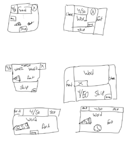
Sketch of one core element made huge:
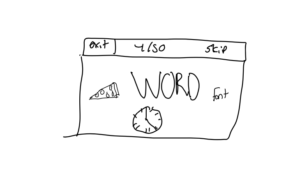
Sketch using one color:
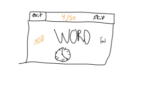
Four thumbnails in Different Ways:
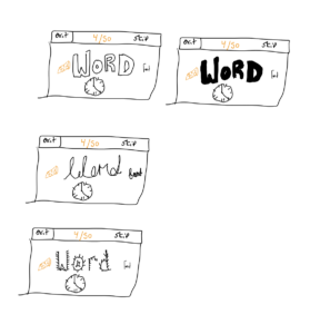
Proximity:
- The cheese, font, and the word should be grouped together as they are the core components that make the game run. With just those 3 elements, you are able to partake in the game. The game runs around being able to guess a cheese or a font given a word, thus without these elements, the game loses its identity. With all these present, you can play the game, and all the other components seem like add-ons.
- Things like the scoreboard, timer, and skip buttons should be made smaller and are not as core components of the game, and all serve to share useful information, but end up taking you out of “game mode”. They add interesting mechanics that serve as mini-challenges in addition to the overall game (i.e trying to get a better score or beating your best time isn’t the core objective of the game which is to guess cheese or font, but can enhance the experience). Thus, these enhancements should be separated from core gameplay, but visible enough to be incorporated if a player desires, rather than packaged in a way that makes them unavoidable.
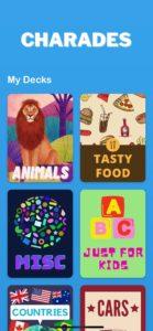
When I think of a fantastic graphical interface, oddly enough, I always think of the Charades iPhone game. To some, it looks pretty underwhelming, but I think that is exactly what makes it so excellent. The balance of visual and text-based cues creates an easy-to-navigate interface that gets straight to the point. The title of the game is bolded in a distinct white font which is separated from the colorful layout of the decks and provides a clear separation between descriptions and clickable components. The decks are spaced to clearly fit on an iPhone screen without looking too smooshed together, while still allowing you multiple options at once. Furthermore, there is a distinct front and text layout for each set of cards to really set them apart.

Once a deck is clicked, the minimalist approach to color is carried on, and once again, descriptions are made distinctly different from clickable components. Things like the sliding scale for adding time make the mechanics much less clunky, and are able to communicate text-based cues through visual imagery for a much cleaner look. The spacing is also extremely well done to allow for ease-of-use when tapping the screen, and allows the eye to smoothly scan the game without having trouble separating the different components.

Finally, the in-game screen when you are trying to guess a word sticks to a color-palette of just white and blue. The entire focus is on the game-mechanics and things like timers, and exit buttons are made extremely small so as not to distract the players. The minimalist color-palette also helps to immerse the player into the game by removing all distractions to the eye, and the word is made much larger than any other element to draw attention immediately.
Overall, charades on the iphone is a fantastic example of minimalist design done well! Less is sometimes truly more in terms of maximizing the game-play experience.


