Cheese and Font elements:
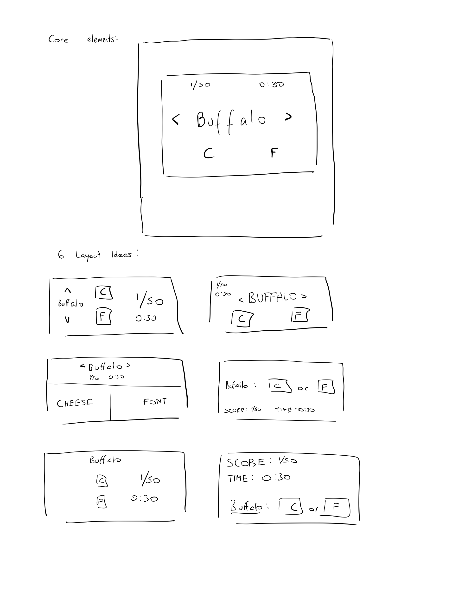
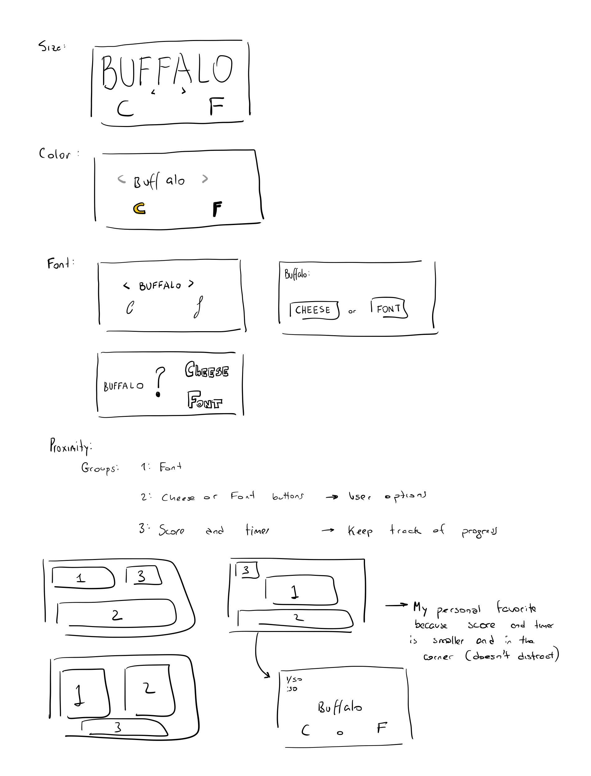
Core Elements:
- List of words
- Input box/buttons to say if it’s cheese or font
- Prev and Next buttons to navigate through the list
- Scoreboard and timer
Supportive Elements:
- Instructions: “Enter C or F”
- “Play Quiz” Button → game could start as soon as you enter the first word
- Table with list of fonts/cheeses
Extraneous Elements:
- The description that shows up when you get a word wrong
- “Give up” button
- Average and player stats that show up at the end of the game (share with friends)
Game Analysis: Mr. Jump
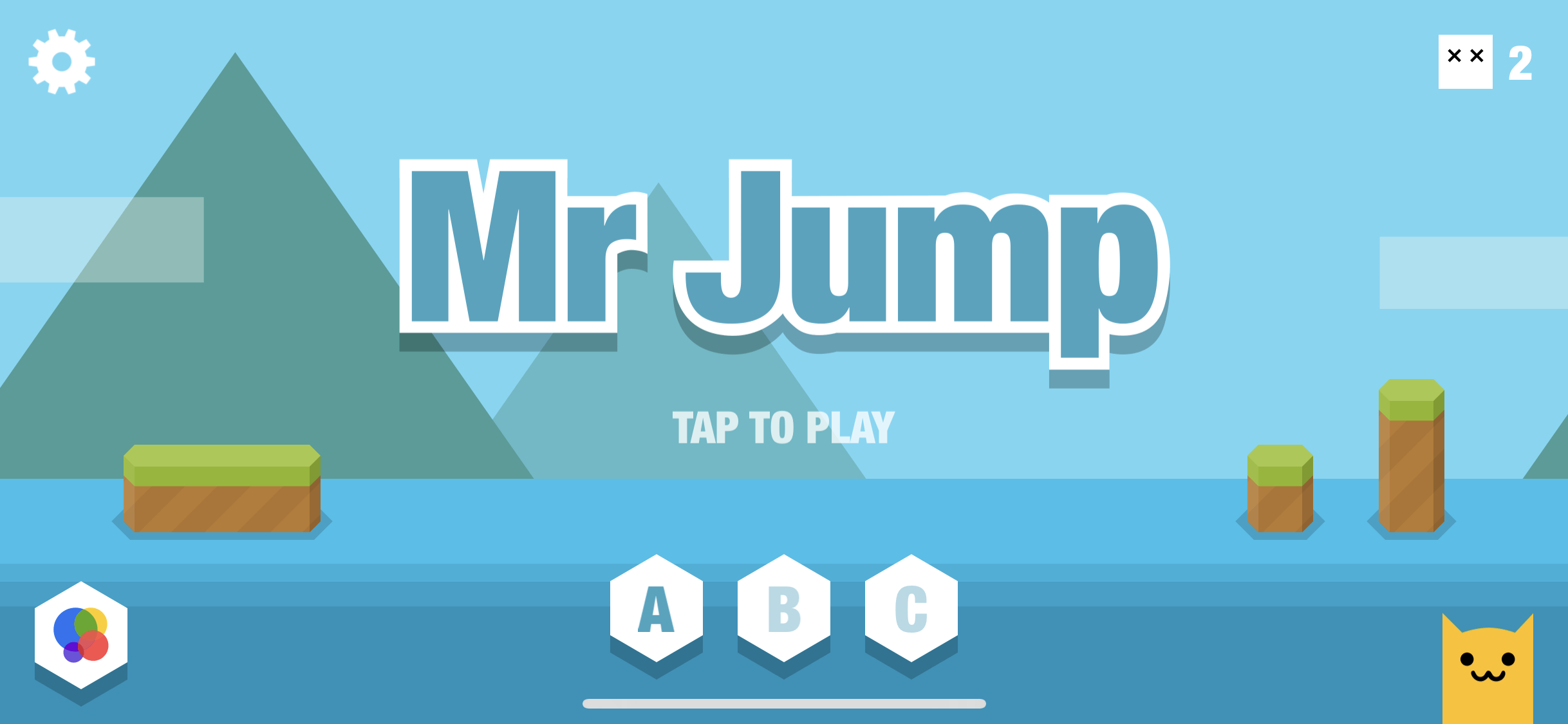
A game I think is beautiful on iOS is Mr. Jump. It is a game where you tap the screen to make your character jump and avoid obstacles and water. One of the design principles that make it in my opinion so pretty is its simplicity. The character has no face and lacks detail. The background uses a complimentary soft color palette that provides a beautiful ambiance without distracting the player from the game. The grass and land have almost no texture (just a few striped lines) which makes it easier for the player to focus on the core mechanics of the game.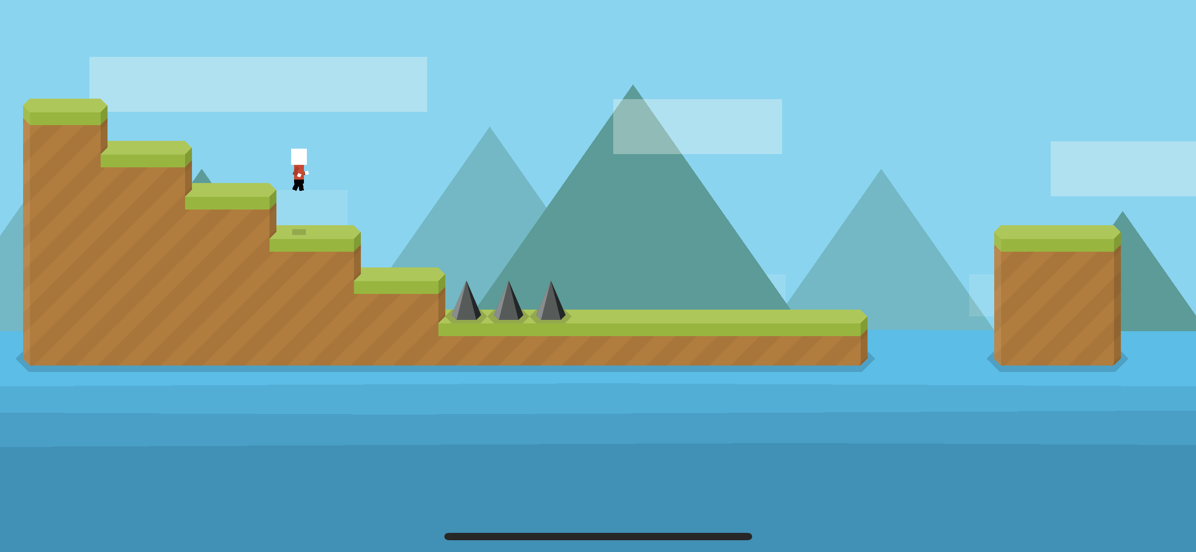
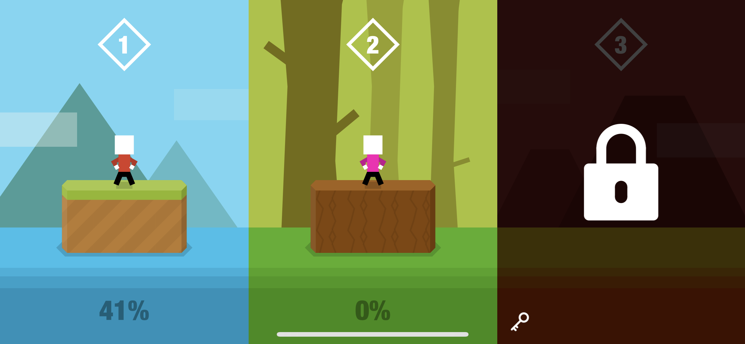
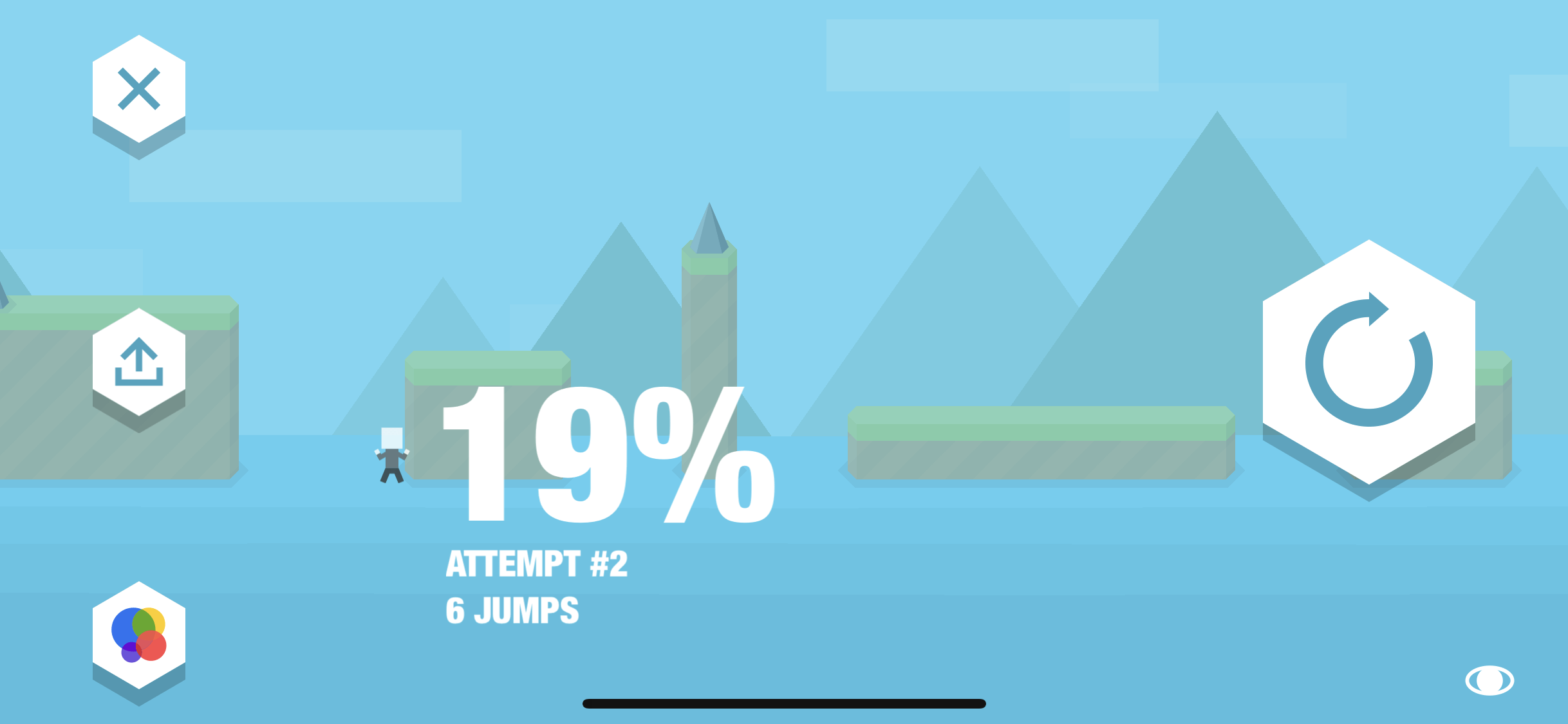
Additionally, the game has really good use of proximity and spacing. When you lose, a screen shows up with what percentage of the game was completed, and a few details that are all grouped together allowing for easier understanding. The important numbers are very large (percentage) while the less relevant yet still important numbers (ex: number of jumps) are a bit smaller. The replay button is very large and separated from the other elements.