

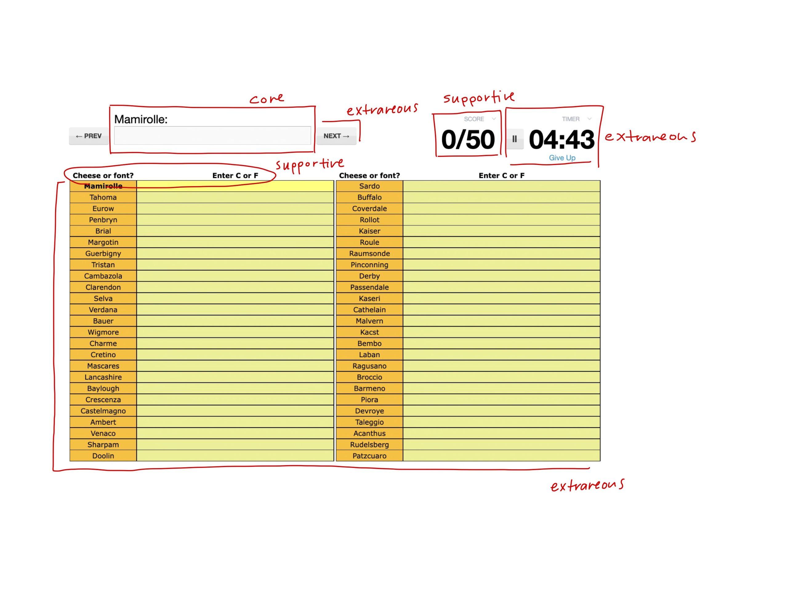
“Cheese or font?” exercises
I identified the elements as core, supportive, or extraneous.
Core:
- Prompt
- Input field
Supportive:
- Instructions
- Score
Extraneous:
- Timer
- Chart
- Navigation buttons
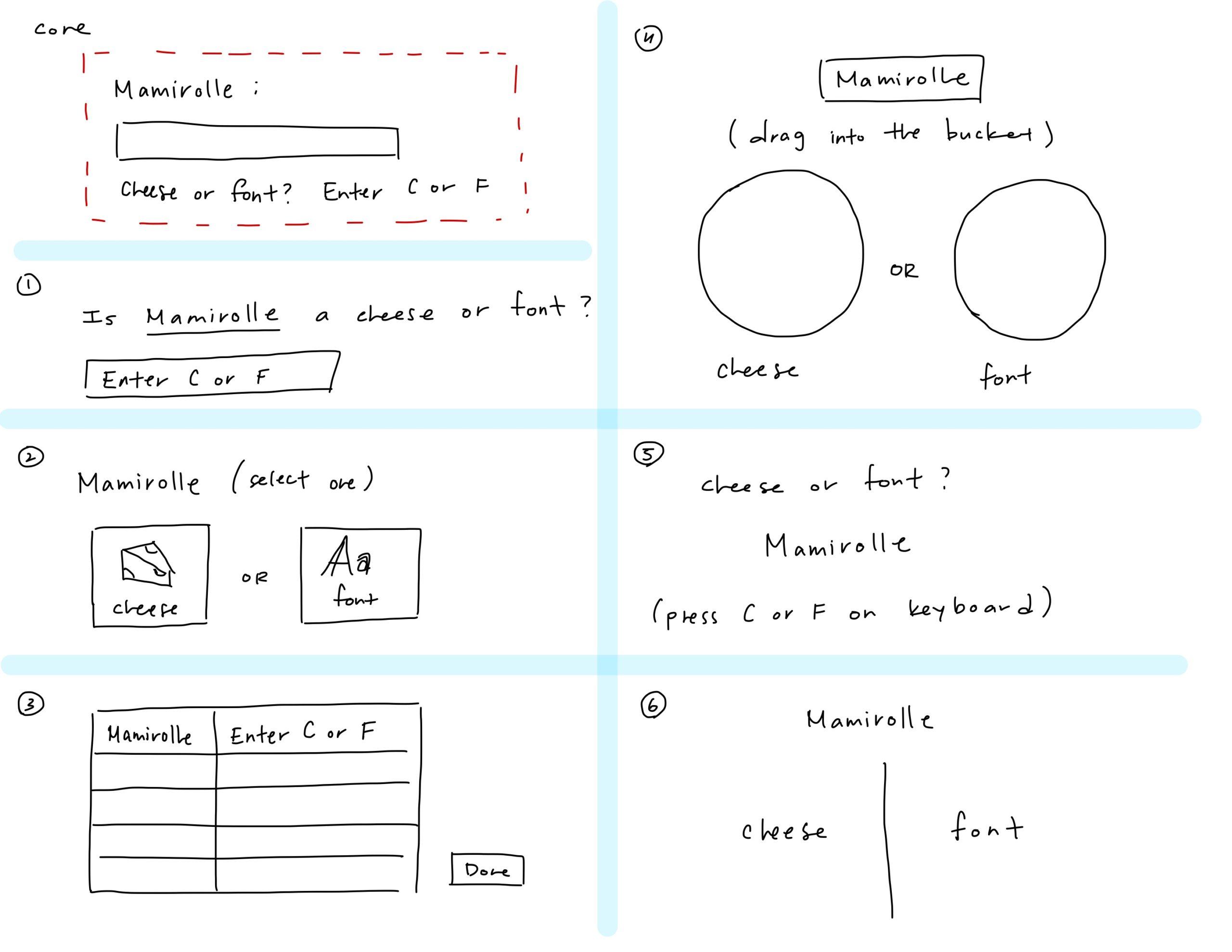
From this, I extracted the core elements and created 6 alternative designs.
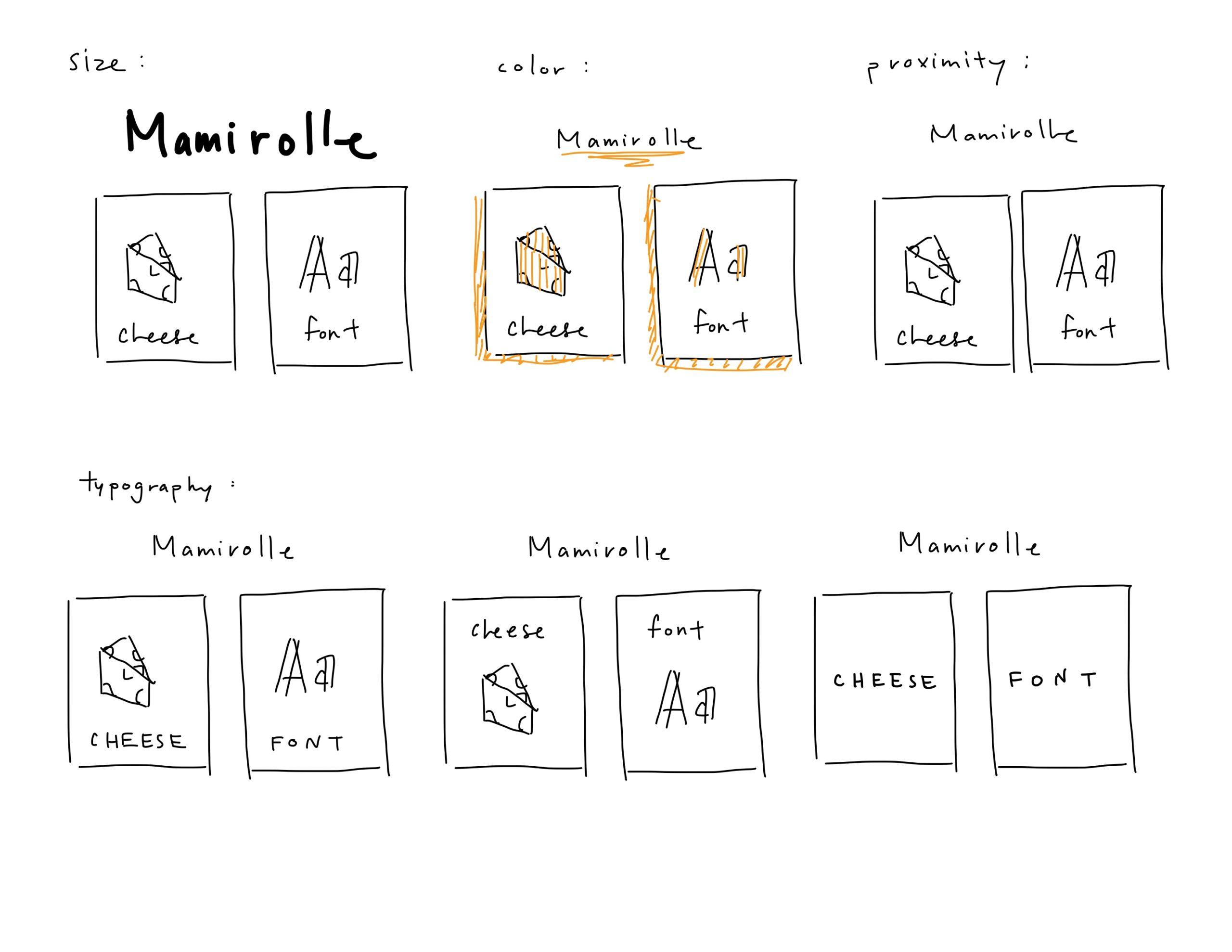
Then, I experimented with size, color, proximity, and typography in these designs.
Beautiful Design
The game I chose for my beautiful design is Tiny Wings.

I think that the primary design principles that make this game beautiful are color, proximity, and typography. The game features vibrant colors for the landscape that are constantly changing as the the player levels up. The use of proximity is also very intentional: the score and time (both measures of progress) are grouped in the bottom left corner so it doesn’t obstruct the view of the player. Additionally, the font chosen for the text emphasizes the score over the time, so it gives the eye one primary goal to focus on.
