

Elements of “Cheese or font”
Core
- The word you are guessing whether is cheese or font
- The box where you enter your answer
- The score
Supportive
- The entire table at the bottom of all guesses and the results
- The labels “Cheese or font?” and “Enter C or F”
- The Timer
- The Prev and Next buttons
- The play button
Extraneous
- Replay, next quiz, quiz stats, challenge friends, random quiz buttons
- Ads
- Other quizes
- Everything else on the page
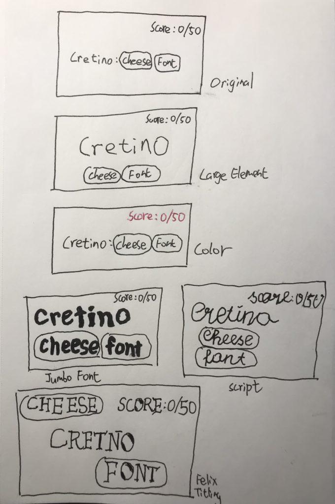
Out of the designs above, the one using “script” is the best with regards to proximity, and the one using “felix titling” where I separated the buttons was an experiment that definitely doesn’t feel as good.
On Proximity
I think that the buttons for “cheese” and “font” should be grouped together because they are the two options the player has. Together, the buttons should be grouped with the word as this is the core of the core game. The score, which in my opinion makes “cheese or font” a game instead of just a quiz, should be separate as it’s not critical for the player to look at all the time. Out of the designs above, the one using “script” is the best with regards to proximity, and the one using “felix titling” where I separated the buttons was an experiment that definitely doesn’t feel as good.
The design of Disco Elysium

Disco Elysium is not only one of the best role-playing games EVER, it is also gorgeous in every sense. (I know the focus is the UI here, but just look at the art and the writing, and the irony haha!) This particular screenshot showcases an example of a “completed thought”, a perk that has benefits and drawbacks.
- The most important information is the name of the thought completed, and it is huge. It’s also the only text on the page in black with white background, so it really stands out. The second most important thing is the accept button the player needs to click on to continue, and it is the second largest element, as well as the only element with a bright orange background. The rest of the elements are in consistent much-smaller fonts.
- The entire screen is laid out on a grid to make it easy to read.
- The meta information, such as the words “thought complete” and “accept”, is in sans-serif. The rest of the text conveying in-game information is in serif.
- In addition to the orange accept button, the only colors are “Hand/Eye Coordination” and “Conceptualization”, which are color-coded skills consistent with the rest of the game. This sparse use of color makes the colorful bits really stand out.
- Excellent use of Gestalt’s principle. “Thought complete” and the actual thought completed are big headers grouped together. The flavor text is in its own group. The actual gameplay effects are grouped together.
