

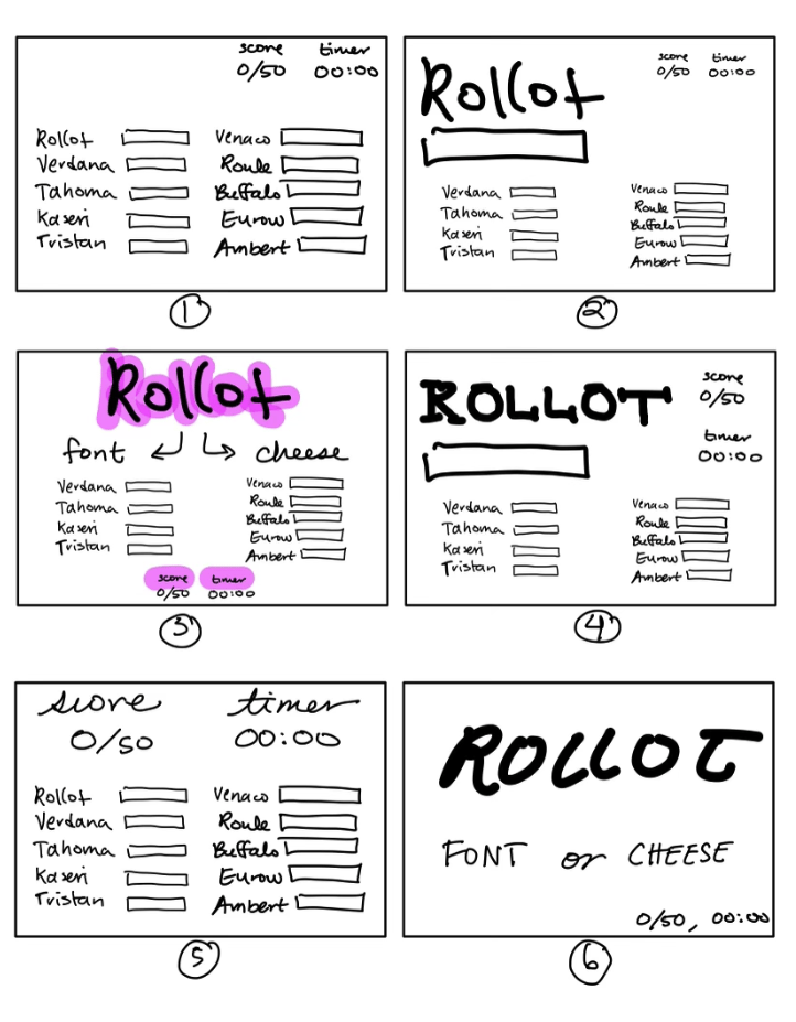
Elements of Cheese or Font:
- Core: Names of cheese and fonts, timer, score count, font or cheese response
- Supportive: “Enter C or F” subtitle, “Cheese or font?” subtitle, Buttons (Next, Prev)
- Extraneous: Orange and yellow color scheme, “Popular Quizzes Today” section, ads
Box #1 represents core elements
Box #2 represents exploring the size. I made the size of the current font/cheese being played much bigger than the other elements.
Box #3 represents exploring color. I emphasized the current font/cheeses, the score, and timer by adding a pink highlight behind it.
Box #4-6 represent exploring types. In Box #4, I used a bolder type for the current font/cheese to emphasize it. In Box #5, I used cursive to distinguish the score and timer from the fonts and cheeses. In Box #6, I again tried to emphasize the current font/cheese by giving it a distinguishing type that is a bit italic and bolder than the other types on the card.
Box #1-6 represent exploring proximity. In particular, I focused on experimenting with the proximity of the key elements: current font/cheese, score, and timer. I typically placed the score and timer closer together since they serve the same purpose of informing the user’s standing in the game. I placed the score and timer towards the corners and margins of the screen because I didn’t think they were important enough to draw the user’s focal attention. Rather, their attention belongs to the current font/cheese. Therefore, the current font/cheese was placed in key areas of the screen, such as the top, center, and the top-left (a typical place to put titles in a grid system).

Candy Crush is a beautiful game because it effectively uses principles of graphic design. For example, the colors of the candy are bright and varied, making a colorful canvas on the screen and drawing the eye of the user to various parts of the board. As a grid system, there is consistency in the design that not only brings beauty, but also consistency and order in an otherwise chaotic game. Furthermore, the score tracker and timer are neatly vertically aligned on the screen and cleverly placed on the left margin of the screen so as to not distract the user from the board.
