

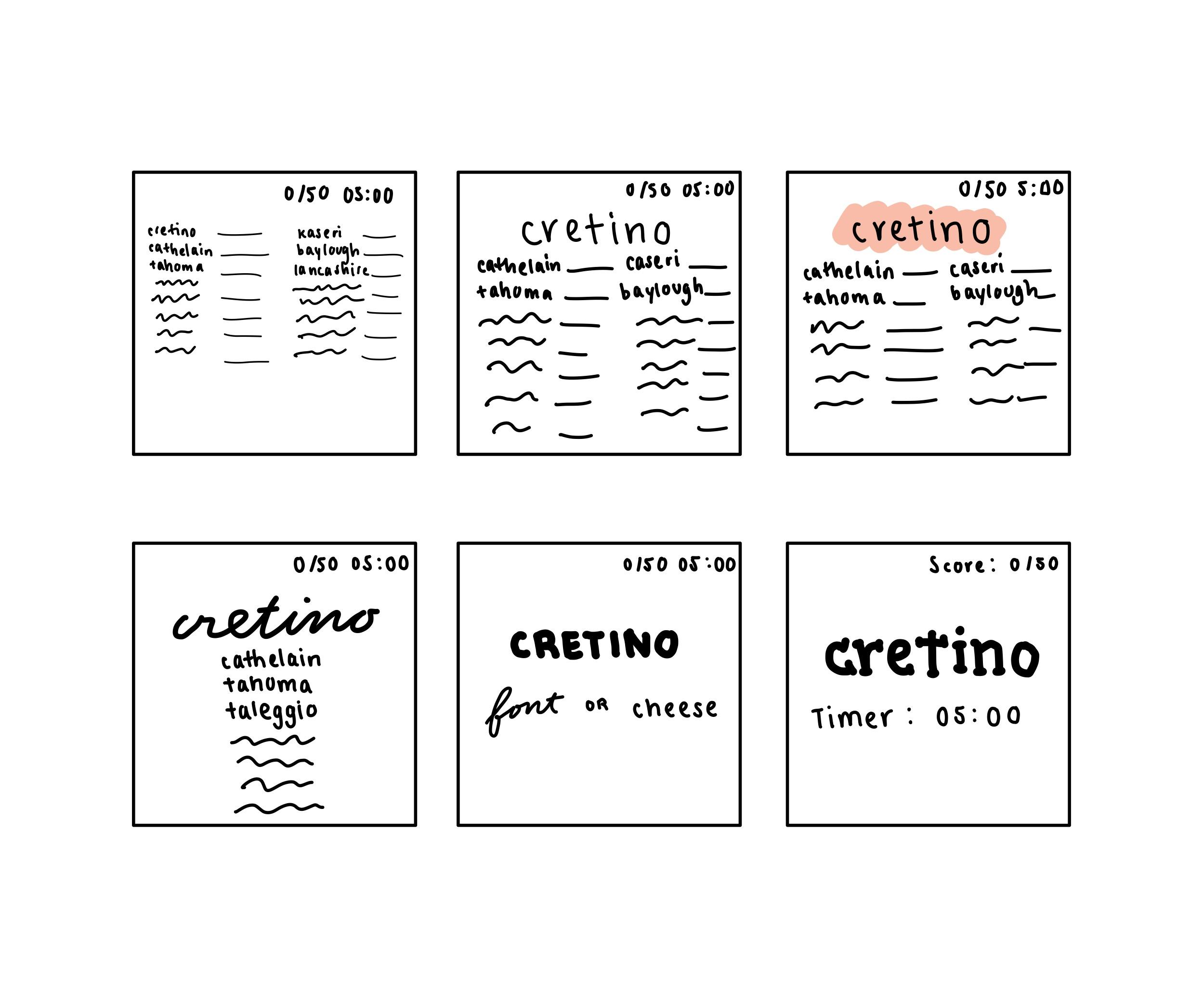

- Elements of Cheese or Font:
- Core: list of cheese or font names, timer, score
- Supportive: play button, “enter c or f” instructions
- Extraneous: ads, other quizzes
- Core elements: top left box
- Size: top middle box
- I made the current name the largest. Everything else can be small.
- Color: top right box
- I added color to the current name to draw attention to it.
- Type: bottom row of boxes
- I used type to draw attention to certain words or differentiate the meaning between words.
- Proximity: The timer and score tracker should be separated from the gameplay, since it is only for reference and not something the player needs to interact with. The list of “on-deck” words should be grouped. The current word should be separated so it is clear that is more important (at the moment) than the remaining list.
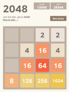
A game that I think is beautiful is 2048. They do a great job of attaching meaning to color and making the most important elements (the gameplay) the largest. The detailed instructions are not written out, but the player can easily find them if they need them (click on “How to play”). The score trackers are at the top — easy to find, but not in the way.
