Cheese and Fonts Elements
Core
- Name of the cheese or font
- Input method for the player to indicate their guess
- Score
- Timer
Supportive
- Navigation buttons
- Table listing the cheese/fonts
- Table Headers: “Cheese or font?”, “Enter C of F”
- Text that is displayed when the player guesses correctly/incorrectly
Extraneous
- The colors in the table or when a guess is correct or not
- Average score at end of the game
- “Quiz Stats”, “Challenge friends”, “Random Quiz” buttons
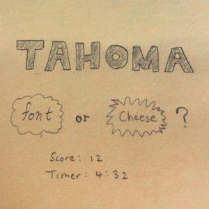
Cheese and Fonts Layout Ideas


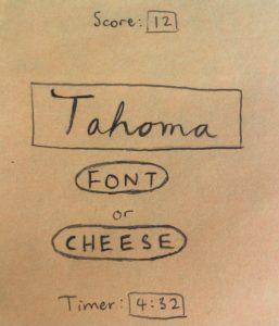
This sketch idea incorporates a huge element, the name of the cheese/font:
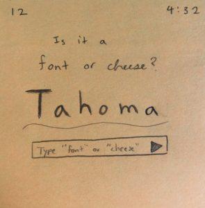
 Here is a sketch idea that incorporates color (gray) which contrasts with the black lines and orange background:
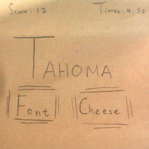
These sketches experiments with fonts, some using different combinations of fonts:


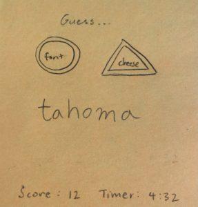
Here, I explored proximity, grouping the font and cheese buttons and font/cheese name together and the score and timer together:
Game Analysis: Assemble with Care
A game that I think has beautiful graphic design is called Assemble with Care. It is a mobile game available through Apple Arcade.
The game has a text-based story portion as well as a portion which involves assembling/fixing objects.
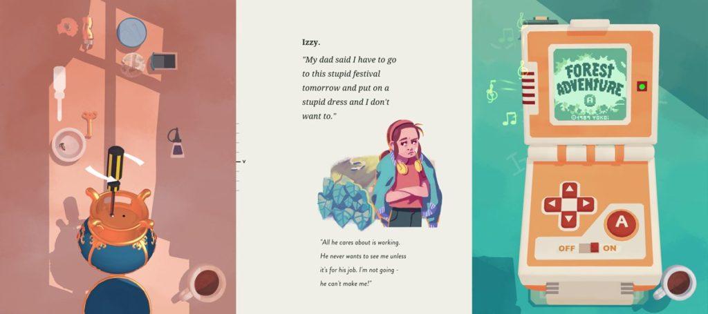
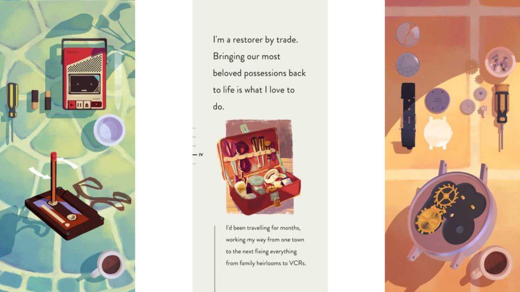
The gif below depicts the menu and story portion of the game. We see that the game makes great use of different types of font. There are many different sizes and styles incorporated, with different fonts for headers, subheadings, quotes, and main text. There’s a great combination of sans-serif and serif fonts, and the fonts are generally clean and simple in style. The menu/story portion also demonstrates great spacing. There is a large amount of white space in all of the different frames, so users are not overwhelmed with too much information at once. The use of colorful graphics and smooth animations also add to the beauty of the graphic design. Graphics use bright and simple color schemes and are interspersed throughout the text. The buttons feature icons which makes using them intuitive.
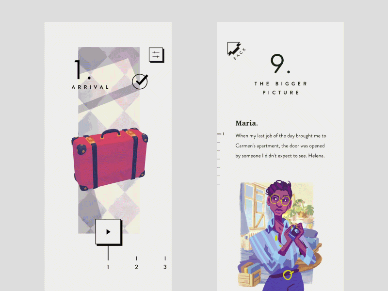
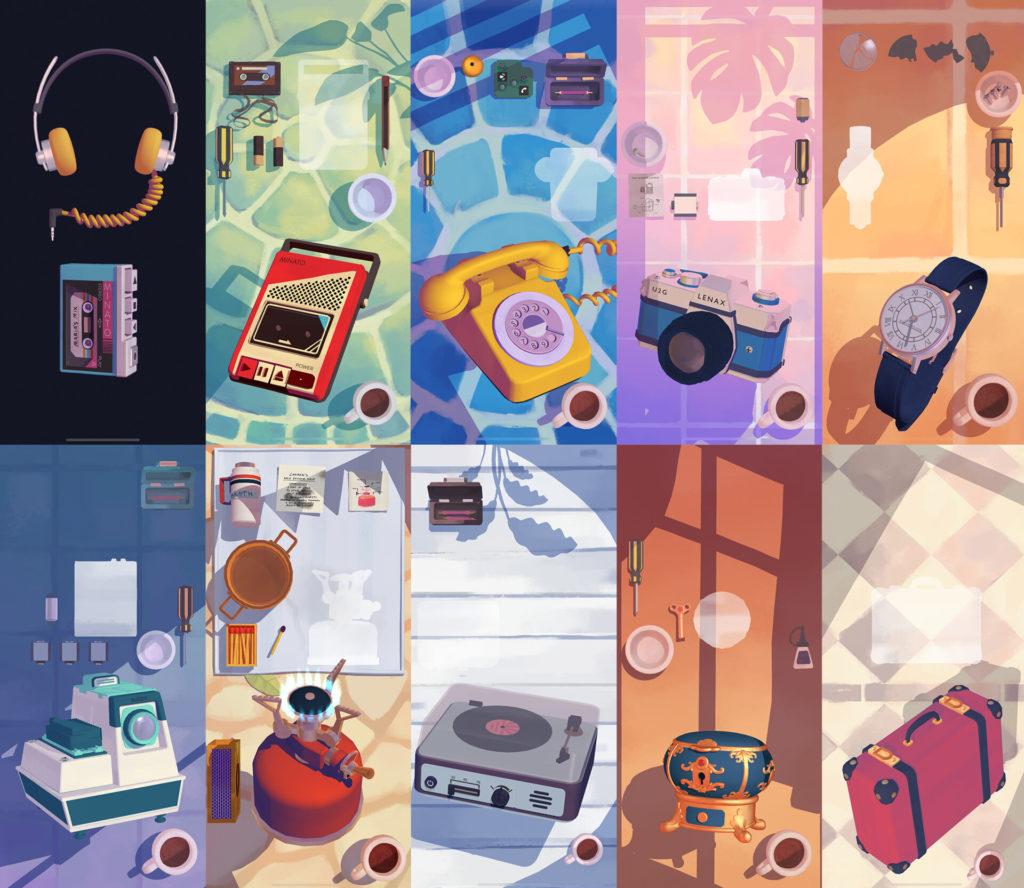
The game’s other portion that involves assembling items is also beautifully designed. Each of the different scenes featured below uses a simple, pastel color scheme. Although there are many bright colors, the colors’ complementary nature allows for a calming effect that is not too overwhelming. The use of shadows and shading also adds a nice touch. There is no text in these scenes, but the graphic design also hints at the game mechanics. For example, there are silhouettes of objects which indicate positions to move objects into. There is also a coffee cup in the lower right hand corner of each scene which acts as a menu button. This is a clever way to incorporate the menu button into the scene without adding extra text. The coffee cup, along with other items like the screwdriver and the screw holder, is a common element across the scenes, adding to the theme.
Overall, these graphic design choices such as use of fonts, spacing, intuitive icons, pastel color schemes, and sparse text lead to a beautifully designed game.