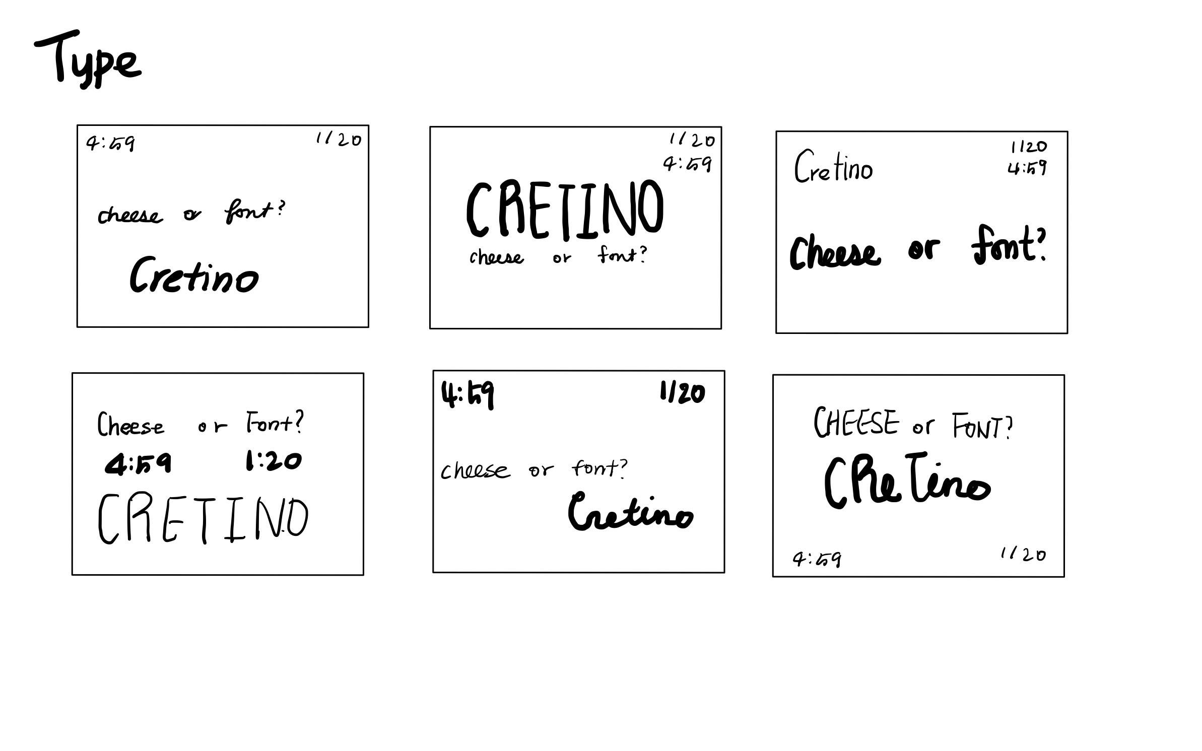
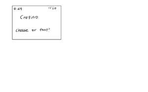
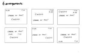
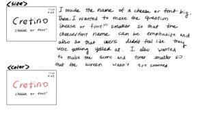
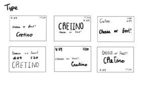
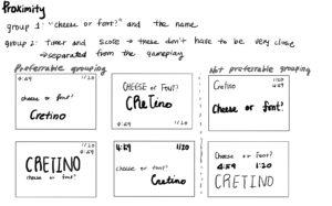
Elements of Cheese or Font
Core (you need for gameplay)
- Names of cheese or font
- Question: “cheese or font?”
- Score
- Timer
Supportive (hints and instructions)
- Timer
- When you make a wrong guess, the game displays various types of messages all in the realm of “try again, it’s a cheese(font)”
- On the top of each row, it either says “cheese or font?” if the row has names or “enter c or f” if it’s a blank row (“enter c or f” is a supportive element)
- Pause and Give up
- Pause stops the timer
- Give up ends the timer
Extraneous (you don’t need)
- Colors
- Cheese or font names are in orange boxes, and blank or correct row are in yellow-green boxes, and the wrong answers are in grey boxes with red fonts. These colors don’t seem like they have significant meanings except for helping users distinguish between different entries.
Exercises
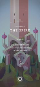
Monument Valley
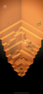
The game of my choice was Monument Valley. Even though it was mentioned briefly in the article, I couldn’t help but choose it because it is the only game that I ever paid to download, and it is the only game that I’ve completed all the levels because its aesthetic was so fascinating. I think Monument Valley uses contrast, color, and size to fabricate the gameplay.
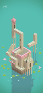
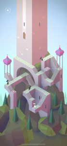
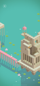
Each level consists of a colorful castle that has mechanics that users must manipulate to take the main character to the exit. In the process, the main character needs to avoid the black crows. Running into the crows doesn’t do anything harmful, but the main character can’t move past them. This overall setting uses size differences between the elements. The crows and the main character are very small compared to the castle. Therefore, it puts a visual emphasis on the beauty of the castle and the necessary mechanics to complete each chapter.
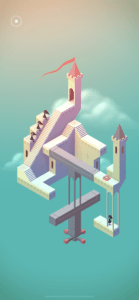
The black crows that our main character needs to avoid often contrast strongly with the background, which is usually pastel and softer color. Additionally, our main character contrasts with the black crows and the background as well since she is white. The colors used in the castles themselves don’t have strong contrast, which helps present the castle as a big complex. The castles also contrast with the background as the background is usually a solid color with smaller decorative elements. Therefore, while setting up the story of the chapter, the design makes sure to not draw too much attention away from the players. Monument valley uses colors and lines to make the design feel 3-dimensional. It also plays tricks with players’ eyes to bring changes to the structures.
Type doesn’t play a large role in the gameplay itself. However, it plays an important role between chapters to describe the story behind it.