

Cheese and Font Exercises (from Graphic Design for Game Designers)
Elements:
Core: prompt (name of either cheese or font), place for player to respond, way to navigate between prompts (‘next’ arrows), score, timer.
Supportive: table showing all possible prompts, instructions (“Enter ‘C’ for ‘Cheese’ and ‘F’ for ‘Font.’)”, start (“Play quiz”) button, feedback messages (“Cripes, it’s a font!”).
Extraneous: “give up” button, average score of other players, player’s final score in percentage.
Exercises:
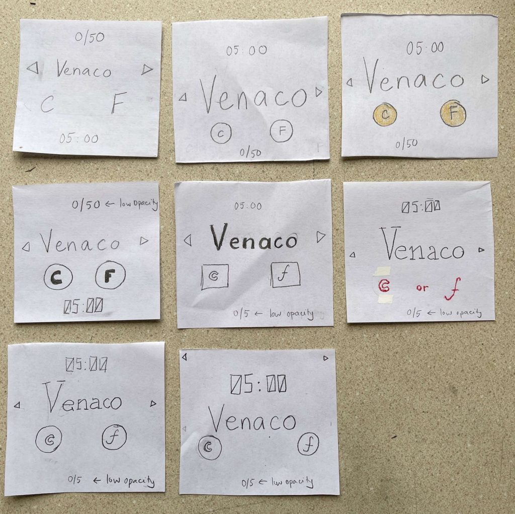
From left to right, top to bottom (0/5 refers to score, 05:00 refers to time left):
1. Sketch of core elements.
2. Making the prompt larger. Player response buttons made smaller and put into box to emphasize that they are buttons.
3. Using color (orange) to emphasize the response buttons.
4 to 7. Changing type. For 4, I used a bold type for the response buttons to place more emphasis on them, lower the opacity of the score so the player can focus on the timer and the prompt, and change the font of the timer to the ‘digital’ typefont to be more clear that it is a countdown clock. For 5, I used different fonts for the 2 response buttons for more emphasis. For 6, I used a serif font for the prompt to further differentiate from other elements, and used some colors for the response buttons for more emphasis. Here I removed the buttons around the responses to see if I could simplify the design. For 7, I used a serif font for the prompt, and put back the buttons for the responses because I think the emphasis was necessary.
8. Changing proximity. I put the response buttons closer to the prompt, and the two buttons themselves further apart. I moved the navigation buttons to the top of the screen so they wouldn’t be too close to the response buttons (potential for mistake).
A game I think is beautiful is Inside (screenshot below):
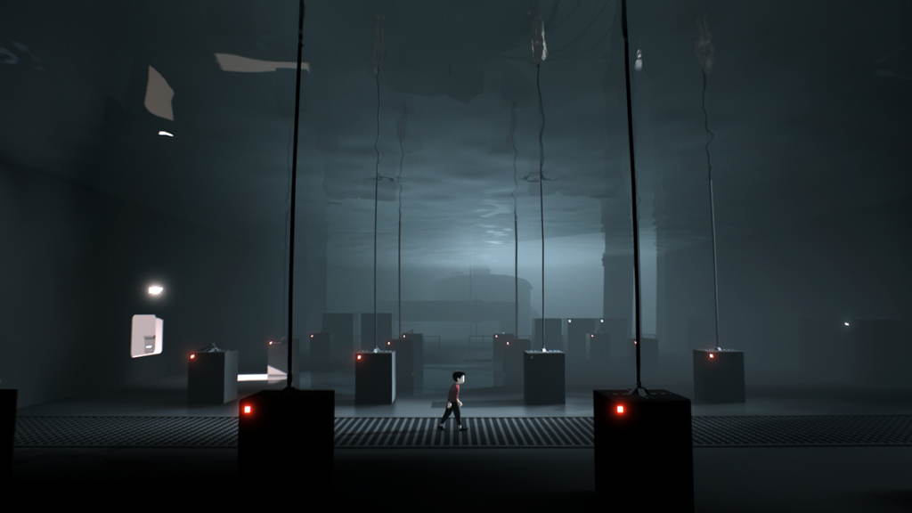
The game makes great use of colors, keeping the background very monochromatic (shades of black, white, gray), while using red for the protagonist for emphasis. Because the background is monochromatic, when colors are used in the background (for e.g. the red lights on the machine in the above screenshot) the player’s focus is drawn to them. The game makes use of colors of background elements to highlight new mechanics, or important elements for the story’s narrative.
