

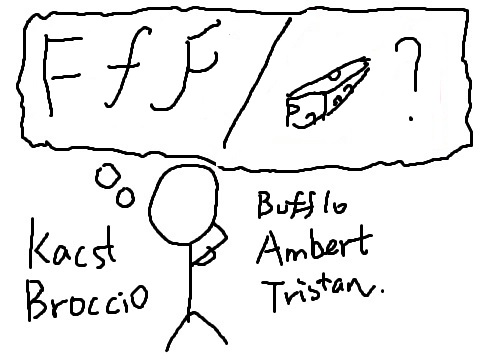
Core elements:
- The bank of the cheese/font names
- The core gameplay is to have players identify which names are cheese names, which names are font names.
- The input interface that detects users’ input to check whether the user enters the correct answer is a core element of the game.
- The message displayed to users, telling them whether they answered correctly, is a core element.
- The counter for score is also a core element.
- The timer at the top right is a core element.
Supportive elements:
- The rule explanation text is a supportive element.
Extravenous elements:
- The one-line playful text that appears along with the answer when you get the answer wrong is an extravenous element, e.g. “Rollot the barrel, we’ll have a barrel of fun…”
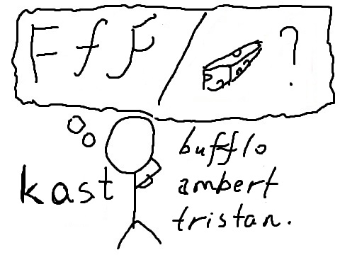
First sketch:
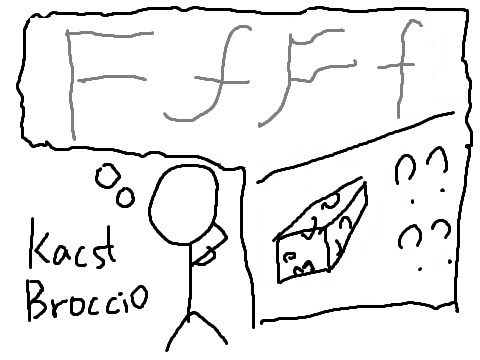
I made the fonts bigger. Sketch with a huge element:
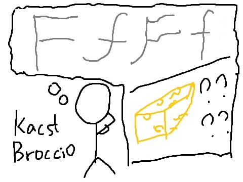
I use yellow to highlight the cheese.
The 3 sketches with different types:
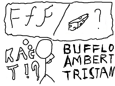
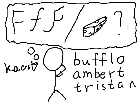
Proximity exploration:
The “font or cheese” part should be grouped together. Also, the names that are actually cheese should be grouped together with the cheese, and the names that are fonts should be grouped together with the f’s.
The player who is thinking can be separated from the rest of the elements because the player is not part of the game itself.

This ibb & obb design is one of my favorites. The type of “ibb” and “obb” texts are wisely chosen. The font of the “&” sign is also fitting. In addition, the proximity aspect of the image is very well-done: the two characters float symmetrically with the title in the middle as the vertical axis. Each of them are jumping towards each other, but their figures do not obstruct any other part of the image.
