

REDESIGNING CHEESE OR FONT
Cheese or Font is a simple game that shows players a list of names and asks them to list if the name belongs to a cheese or a font. The original game can be found here, but I took the opportunity to redesign it for educational purposes.
THE ELEMENTS
In essence, Cheese or Font can be broken down into an array of core, supportive and extraneous elements. The core elements that make up the main gameplay consist of the element name (e.g. Helvetica, Cheddar etc.), some way to sort the element as a cheese or font, the player’s score and the game timer. These 4 elements make up the primary elements needed to make this game work. The supportive elements of the game consist of the How-to-Play section (including the instructions) as well the hints provided to the player when they get a choice wrong multiple times. These elements provide assistance to the player but are not essential for its basic function. Finally, the game also consists of extraneous elements that are not relevant to the actual gameplay (and thus could be removed) but might help in providing a more fun experience to the player. In Cheese or Font, the jokes and funfacts given to the player when they get an option wrong, as well as the comment on the player’s final score are items that add levity to the game but don’t really change its function.
SKETCHING AND REDESIGNING THE CORE ELEMENTS
Here’s 6 different re-thinkings for structuring the game’s core elements.
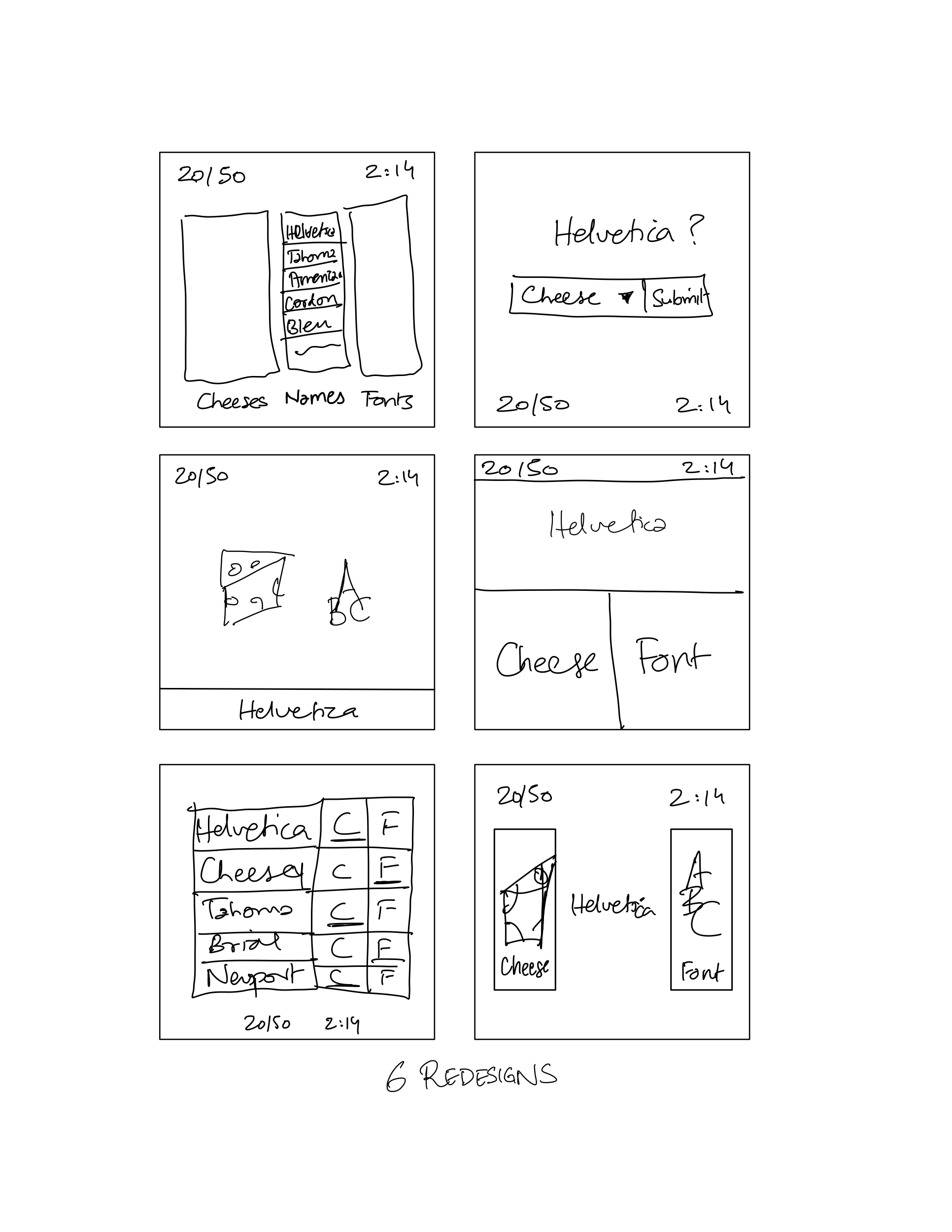
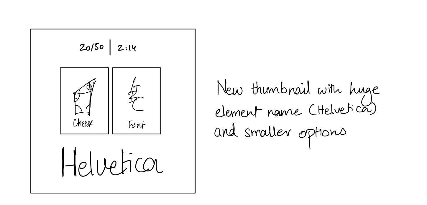
VISUAL HIERARCHY: MAKING ONE ELEMENT HUGE
Here’s a new element with one HUGE element (the font/cheese name). Notice how making this item huge has caused the option buttons to become slightly smaller and broader in width to occupy the screen real estate more efficiently. I chose to make this the largest element since it is essential to the gameplay and changes with every turn. Therefore, I wanted to use visual hierarchy to emphasize it.
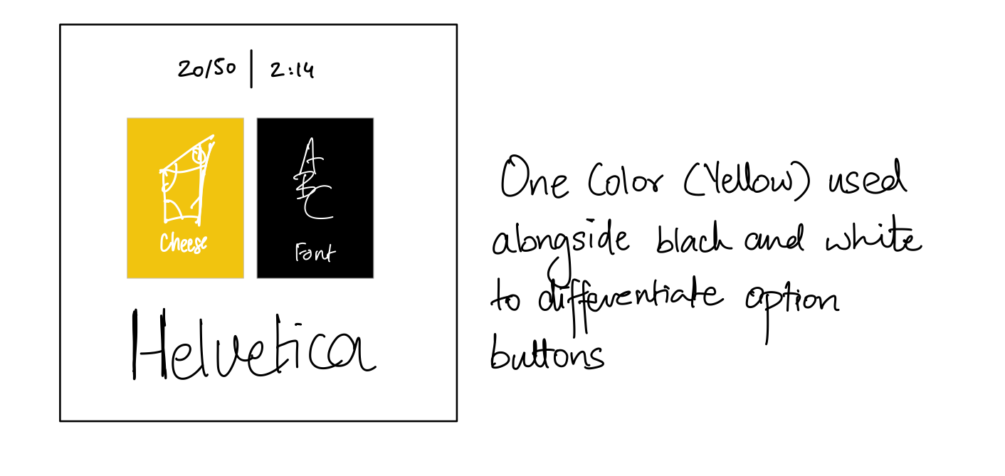
EXPERIMENTING WITH COLOR: USING ONE COLOR IN MY THUMBNAIL
Next, I chose one color (yellow) and used it in conjunction with the allowed themes of black and white to distinguish the player’s two option buttons for sorting. Additionally, the yellow complements the visual association for cheese, making it an intuitive choice.
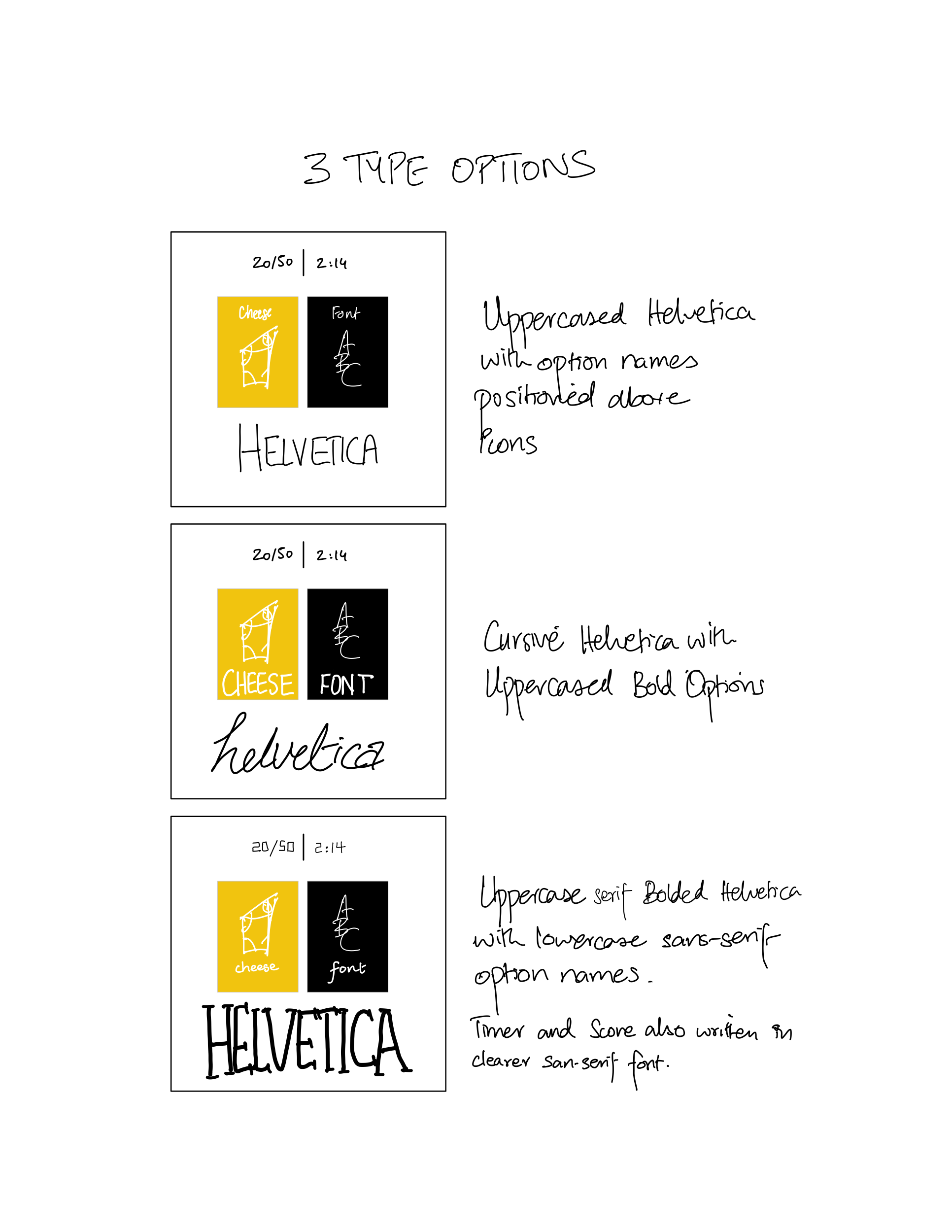
WORKING WITH TYPE: 3 REALIZATIONS OF DIFFERENT TYPE USES
I chose to experiment with the font, size, weight, contrast and positioning of the typefaces on my thumbnail. My favorite rendition is the last one, that uses an uppercase, bold serif font for the element name and lighter, centered, lowercased serif fonts for the two options.
PROXIMITY IN MY DESIGN
While designing my thumbnail, I also explored the concept of proximity for associated elements. Since the element name (Helvetica, Cheddar etc.) is tied to the two options for the user (cheese of font), I decided to group these three elements together. In conjunction, they form the core gameplay experience for the user. In contrast, the timer and score are separate from these elements but closely related to each other as logistical game artifacts. That is why arranged them above the other elements but next to each other, so that the user could easily designate this section as the place that keeps track of the overall game’s state.
ANALYZING DOTS: A VISUAL MASTERPIECE
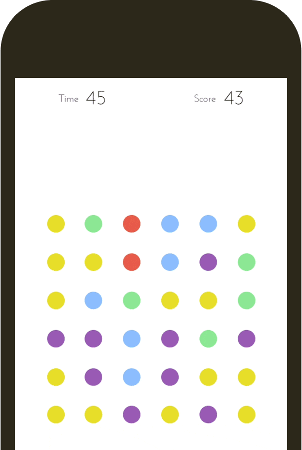
Dots is a game that has the user join together dots of the same color (only vertical and horizontal lines allowed) within a given time limit. The higher the number of dots joined in one turn, the greater the number of points. In addition, created a square with dots gives the player a bonus.
Dots has a very simple and clean aesthetic that compliments its simple nature. It makes use of Gestalt Psychology and proximity by clustering the dots in one square grid at the center of the screen and keeping the game-state elements (timer, score) far removed at the top of the screen. This helps the user distinguish between these sections.
Dots also make good use of typeface. It uses a simple sans-serif font for its game-state labels that’s easier to read. By making these labels small in contrast to the actual values, the designers establish a clear contrast and emphasize the values more than the labels.
Finally, one of the biggest contributors to Dots’s aesthetic is its great use of color. Dots makes use of rich bold colors that contrast with each other heavily. This allows the user to easily form associations with related colors, which helps them in playing the game when they’re looking to join dots of the same color. Using these colors with pulsing animations when the dots involved are selected helps the player keep track of what they’re doing.
In short, all of Dots’s visual design decisions help the game develop an engaging aesthetic that is not only visually stunning but also extremely functional with regards to the gameplay.
