

Graphic Design for Game Designers Exercise
Identify elements of cheese or font
Core Elements
- Word
- “Play Quiz” button
- Timer
- Score keeper
- “Next” button
- Final score
- A way to indicate “cheese” or “font”
Supportive Elements
- “Cheese or Font?” texts above the tables
- “Enter C or F” texts above the tables
- The title of the game “Can you name the cheeses and fonts?”
Extraneous Elements
- Columns of names of cheeses or fonts
- Average score
- Quiz stats
- % Correct
- Message at the end (“At least we know you didn’t cheat.”)
- Pause game button
- Both the “refresh” and “play again” buttons (only need one)
- “Give up” link
- “Previous” button
- Option to present score as a percentage as opposed to numerical
- Option to present timer as a stopwatch as opposed to the default
- “Play another” button (links to a separate game)
- Button for logging into the website
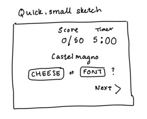
Sketch out the core elements
Make one element in a NEW thumbnail sketch HUGE.
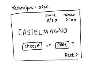
Other things I could change or make smaller include making the score and time keepers smaller and letting the “CASTELMAGNO” look even larger by comparison.
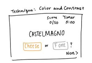
Try taking ONE color and using it in your thumbnail sketch along with black.
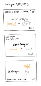
Make 3–4 thumbnail drawings that use type in different ways
Explore proximity in your design.
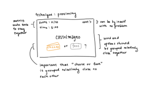
As noted in the figure above, it seems important to keep the “cheese or font” options grouped close to one another, as these elements are directly related to each other as one question. Consequently, it would also make sense to keep the word and the options (cheese or font) group relatively near each other, as the word is what the options are directly in reference to. Finally, it would be intuitive for the metrics for the game (time and score) to hold more proximity towards each other, while the “next” button can reasonably be placed in a location further away from the rest of the grouped elements.
Picking a Game
Size
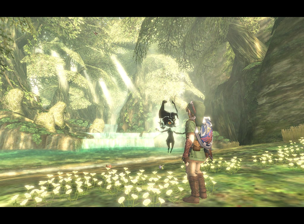
The relative size of the two figures in the foreground indicate their role in the video game. Link, the protagonist of this open-world adventure video game, is shown to be physically larger than Midna, the secondary character floating next to him. The giant trees and forms of wildlife towering and completely surrounding the characters indicate that they are operating in a wide and expansive game world.
Color and Contrast
This scene takes place after a curse has been lifted on Faron Woods, explaining the misty, dreamlike glow of the rocks and background. Although the scene has mostly green and yellow hues and Link is also clad in a green and brown outfit, the hints of blue and red on his shield make him stand out as the protagonist. Midna, who contrasts sharply with the light background as small, dark and hovering figure, also stands out as a significant character in the game thanks to the color choices made by the game designers.
Alignment and Proximity
Link and Midna are situated very closely together, indicating their dependence on one another and close relationship throughout the game. Additionally, they are both aligned to the foreground of the shot, indicating their important roles in the game relative to the objects of nature decorating the background of the scene in a somewhat haphazard arrangement.
