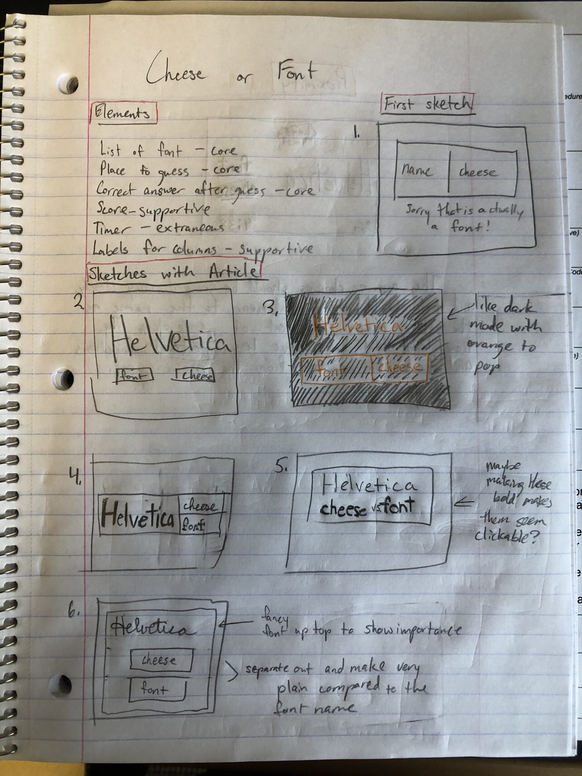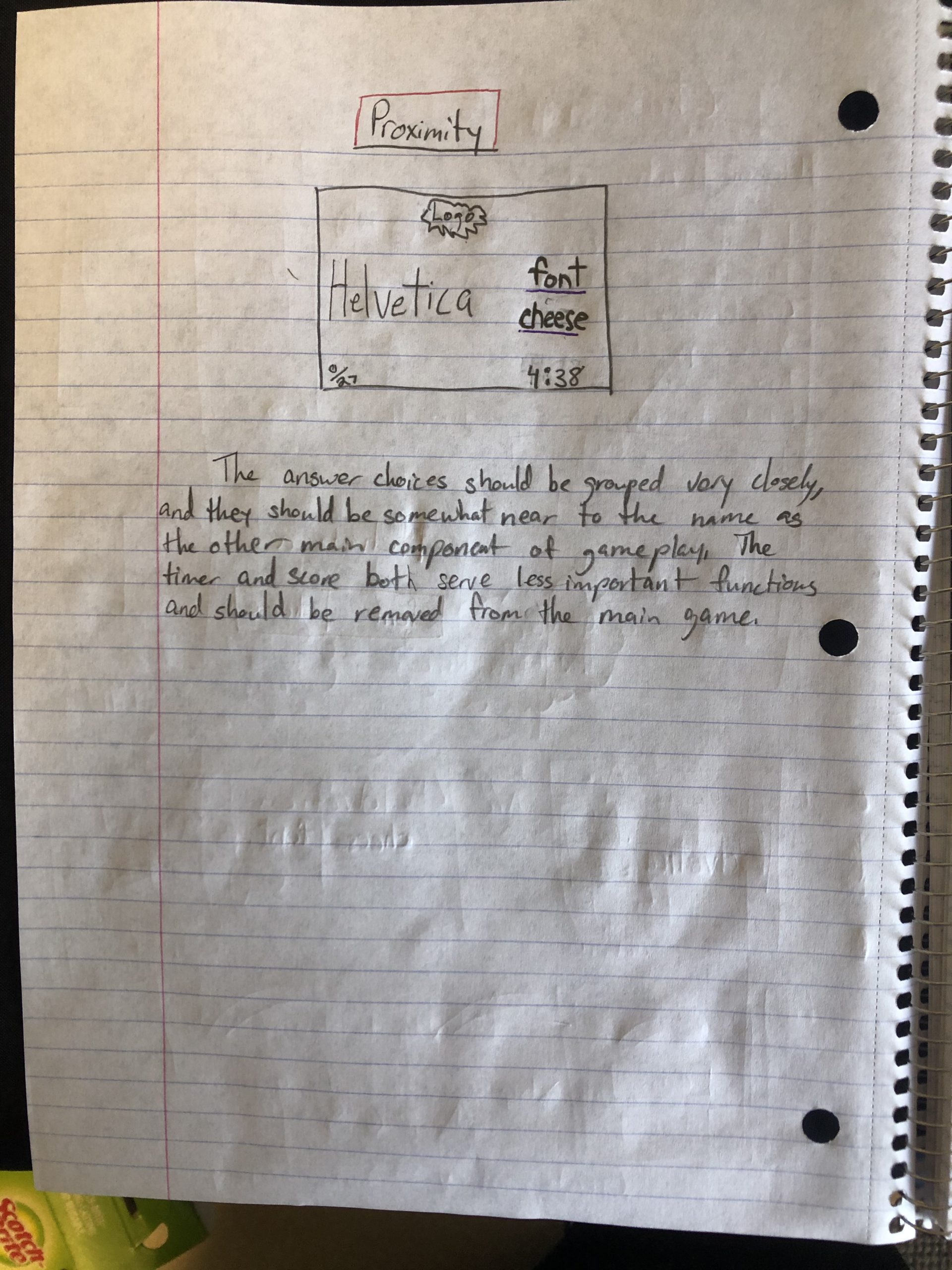
Game Analysis
For this assignment, I chose to look at Totally Accurate Battle Simulator, because I really enjoy its graphic style, and I believe it uses the elements of graphic design to make a very fun environment for players. 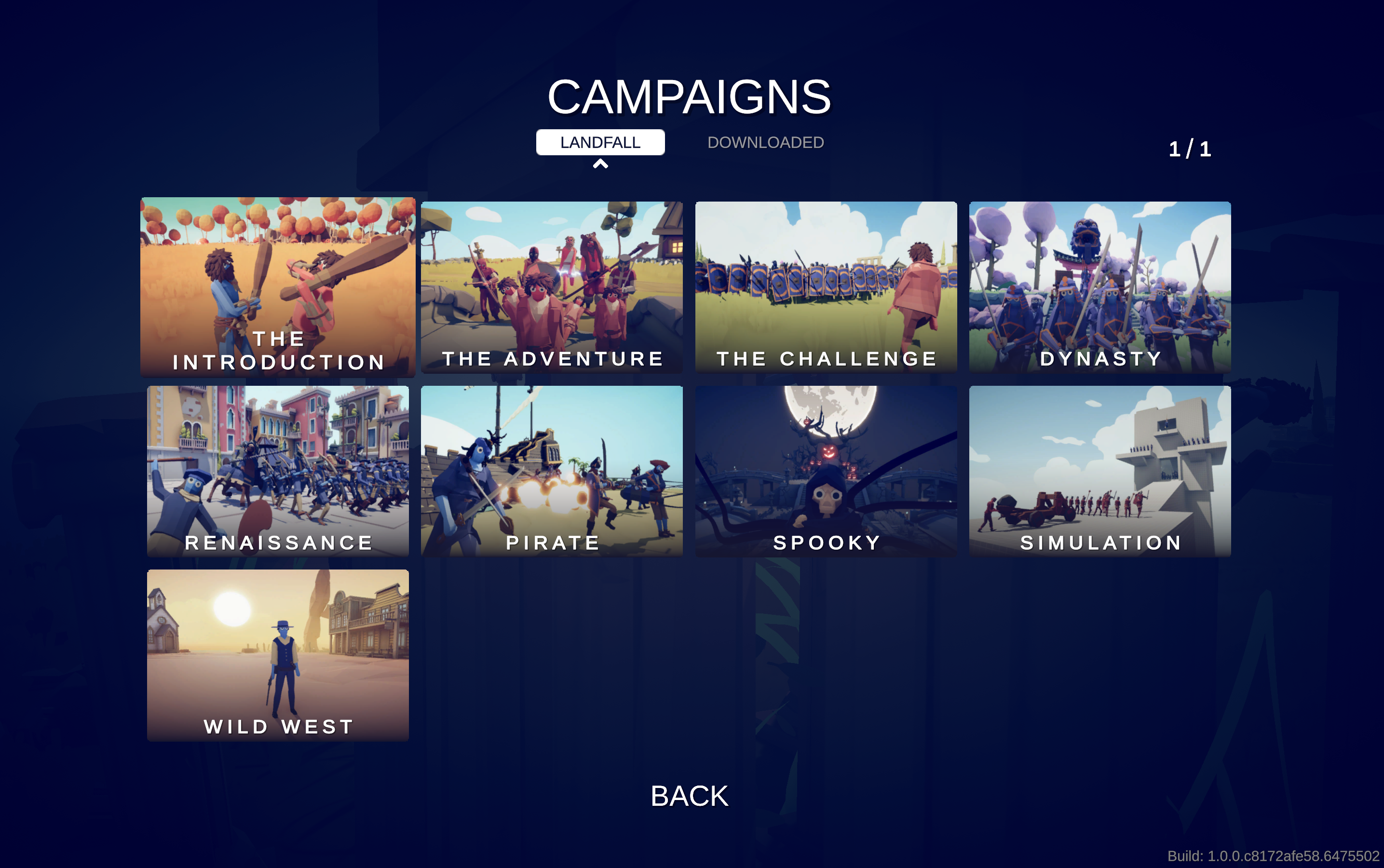 Looking first at its campaign screen, we can see that it does a good job grouping similar elements together (the actual maps in the middle, landfall/downloaded up top) as well as separating different elements (the pages numbers and the back button). Also, it does well to use size to justify importance (campaigns being bigger than landfall and downloaded as well as the actual maps being rather large to show their importance as options).
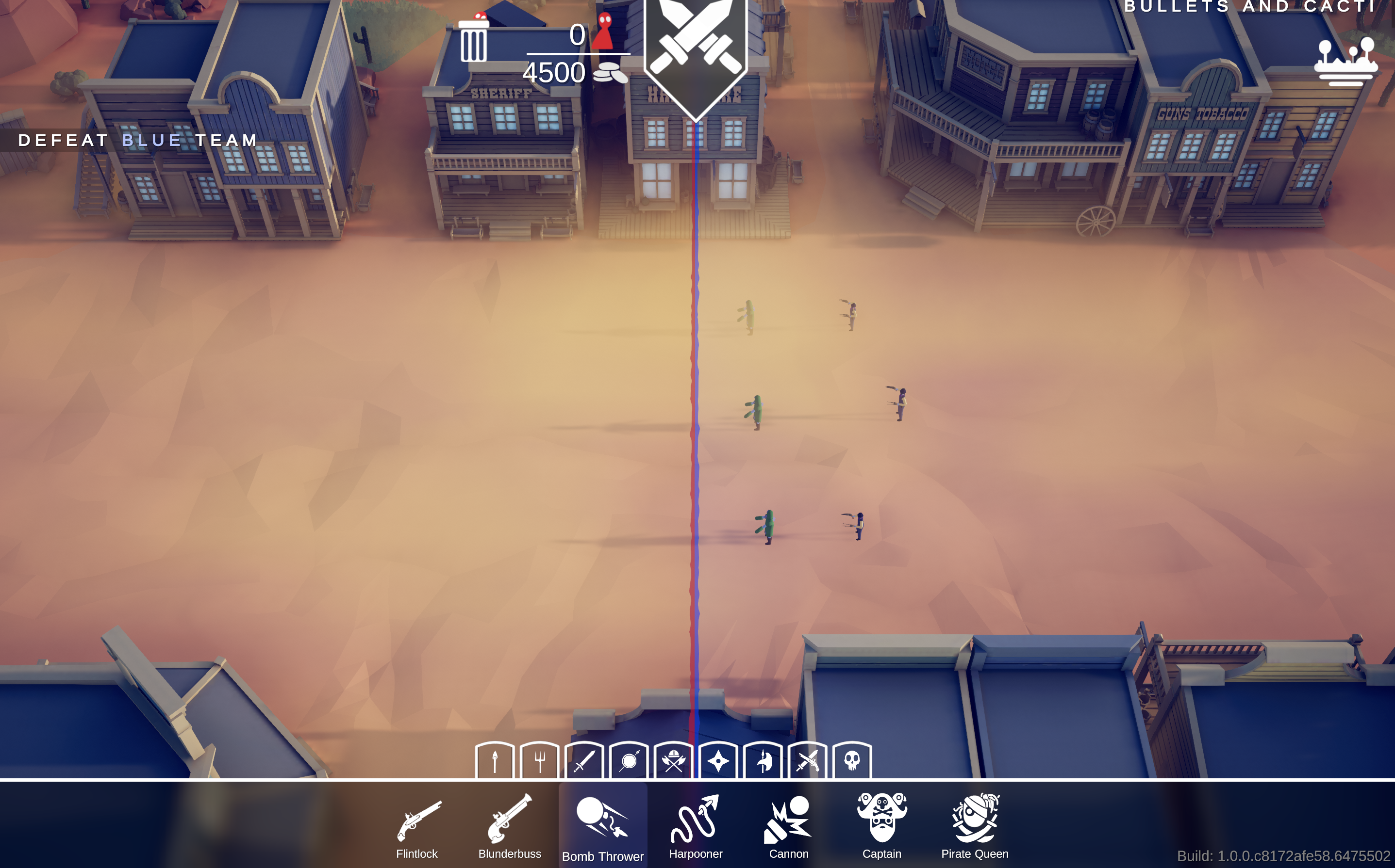 Those principles also carry over into actual gameplay. Up at the top of the screen, sort of middle-left we can see the resources where in this screenshot I have created zero units and still have 4500 gold left to spend, and the units can be deleted with the trash can. Additionally at the bottom of the screen, the smaller icons represent types of units that you acquire from each campaign map, and therefore can use in later maps. Since Wild West is one of the later maps, we have a lot of options here. However, size in this example shows that the categories of units are less important than the units themselves, which are shown right below. Lastly, I want to talk about how they use grouping and framing as a gameplay mechanic. So this first screenshot is how it is framed when the level loads, and we can pretty obviously see a group of enemies on the right side. However, in this second screenshot –
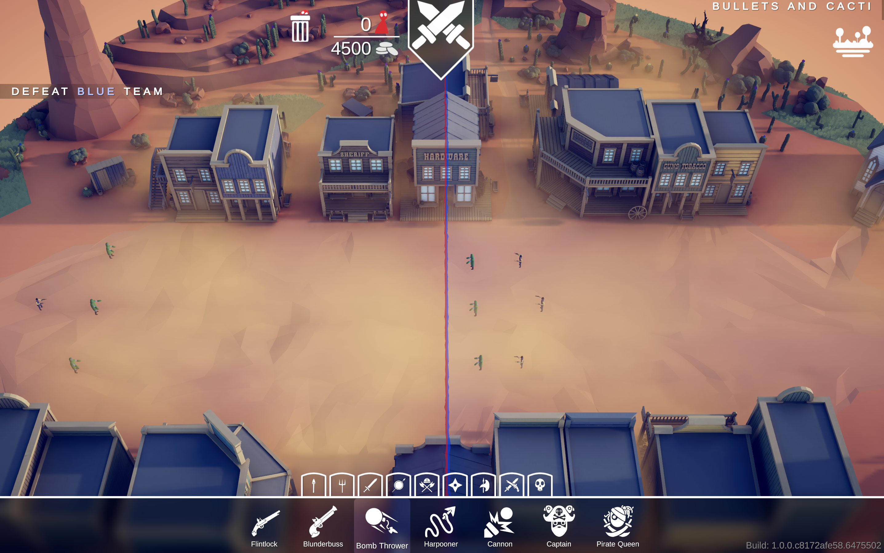 – we can see that framing and grouping were actually used to hide enemies and lure players into a false sense of security as there is actually a second group of enemies, separated from the first on the far left of the screen outside of the player’s initial scope.
Article Exercises