In “Graphic Design for Game Designers”, Christina Wodtke recommends experimenting with the elements of graphic design by reimagining the “Cheese or Font” quiz.
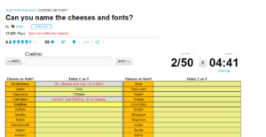
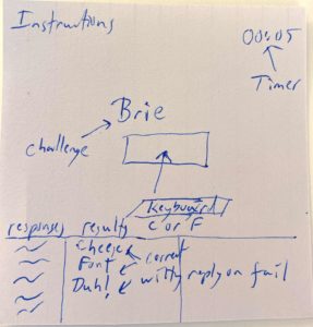
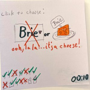
Here is the original:
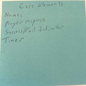
Analyzing the game led me to the following list of elements:
- Core: names, player response, success/fail feedback, timer
- Supportive: title, instructions, score, response history, start button, next/prev buttons
- Extraneous: average score, quiz stats
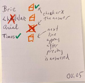
I summarized the core elements on a post-it and made a sketch of the original design:
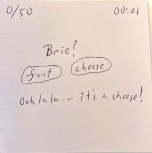
Here is my first attempt at a new design before reading the rest of the article. Although I do not consider the score to be a core element, I felt it was needed to balance the placement of the timer in the upper right corner:
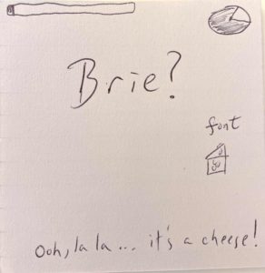
As recommended, I experimented with making one item HUGE. I also experimented with using graphics instead of text to represent progress through the quiz (instead of score), the timer, and the cheese choice.
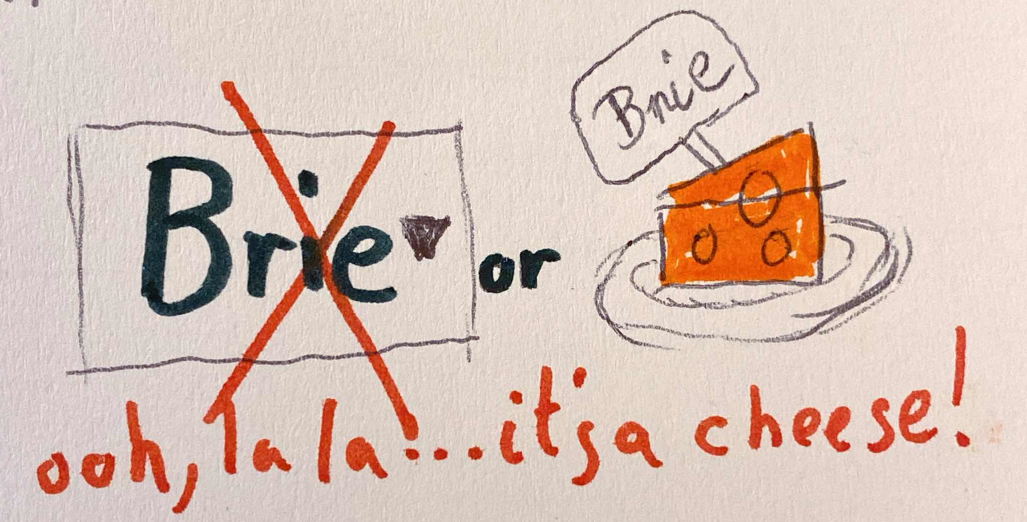
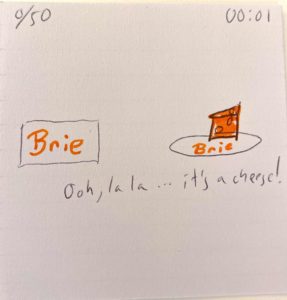
The next challenge was to add a single color. Of course it had to be the cheese…
The next exercise, playing with fonts in 3 different ways, was quite challenging for me as reproducing fonts is at the outer limit of my artistic ability. In the first design, I gave each candidate a different font, and experimented with a different spatial and temporal presentation — having the candidates appear one by one and remaining on the screen.
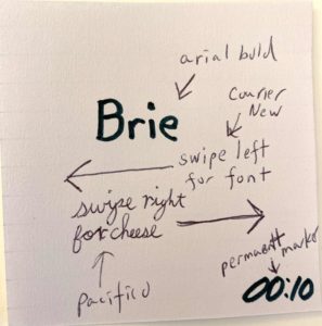
Next, I experimented with a different player input, swiping left and right. I chose arial bold for the candidate, a font so common that it would hopefully not influence the player. Although the design guidelines called for limiting fonts to two, I felt the instructions for the swipes needed different fonts to differentiate them, choosing courier new because I thought players would recognize its font-ness, and pacifico to imply the softness of cheese. Having broken the rules, I went crazy by changing the timer to permanent marker font to make it more fun.
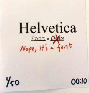
For the final font exercise, I threw in the artistic towel and cheated by using Google Docs to write the fonts for me. Adding the success/fail message in red came after the fact, and I would probably go with the caveat font.
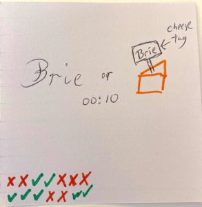
The next exercise was to use proximity, so I tried moving the timer and changing the score to a series of checks and x’s. I was pleased with the innovation of using a cheese tag to display the name:
Gathering together my favorite elements, here is my final sketch:
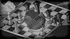
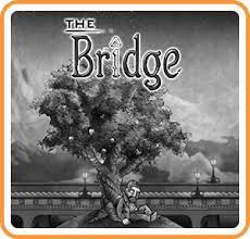
One game that I consider beautiful is a 2D logic-puzzle game for Nintendo Switch, The Bridge:
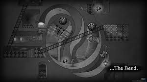
The game’s monochromatic design and use of texture create a mood that is slow and heavy, complementing the narrative arc where the player must solve a spatial puzzle in order for the main character to traverse each level. The Escher-like visual design is integral to the chief game mechanic — the player rotates the device, which in turn rotates the set and causes the main character and obstacles like walls and large boulders to move according to the geometry of the buildings and application of physics laws. The game story is revealed in short, minimal phrases presented in a gothic font that is, like the drawings, composed of simple bold lines with ornate details. The aesthetic of the game is a physical challenge overlaid with just a touch of a narrative story.
more stuff…