Exercises from Graphic Design for Game Designers:
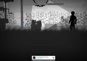
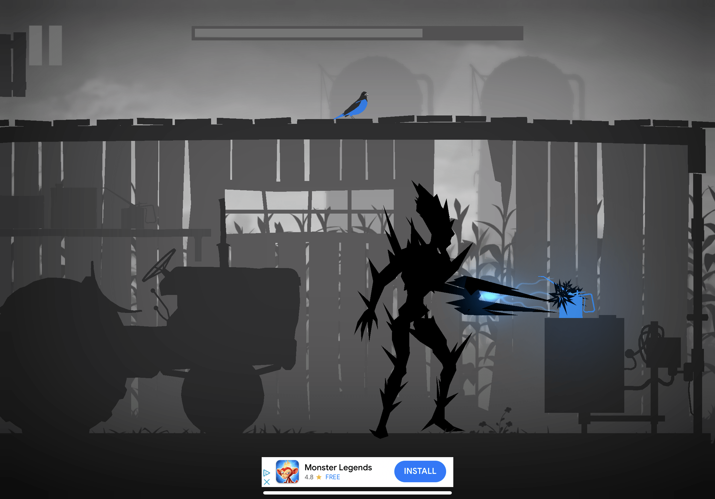
The game I’ve picked out to speak about its beauty is Grayland. From what I understand after my first time playing Grayland, you are a bird who is trying to rescue your loved that humans captured at the beginning of the game. The game appears to be set in the middle of a war between humans and some sort of aliens and the visual design reflects this with radioactive barrels and a gloomy, gray background.
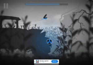
The first graphic design principle that I noticed while beginning the game was the color and contrast. In the game, you play as a bluebird and a gray world as you fly through various gray locations with the constant presence of leafless trees and tall plant stalks in the background. Additionally, as I was playing, I found that the only other creatures in the game, the aliens and humans, were black silhouettes which created an even greater contrast as they too stood out against the gray world. Going back to the topic of the color blue against the black, white, and gray colors, I found it interesting how the only other living creature that shares the color blue is the alien through some sort of seemingly electrical power. This makes me believe that the aliens and the birds may somehow be allies of some sort.
The other major graphic design principle I noticed in Grayland was how they used size. The player navigates the gray huge world and ends up only taking about an inch of the screen. This makes the game so beautiful in addition to the contrast that the colors provide as you truly feel like this lost bird navigating the uncertain world. It also makes it as though you’re observing the world rather than observing your character going through the world which allowed me to catch so many small details in the game which overall created such a pleasant and intriguing experience in this beautiful game.