

Blog Response: Visual Design of Games
Elements of Cheese or Font:
- Any number of players can play this game (supportive)
- Objective is to guess if a given name is a font or a type of cheese (core)
- You can only guess font or cheese for each of the 50 questions (core)
- Questions are listed downwards in order in two columns (extraneous)
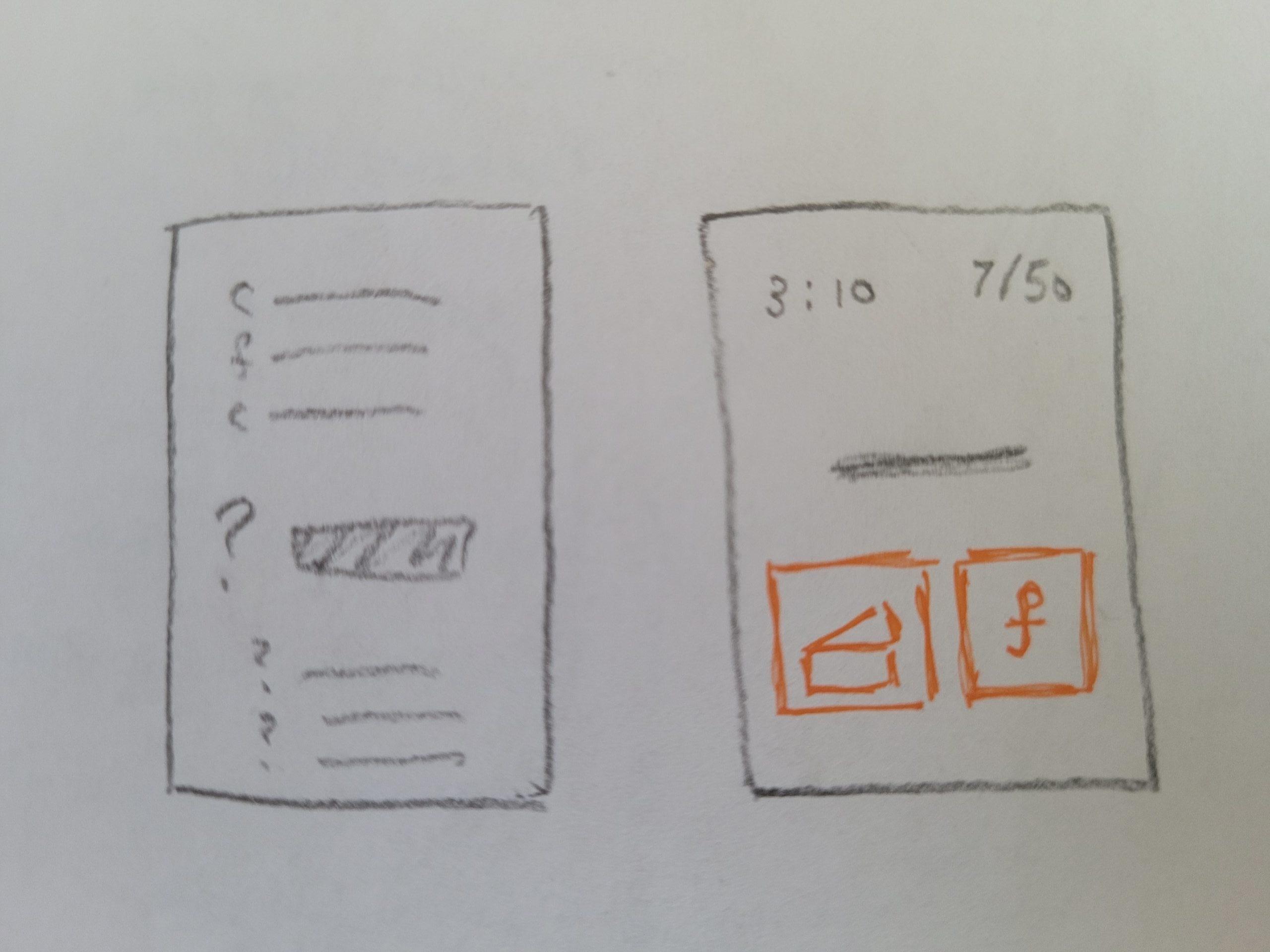
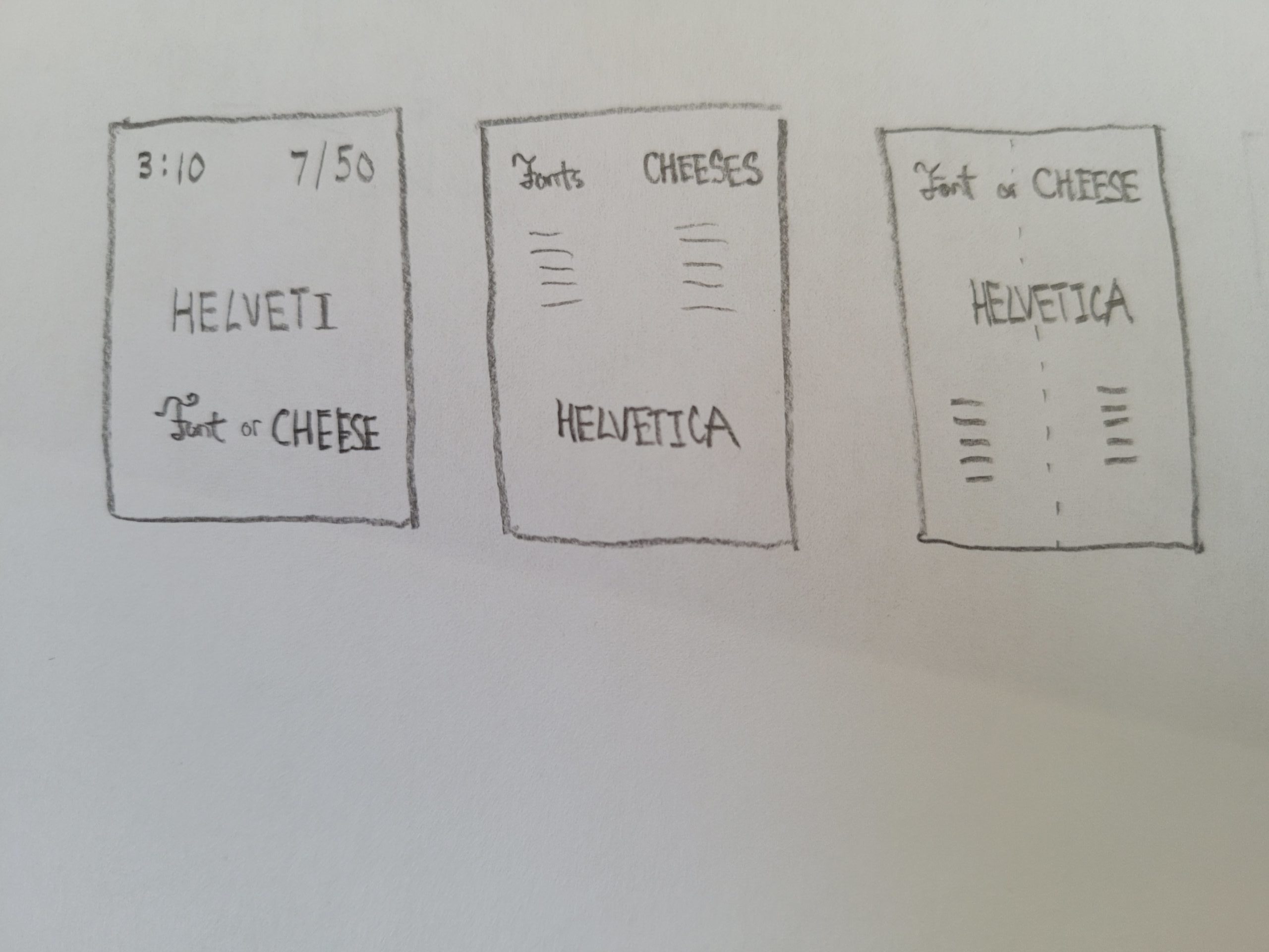
- There is a timer and a score indicator (supportive)
- Each wrong answer is met with a unique response (extraneous)
- Correct answers are labeled in yellow, incorrect in grey; questions are orange (extraneous)
- Quiz is taken in an online format (supportive)
- Zero-Sum game; questions are right or wrong (core)
Core Element Prototypes:
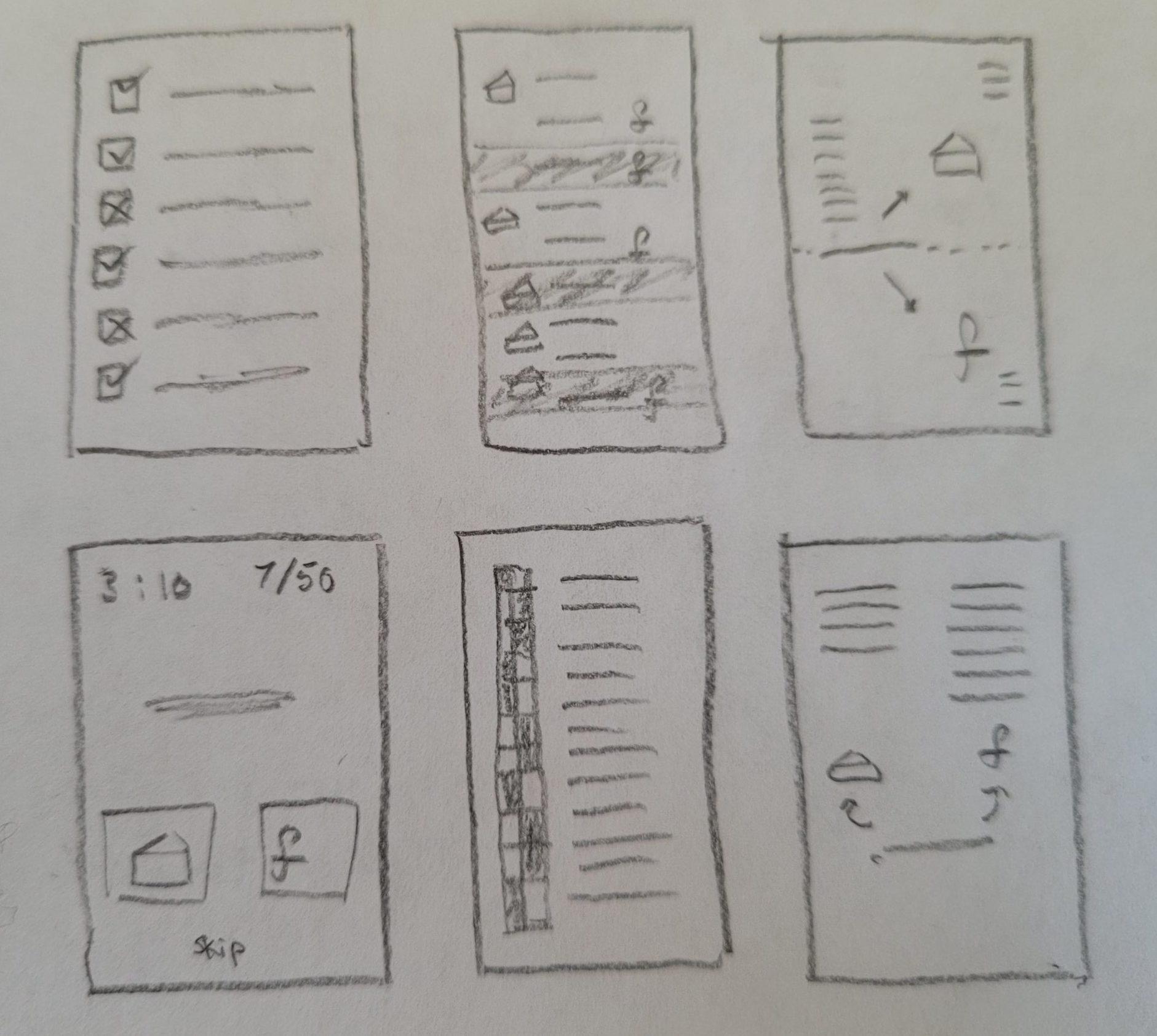
Experimenting with Size and Color:
Experimenting with Font:
Experimenting with Proximity:
- Decisions between Font and Cheese should be equal in size and in line, but separate
- The timer and score should be kept separate from the rest of the game
- In designs with answers listed, the fonts and cheese should be grouped together, respectively
- The font / cheese in question should be isolated by itself, not in line with either category
Beautiful Game:
The beautiful game I chose to write about is called Humankind. It is a 4x game whose premise is similar to that of Civilization, in that you lead a civilization from the ancient era to the modern era. According to the principles of graphic design that we covered, the typography stands out the most to me. In the screenshot below, the fonts for the leaders at the top left containing the leader name, era, and age are all different colors and fonts, as well as contrasting sizes and spacing to emphasize certain elements over others. There are also the resources in the top right, which are separated by contrasting colors and iconography, contrasted by the dark, translucent background. Lastly, the color scheme of each of the boxes match nicely (blue-green aesthetic) and provide good contrast to the yellow-white-grey lettering.
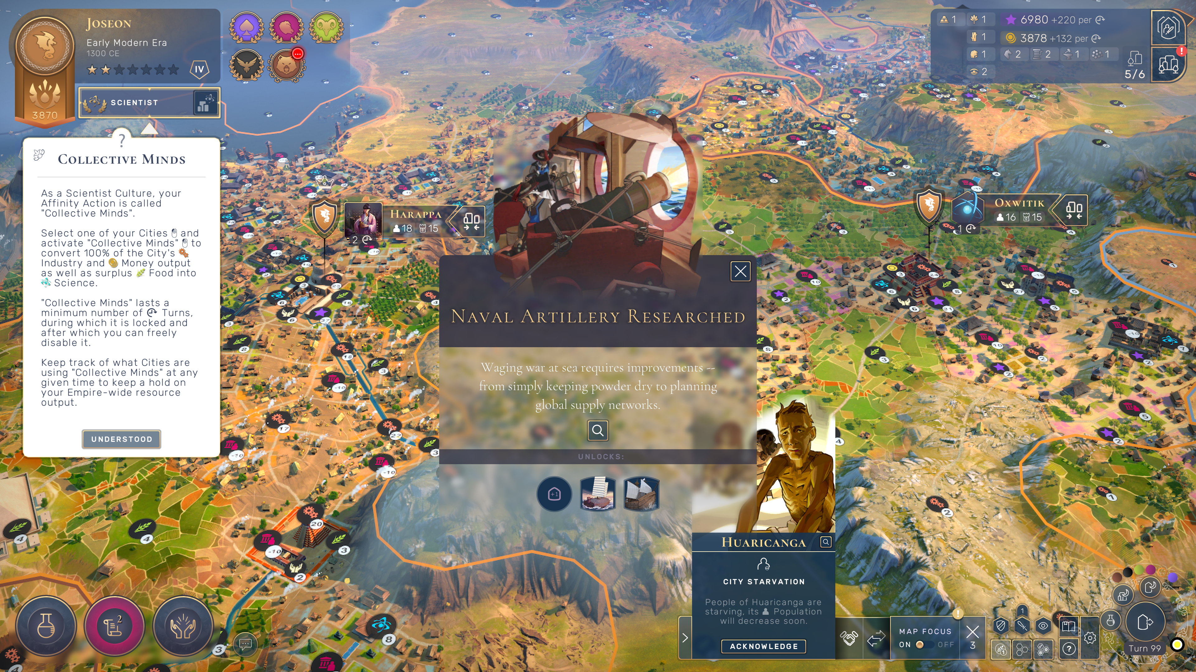
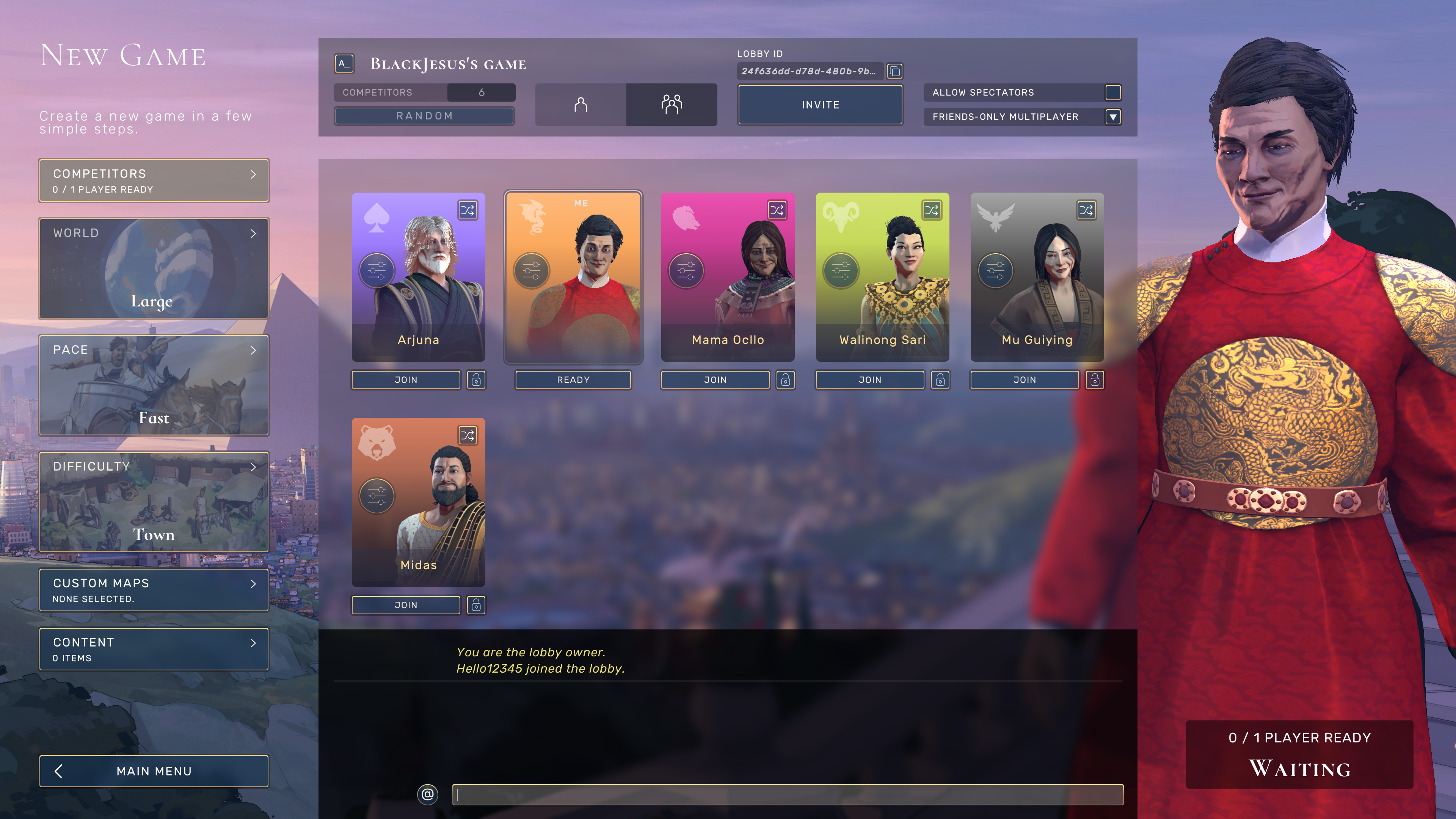
Also, in the screenshot below, the sizing of different elements is organized very neatly to emphasize the player’s character, as well as the map settings and the players in the lobby. The character on the right, customized by the player, is enlarged to show player preference, but also fitted in a matching outfit according to the dynamic player progression within the game. To the left, the game settings are shown with appropriate graphics, and are matched neatly in a linear fashion. In the center, players are represented with their avatars, albeit smaller, and shown with contrasting colors to distinguish between the two.
(Also, as a separate note, I also love the dynamic graphics generated by the game; even they don’t fit into the distinct categories laid out in the reading, I find that the graphics make the game more immersive, as they adapt to in-game decisions. )
