

Elements:
Core:
- A table that contains two columns: one for the name of cheese/font and the other column for the player to input their response
- Timer
- Score
- Button that allows player to start playing
Supportive:
- Previous and Next arrow (site automatically moves you on the next cheese but if necessary, players can go back and edit)
- “Friendly” error messages that state the correct answer
- Instructions on how to enter an answer
Extraneous:
- “Give up” button
- Quiz statistics (Average score of other people who took the quiz + the score you got in percentage form)
- The table shows all the questions, as opposed to showing them one at a time
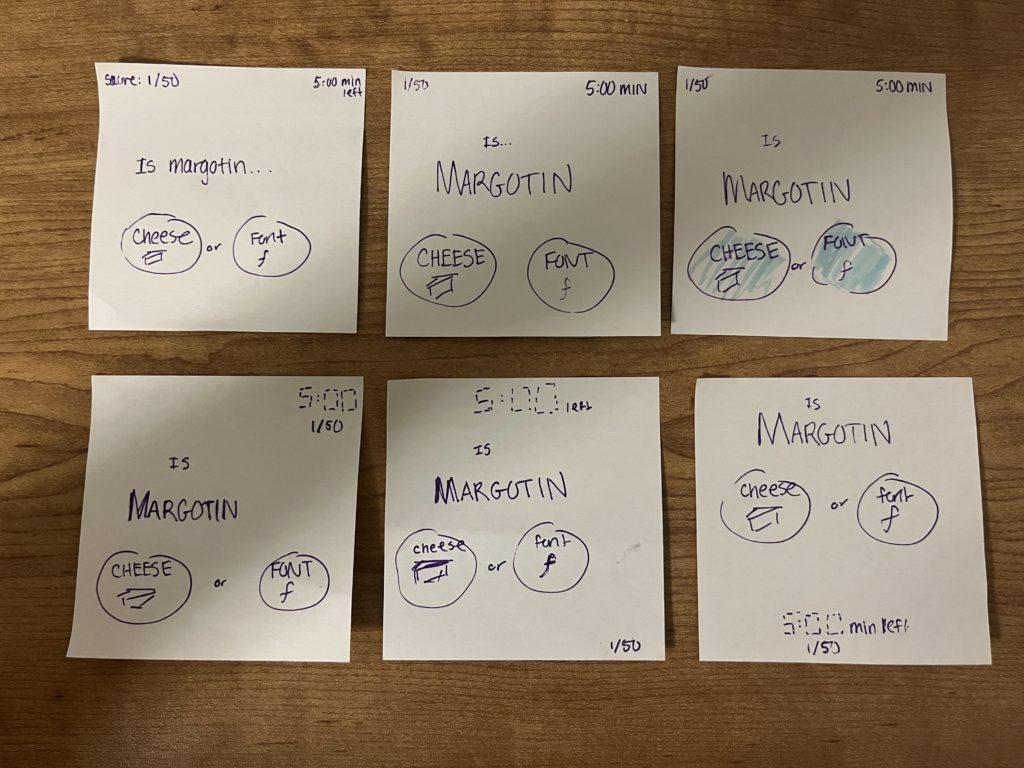
- Sketched out the core elements
- I made one element (the clue MARGOTIN) in Thumbnail #2 huge. This made me realize that the cheese/font buttons could be slightly bigger and the score could be smaller. I also had to
- One-color sketch—I highlighted the cheese/font buttons blue to indicate the importance of the options and attract people to select one of the two.
- For the next three thumbnails, I essentially tried different font sizes and types, boldness, and proximity to see what would make the most sense for the game. To make the timer number look more timer-like, I explored using the digital font to resemble a digital alarm. I also tried bolding the question topic (Margotin) to provide even more emphasis. While I did bold “cheese” and “font” (as the answers are just as important as the questions), I made the font a little smaller to draw more attention to the question.
- While trying out different fonts, I explored proximity and grouping elements. I ended up grouping the question and answer buttons together. It made sense to me to center the timer so that it was aligned/in view when the player was answering the question. Additionally, I made the size of the score less apparent and put it off to the side, as it’s not as important to know during gameplay.
Even before reading the article, the #1 game that came to mind for “beautiful graphics” is Monument Valley, a game I first discovered in high school.
/cdn.vox-cdn.com/uploads/chorus_image/image/60982657/monument_valley_hero.0.jpg)
This game is so beautiful because of the way the main character explores the world. Inspired by MC Escher’s artwork, players have to examine the world and change the given paths to create a feasible path. Even though you may not initially see the shapes, by turning the world at the right angle, it’s puzzling to players how it appears. Even though the premise of the game is quite simple (a girl is traveling from a start to end), the clean, simple, peaceful visuals make Monument Valley a terrific puzzle game and enticing to many. The color scheme is usually a hue of two colors but the main character is white and the crows (enemies) are enemies so it is easy to follow and understand the rules/limitations without having clear, written-out instructions. It also makes the user focus on the beautiful layout of the world.
